

TL;DR:
- Effective interior color mixing relies on balancing proportion, saturation, and undertone temperature to create cohesive and inviting spaces. The 60-30-10 rule provides a practical framework for distributing colors, while understanding undertones enhances harmony across rooms. Using methods like the Rug Method and color wheel relationships helps build confident, intentional palettes that reflect personal style.
Colour mixing in interiors is the deliberate practice of combining hues, saturation levels, and temperature to produce rooms that feel balanced, alive, and intentional. This guide to mixing colours in interiors covers the core tools professionals rely on: the 60-30-10 rule, colour wheel relationships, undertone harmony, and the Rug Method. Master these, and you move from guessing at paint chips to composing spaces with real confidence. The result is not just a prettier room. It is a room that holds together, that breathes, and that feels unmistakably yours.
How to apply the 60-30-10 colour rule in any room
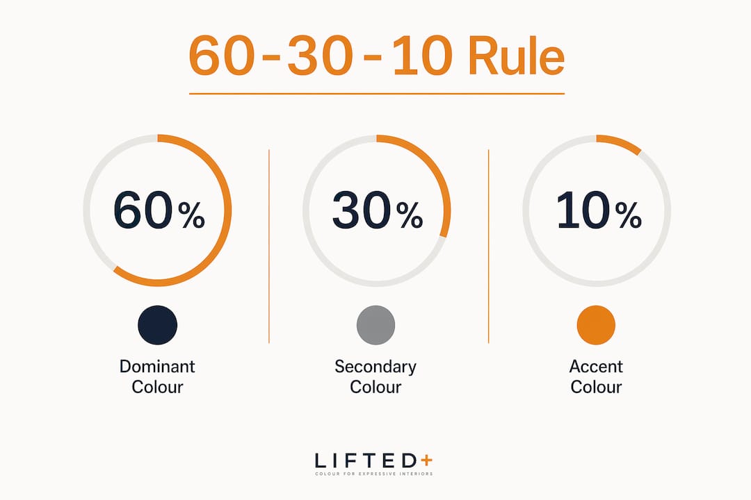
The 60-30-10 formula is the industry-standard balance for cohesive rooms: 60% dominant colour, 30% secondary, and 10% accent. It gives every space a clear visual hierarchy without tipping into monotony or chaos. Think of it as the grammar of a room. Without it, even beautiful colours compete rather than converse.
Here is how the proportions work in practice:
- 60% dominant colour covers your largest surfaces: walls, a large sofa, or floor-to-ceiling curtains. This is the room’s ground note. Choose a colour with lower saturation here, since it will carry the most visual weight.
- 30% secondary colour lives in furniture, rugs, and cabinetry. This layer introduces contrast and personality. A warm terracotta sofa against a soft sage wall is a classic 30% move.
- 10% accent colour appears in cushions, artwork, vases, and light fittings. This is where you can be bold. A deep cobalt or burnt sienna at 10% reads as intentional rather than overwhelming.
The formula is better understood as a visual weight equation than a strict measurement of physical area. A highly saturated colour at 10% can attract more visual attention than a muted tone covering 60% of the room. This is why saturation control matters as much as proportion. A vivid emerald cushion holds the eye longer than a pale linen wall, even though the wall is twenty times larger.
| Surface | Proportion | Example Colour |
|---|---|---|
| Walls and large surfaces | 60% | Warm white, soft sage, dusty rose |
| Furniture and rugs | 30% | Terracotta, slate blue, warm oak |
| Accessories and art | 10% | Deep cobalt, burnt sienna, forest green |
Pro Tip: When your accent colour is highly saturated, reduce it to closer to 5% of the room’s visual field. A single statement artwork or one bold chair is often enough to anchor the palette without tipping the balance.
How do colour undertones affect interior harmony?
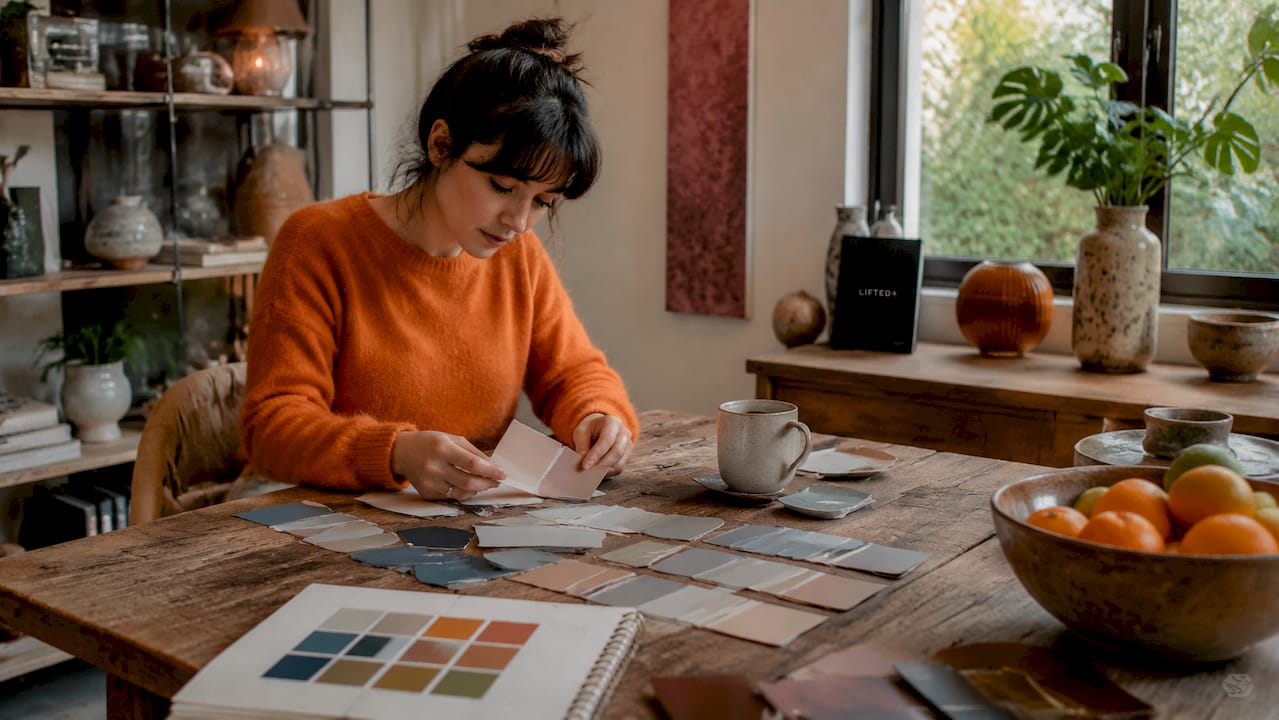
Undertones are the secondary hues sitting beneath a colour’s surface. They are the reason a white wall can look pink in one room and green in another. Every colour, including neutrals, carries an undertone. Getting these right is what separates a room that feels cohesive from one that feels subtly wrong.
Warm undertones carry red, yellow, or orange beneath the surface. Cool undertones lean towards blue, green, or violet. Neutral undertones sit between the two, though even these are rarely perfectly balanced. The challenge is that most homeowners choose colours in isolation, then wonder why the finished room feels unsettled.
Shared temperature across connected rooms ensures visual cohesion and intentional flow. If your hallway reads warm and your living room reads cool, the transition will feel abrupt rather than considered. This does not mean every room must be the same temperature. It means the shift should be deliberate, not accidental.
Mixing warm and cool tones creates sophistication when one temperature dominates and the other plays the accent role. A room grounded in warm terracotta and timber can carry a single cool-toned artwork beautifully. The contrast adds depth. The dominance keeps it from feeling fractured.
Neutrals carry undertones that must be matched carefully. A warm beige and a cool grey placed side by side will clash in a way that is hard to name but impossible to ignore. The room simply feels unresolved. Bridging elements such as natural wood, greige textiles, or woven rattan can reconcile conflicting undertones by sitting comfortably between warm and cool. They act as a visual translator between two tones that would otherwise argue.
Understanding how colour affects mood and perception deepens your ability to make undertone decisions with intention rather than instinct alone.
Pro Tip: Before committing to a neutral, hold paint swatches against both warm and cool elements already in the room. The undertone will reveal itself clearly in context, not on the paint chip.
What are the best practical methods for choosing a colour palette?
Choosing colours confidently comes down to having a reliable starting point. Two of the most effective methods are the Rug Method and basic colour wheel relationships. Both give you a structured framework rather than a blank canvas.
The rug method
The Rug Method uses a patterned rug as the palette anchor for an entire room. A well-designed rug already contains a curated set of colours in tested proportions. You simply extract them.
- Identify the base colour of the rug. This becomes your 60% dominant tone for walls or large surfaces.
- Pull the secondary colour from the rug’s main pattern. This informs your furniture and soft furnishings.
- Use the fleck or accent colour, often the smallest detail in the rug’s pattern, as your 10% accent across cushions, artwork, and accessories.
This method works because the rug’s designer has already done the colour balancing for you. You are not inventing a palette from scratch. You are reading one that already exists.
Colour wheel relationships
The colour wheel offers three reliable relationship types for interior schemes:
Complementary colours sit opposite each other on the wheel, such as burnt orange and slate blue. The contrast is high and energetic. Use complementary pairings when you want a room to feel bold and alive, but keep one colour dominant to avoid visual tension.
Analogous colours sit adjacent on the wheel, such as sage green, olive, and warm yellow. These schemes feel harmonious and restful. They suit bedrooms and reading rooms where calm is the goal.
Triadic schemes use three colours equally spaced around the wheel. They are the most complex to balance but produce the most vibrant results when handled with restraint.
| Relationship | Example Pairing | Best Used In |
|---|---|---|
| Complementary | Burnt orange and slate blue | Living rooms, dining rooms |
| Analogous | Sage, olive, warm yellow | Bedrooms, studies |
| Triadic | Rust, teal, mustard | Feature rooms, studios |
Designers recommend reducing saturation rather than changing the hue when a colour feels too intense on a large surface. Muted, grayed versions of a colour read as sophisticated and are far easier to live with long-term. A muted terracotta wall is grounding. A fully saturated one can feel relentless after a week.
Pro Tip: Always test paint samples on the actual wall in a 30 x 30 centimetre patch and observe them at different times of day. Morning light and evening lamp light can shift a colour’s undertone significantly.
Common mistakes when mixing colours in interior design
Most colour schemes that feel “off” share the same handful of problems. Recognising them early saves you from expensive repaints and lingering dissatisfaction.
Conflicting neutral undertones are the most common and least obvious mistake. Warm beige walls paired with a cool grey sofa create a low-level visual discomfort that most people cannot name. The fix is a bridging element: a natural timber coffee table, a greige rug, or woven linen cushions that sit between the two temperatures.
Ignoring saturation on large surfaces is the second most frequent error. Fully saturated colours on walls feel oppressive in most residential spaces. Muted, grayed hues are the professional choice for dominant surfaces because they recede gracefully and let furniture and art carry the room’s energy.
Overlooking Light Reflectance Value catches many homeowners off guard. LRV is a scale from 0 to 100 indicating how much light a colour reflects. A colour with a low LRV will read much darker in a north-facing room than it appeared on the swatch. Assigning a target LRV to your surfaces before selecting paint helps you maintain the intended colour perception under your room’s specific lighting conditions. Pairing this knowledge with an understanding of warm versus cool lighting gives you far greater control over the final result.
Lacking colour repetition is the mistake that makes rooms feel disjointed rather than designed. A colour introduced in one location needs to appear at least twice more in the room, at different scales, to feel intentional. A rust cushion on the sofa should echo in a small artwork and perhaps a ceramic vase. Repetition creates rhythm. Without it, a colour reads as an accident.
Pro Tip: Photograph your room in both natural and artificial light before finalising any colour decision. The camera often reveals undertone clashes that your eye, adjusted to the space, has stopped noticing.
Key takeaways
Effective colour mixing in interiors depends on controlling proportion, saturation, and undertone temperature together, not in isolation.
| Point | Details |
|---|---|
| Apply the 60-30-10 rule | Distribute colour as 60% dominant, 30% secondary, and 10% accent for visual balance. |
| Match undertone temperatures | Keep connected rooms in the same warm or cool family to maintain cohesive flow. |
| Use the Rug Method | Pull base, secondary, and accent colours from a patterned rug to build a tested palette. |
| Reduce saturation on large surfaces | Choose muted, grayed hues for walls to avoid visual overwhelm and add sophistication. |
| Check LRV before committing | Assign a Light Reflectance Value target to surfaces to predict how colours will read under your room’s lighting. |
Colour is a design decision, not a decoration choice
I have spent years watching homeowners treat colour as the final layer, something you add after the furniture arrives and the curtains go up. That approach almost always produces rooms that feel assembled rather than composed.
The shift happens when you start treating colour as structure. The 60-30-10 rule is not a formula I follow rigidly. It is a way of thinking about visual weight, of asking which colour should carry the room and which should punctuate it. Some of the most sophisticated spaces I have seen break the proportions deliberately, but they break them with understanding, not ignorance.
What surprises most people is how much undertone awareness changes the experience of a room. You can have beautiful individual colours that simply do not belong together because their undertones pull in opposite directions. Once you learn to read undertones, you cannot unsee them. And that knowledge is genuinely freeing. It turns colour selection from an anxious guessing game into a considered, satisfying process.
My honest advice: start with the tips for colourful interiors that ground colour choices in proportion and temperature first. Experiment with mixing warm and cool tones in a single room. Let one temperature dominate and use the other as a quiet counterpoint. The result will feel richer and more considered than any single-temperature scheme, and it will hold the room in a way that safe, matching palettes rarely do.
— Michelle
Bring your colour palette to life with Liftedplus
Knowing the principles is one thing. Finding pieces that carry the right colour, form, and presence is another.
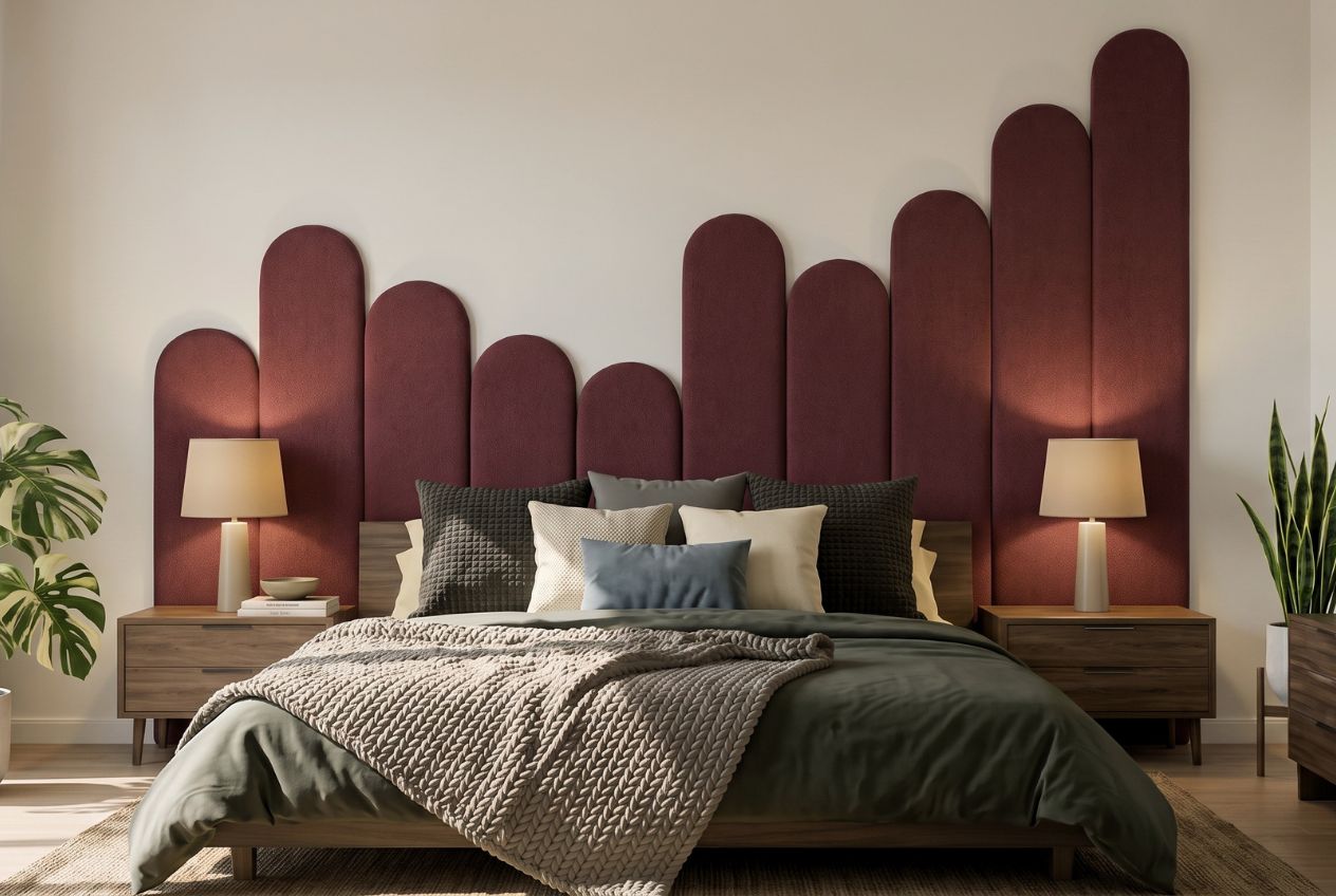
Liftedplus curates vibrant, colour-led furniture, wall art, and lighting designed specifically to anchor and complete interior colour schemes. Whether you are building a palette from scratch or adding the 10% accent that pulls a room together, the Liftedplus collection gives you pieces with genuine colour intention behind them. Explore the mood library for curated palette starting points, or read more about how decor shapes mood and style in your home. Every piece is selected for form, presence, and colour impact, not trend.
FAQ
What is the 60-30-10 rule in interior colour mixing?
The 60-30-10 rule divides a room’s colour into 60% dominant, 30% secondary, and 10% accent to create visual balance. It functions as a visual weight equation, so saturation matters as much as physical area.
How do i stop my neutrals from clashing?
Neutrals carry undertones that must be matched carefully, since warm beige and cool grey placed together often create unresolved visual tension. Use a bridging element such as natural timber or a greige textile to reconcile conflicting temperatures.
What is the rug method for choosing a colour palette?
The Rug Method uses a patterned rug’s base, secondary, and fleck colours as the foundation for an entire room’s palette. It works because the rug’s designer has already balanced the colour proportions for you.
Why does my paint colour look different on the wall than on the swatch?
Light Reflectance Value, or LRV, determines how much light a colour reflects, and it shifts dramatically depending on your room’s natural and artificial light. Testing a large paint sample on the actual wall at different times of day gives you a far more accurate result than reading a small chip.
Can i mix warm and cool tones in the same room?
Yes. Mixing warm and cool tones creates depth and sophistication when one temperature dominates and the other acts as an accent. The key is proportion: let one temperature carry the room and use the other sparingly to add contrast.