
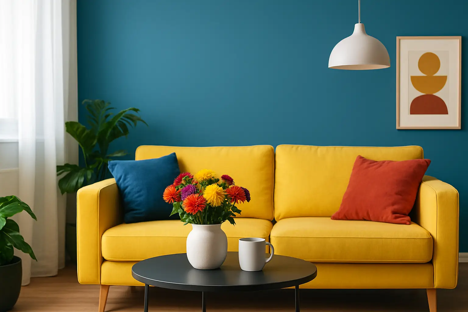
You know the room. Nice enough. Tidy. Technically fine. And yet it feels like it’s waiting for someone to move in – even if you’ve lived there for years.
That’s not a furniture problem. It’s a colour problem.
If you want a space to feel brighter, warmer, more energetic, more you, colour is the fastest lever you can pull. Not more cushions. Not another small decor object. Colour – placed deliberately – changes how a room reads in seconds.
How to use colour to lift a room (without repainting everything)
Lifting a room isn’t about “adding colour” in a vague, scattergun way. It’s about choosing where colour does the heavy lifting, then supporting it so the space feels intentional rather than chaotic.
Think in three layers: an anchor (the piece that holds the room), supporting colour (the echo), and light (the amplifier). When those three align, the room shifts from flat to charged.
Start with the anchor: one bold decision
Most rooms feel dull because nothing is leading. If everything is medium, the room reads as background. You need one decision that declares the mood.
In practical terms, that anchor is usually large-scale wall art, a statement rug, or a hero sofa. For NZ homes and flats where space is precious, wall art is often the cleanest move – it doesn’t steal floor area, and it sets the colour story immediately.
Pick a dominant colour that actually moves your mood. Cobalt that feels like a deep breath. Hot pink that refuses to whisper. Acid green that makes mornings feel less grey. The point is not subtlety. The point is impact.
A good anchor has enough colour to be read from the doorway. If you have to stand next to it to notice it, it’s an accessory, not an anchor.
Decide the feeling first, then the colour
A lot of people choose colour the way they choose a throw blanket: “Does it go with the room?” That’s how you end up with polite, forgettable spaces.
Instead, decide the feeling you want the room to deliver, then reverse-engineer the palette.
If you want the room to feel calm-but-not-boring, you’re looking at saturated cools (teal, indigo, forest) paired with a crisp contrast.
If you want a room to feel sociable and awake, you want warm brights (tomato, tangerine, marigold) with a grounding note so it doesn’t become a children’s playroom.
If you want cosy and flattering at night, lean into reds, plums, ochres, and anything that makes skin look good under lamplight.
Colour isn’t decoration. It’s atmosphere.
Use contrast like a designer, not a maximalist
Colour lifts a room when it has something to push against. A bright hue in a room with zero contrast can still feel oddly muted. The secret is not adding more colour everywhere – it’s creating a clear relationship between bold and quiet.
If your walls are white, you have the perfect blank stage. Your colour can be louder. If your walls are already mid-tone, you’ll get a more cinematic feel with fewer, stronger colour moves.
The easiest contrast wins are:
- A single high-chroma colour against a simple base (white walls, timber floors, black accents).
- A dark grounding element (charcoal, ink, espresso) that makes brights look sharper.
- A deliberate repeat of the hero colour in one other place, so it reads as a choice.
This is where many rooms fall over. They add colour once, then stop. One bright item can look accidental. Two or three placements look designed.
Put colour where it changes the light
If you want a room to feel lifted, you need to think about what colour does to light. Colour doesn’t sit still – it reflects.
In a south-facing NZ lounge that gets cooler light, warm colours will literally warm the room’s feel. In a north-facing space that already gets strong sun, cool brights can stop it feeling washed out.
A simple rule: place your strongest colour where your eye naturally goes, and where light can catch it. That might be the wall opposite the window, a piece above a sofa, or a zone you see from the hallway.
If you put the best colour in a dark corner, it won’t lift anything. It will just… hide.
Lighting is not neutral
Lighting is the quiet deal-breaker. The same pink can look electric under one bulb and muddy under another.
If your goal is mood-lifting colour, avoid lighting that makes everything look greyed-out. Warmer globes tend to flatter reds, oranges, and pinks, while cooler globes can make blues and greens feel crisp (but can also make skin tones look tired).
You don’t need a lighting renovation to make progress. A statement lamp with a shade that throws warm light can turn your hero colour into the star of the room after 6pm, which is when most of us are actually home.
Choose a tight palette – then push saturation
“More colour” doesn’t mean “more colours”. If you want a room to feel elevated rather than messy, keep the palette tight and push saturation within it.
Aim for one dominant colour, one supporting colour, and one grounding neutral (yes, neutral – but used like a tool, not a lifestyle). That neutral might be black, timber, stone, or even a deep chocolate. The grounding shade keeps the bright colour from floating away.
Then, instead of adding five extra hues, you deepen the same colour family across different materials: glossy, matte, woven, ceramic, printed. That’s what makes a room feel layered and confident.
Make colour architectural: scale and placement matter
Small hits of colour are fine, but they rarely lift a room. They decorate it. If you want the “walk in and feel it” effect, go bigger.
Large-scale art is the cleanest way to do that, especially in flats or first homes where you might not want to paint. It reads as architectural. It gives the room a centre of gravity.
If you’re colour-shy, scale can sound scary. But here’s the trade-off: small colour feels safer, yet it often looks fussier because you need more items to create impact. One large, decisive piece is often simpler – fewer decisions, less clutter, more payoff.
Use colour to fix common room problems
Lifting a room isn’t always about making it brighter. Sometimes it’s about correcting a feeling that’s slightly off.
If the room feels cold
Warm up the spectrum. Terracotta, rust, paprika, coral, and buttery yellow will counteract cool daylight and grey flooring. Add warm lighting and avoid too much stark white, which can make the space feel clinical.
If the room feels flat and beige
Add one high-chroma colour and one dark grounding note. A vivid blue with black accents, or a hot pink with deep walnut and smoky glass, will instantly sharpen the whole space.
If the room feels messy
Don’t add more small colour objects. Choose one anchor, then repeat that colour once or twice. Keep the rest disciplined. Colour looks best when it has boundaries.
If the room feels smaller than it is
Keep your largest surfaces calm and place colour in one strong vertical zone (like a large artwork). That draws the eye up and across, making the room feel taller and more intentional.
Don’t match. Coordinate.
Matching is what happens when you’re trying not to be wrong. Coordinating is what happens when you’re trying to be interesting.
Let colours relate, not copy. If your art has cobalt and citrus, your supporting pieces don’t need to be that exact cobalt. They can be a neighbouring blue, a yellow that leans warmer, or a texture that carries the same energy.
This is also how you keep a space feeling modern. Perfect matches can look showroom-y. Slight variation looks collected.
A simple way to test colour before you commit
If you’re nervous about bold colour, test it like a designer would: in context, at scale, and at the time of day you actually use the room.
Hold a colour sample next to your existing sofa, flooring, and curtains, then view it in morning light and again at night with lamps on. If the colour stays good in both, you’ve got a winner.
And if you’re building the room around an artwork, let that piece be the palette. Pull one colour for lighting, one for an object, and leave the rest to breathe.
Where Lifted+ fits (if you want the shortcut)
If you want the decisive version of this – one anchor that sets the palette, then coordinated pieces that echo it – that’s exactly how we curate at Lifted+: colour-forward statement art designed to hold a room, plus themed Edits that make the rest of the choices feel obvious.
The real rule: be brave in one place
A lifted room doesn’t require you to become a different person with a different house. It requires one brave choice that shifts the energy, then a few smart echoes so it feels designed.
Pick the colour that gives you a jolt of yes. Put it somewhere it can be seen. Let the light hit it. Then stop apologising for wanting your home to feel like it has a pulse.