

TL;DR:
- Colour is a powerful interior tool that becomes inviting with understanding of proportion, mood, and lighting. The 60-30-10 rule balances hues, while matching lighting temperature influences how colours read in a space. Starting small in low-commitment rooms and embracing contrast over matching fosters confidence and creates warm, lively interiors.
Colour is one of the most powerful tools you have in a room, and also one of the most misunderstood. Many homeowners hold back, drawn to safe neutrals out of fear that bold choices will overwhelm or date a space. But the best tips for colourful interiors are not about painting everything in sight. They are about understanding proportion, mood, and how light shifts what the eye perceives. Get those fundamentals right, and colour stops being a risk. It becomes the thing that makes your home feel genuinely, unmistakably yours.
Table of Contents
- Key takeaways
- 1. Master the 60-30-10 rule for colour balance
- 2. Know your room’s mood before choosing a palette
- 3. Start small and build your colour confidence
- 4. Use lighting to shift how colour reads in a room
- 5. Embrace contrast and variation rather than perfect matching
- 6. Avoid the most common colour decorating mistakes
- My take on embracing colour with confidence
- Bring your colour vision to life with Liftedplus
- FAQ
Key takeaways
| Point | Details |
|---|---|
| Start with the 60-30-10 rule | Use a dominant colour for 60% of the room, a secondary for 30%, and an accent for 10% to keep things balanced. |
| Lighting changes everything | Warm LEDs shift how colours read on walls and fabrics, making spaces feel richer and more cohesive. |
| Start small to build confidence | Low-stakes rooms like bathrooms are ideal for testing bold colour choices before committing to larger spaces. |
| Contrast beats matching | Spaces that mix tones and patterns feel warmer and more personal than those where everything perfectly matches. |
| Plan furniture before decor | Finalise your layout before buying rugs, cushions, or art, or you risk purchasing pieces that do not fit visually. |
1. Master the 60-30-10 rule for colour balance
Every confident, colourful room has a structure underneath it. The 60-30-10 rule is that structure. It distributes colour across three tiers: 60% dominant, 30% secondary, and 10% accent. Think of the dominant colour as the room’s backdrop, appearing on walls, large furniture pieces, and floor coverings. The secondary colour shows up in upholstery, curtains, or a feature wall. The accent, just 10%, carries the sharpest visual energy. It lives in cushions, vases, art, and small statement pieces.
This framework works because it mirrors how the eye naturally scans a room. Too much of any single hue becomes monotonous. Too little and the colour feels like an afterthought. The 60-30-10 split creates visual rhythm without requiring you to become a trained designer.
Pro Tip: When choosing your dominant colour, consider shades that act as flexible neutrals. Greens with grey undertones, deep navies, and soft lavenders carry colour without rigidity, making it easier to swap out secondary and accent pieces over time.
Beyond the ratio, understanding basic colour relationships shapes every decision. Complementary colours sit opposite each other on the colour wheel and create tension and energy. Analogous colours sit side by side and produce a smoother, more calming effect. Triadic schemes use three evenly spaced colours for a bold, playful result. Monochromatic schemes use one colour in varying tones, delivering cohesion with surprising depth. Knowing which relationship your room is built on gives you a map for every purchase you make afterwards.
2. Know your room’s mood before choosing a palette
Colour theory alone is not enough without considering what a room is actually for. A bedroom palette should support rest. A kitchen or dining room can carry more energy. A living room sits somewhere in between, where vibrancy and comfort need to coexist.
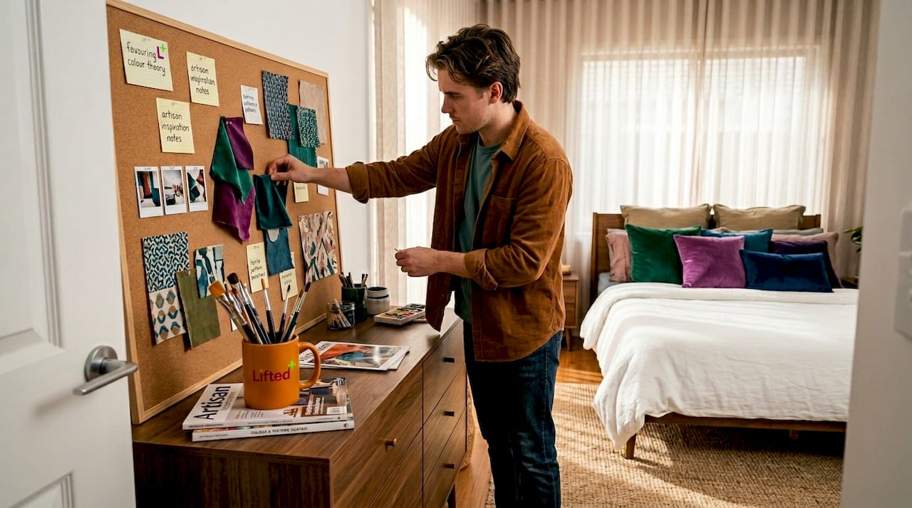
Before selecting any paint or fabric, spend time in the room at different times of day. Notice how natural light moves through it. A south-facing room in New Zealand receives strong, warm afternoon light that will intensify warm tones. A cooler, north-facing space may benefit from richer, deeper shades to counter the flatness of indirect light.
Then create a vision board. Gathering images of spaces that appeal to you will reveal patterns in your preferences before you spend a cent. Vision boards help define colour direction and prevent impulsive decisions that pull a scheme off course. They also make it easier to communicate your direction to anyone helping you, whether that is a partner, a painter, or a stylist.
3. Start small and build your colour confidence
The most common reason people avoid colour is the fear of commitment. A freshly painted wall in a bold shade feels permanent in a way that a cushion does not. That fear is worth respecting, because it often comes from watching other people get it wrong.
Bathrooms and laundry rooms are the ideal proving grounds. They are small, low-traffic, and relatively inexpensive to repaint if you change your mind. A deep teal bathroom, a terracotta laundry, or a cobalt powder room can be genuinely joyful spaces without requiring a full-room commitment to colour elsewhere.
From there, accessories carry enormous visual weight without financial risk. A single piece of wall art adds colour to a neutral room in a way that feels considered and personal, not overwhelming. Cushions, throws, and ceramic vessels let you test how a particular tone sits alongside your existing pieces before you scale it up.
When you are ready to go bolder, colourful wallpaper and murals can transform a single wall into a statement. Pair them with neutral furnishings to let the pattern carry the room without competing with everything around it. Jewel tones such as sapphire, emerald, and amethyst work particularly well in this context, adding moodiness and richness that flat bright colours cannot replicate.
4. Use lighting to shift how colour reads in a room
Light does not just illuminate colour. It changes it. This is one of the most overlooked aspects of bright interior design, and getting it wrong can make even a well-chosen palette feel flat or harsh.
Warm-toned bulbs (roughly 2700K to 3000K) bring out the richness in earthy tones, terracottas, and deep greens. They soften edges and create a sense of enclosure that makes bold walls feel welcoming rather than confrontational. Cool-toned bulbs above 4000K push rooms towards the clinical end of the spectrum, which may work in a modern kitchen but rarely flatters a living space with colour.
Switching to warm LEDs is one of the most cost-effective shifts you can make. A single pack at low cost immediately changes how a colourful room reads, making it feel richer and more considered. For deeper detail on how different temperatures perform across rooms, the guide to warm versus cool lighting at Liftedplus is worth bookmarking.
Lighting consistency across a room matters more than most people realise. Mixing a warm pendant with cool downlights will fracture the mood, making some surfaces read differently from others. Choose a consistent colour temperature throughout each space and layer the sources. Under-cabinet LED strips, floor lamps, and directional spotlights each serve a different function, and together they give colour depth that a single overhead fitting cannot achieve.
Pro Tip: Use layered lighting to highlight your most colourful elements. A well-placed lamp directed at a piece of art or a richly coloured wall will pull it forward in the room and make the whole space feel more intentional.
5. Embrace contrast and variation rather than perfect matching
There is a tempting logic to buying pieces that all share the same tone. Everything coordinates, nothing clashes, the room looks finished. The problem is that perfectly matched tones are beautiful in photographs and often cold and sterile in real life.
The rooms that feel genuinely inviting are the ones with tension in them. A deep amber cushion against a sage green sofa. A navy rug under warm oak furniture. Contrast is what gives a room warmth because it reflects the way colour actually exists in the natural world, where nothing perfectly matches.
For maximalist or layered looks, the key is aligning intensity and saturation rather than hue. Matching colour intensity across patterns creates visual harmony even when the colours themselves are quite different. A bold stripe and a floral print can coexist comfortably if they share the same depth of saturation.
“Green is nature’s neutral. It lets stronger colours take the lead while threading the whole scheme together.” This insight, drawn from experienced interior designers, is one of the most useful things you can bring to a complicated colour scheme. If you are unsure how to connect a bold palette, add green. Olive, sage, deep forest, eucalyptus. It works with almost everything.
Pro Tip: A richly coloured oriental or Persian-style rug is one of the most effective ways to anchor a colour scheme. It introduces multiple tones at once and gives you a ready-made palette to pull from when choosing accent pieces.
6. Avoid the most common colour decorating mistakes
Decorating with colour is not difficult, but it does have a specific sequence. Skipping steps is where people run into trouble. Understanding how to style bold interiors that still feel calm comes down largely to avoiding a handful of recurring errors.
The most costly mistake is buying accent pieces before finalising the furniture layout. 70% of living room redesign regrets come from buying a rug or cushions before placing the sofa, a mismatch that no amount of styling can fully correct. Plan the furniture layout first and every subsequent purchase will have a clear context to work within.
A second mistake is layering too much colour or pattern in high-traffic areas. Hallways, open-plan living spaces, and busy family rooms need breathing room in the scheme. Reserve the boldest choices for spaces where you spend time in a more focused way. A reading nook, a study, a bedroom. These are the places where immersive colour pays off.
Scale and proportion also matter more than most decorating guides acknowledge. A single large-format artwork carries colour differently from four small prints. A floor-to-ceiling curtain in a rich tone commands the room in a way that a short curtain in the same colour never will. When in doubt, go bigger with fewer pieces rather than smaller with more.
Finally, decorate for the mood you want to live in, not the one that looks most impressive on a screen. Colour is a mood enhancer that integrates with furniture and light to create atmosphere. Trend-chasing without grounding choices in how you actually want to feel in the space is what produces interiors that look finished but never feel like home.
My take on embracing colour with confidence
I’ve worked with enough spaces and enough clients to say this plainly: the people who regret going bold are far fewer than the people who regret staying safe. Fear of colour is usually fear of making a mistake, but a coat of paint can always be changed. A room that never quite comes alive because you were too cautious to commit is a harder problem to fix.
What I’ve found is that variation and contrast create more genuinely welcoming spaces than any perfectly matched scheme. The rooms I come back to, the ones that feel warm and alive, always have something a little unexpected in them. A colour that shouldn’t work but does. A pattern that breaks the rule but holds the room.
My advice is to start with lighting and furniture before you touch a single accent piece. Get those right and colour almost selects itself. Then begin small, learn your preferences, and trust that the instinct that drew you to that particular shade of rust or cobalt is usually pointing somewhere interesting.
Colour is not a risk. It’s the thing that pulls a space out of the safe, polite middle and makes it worth living in.
— Michelle
Bring your colour vision to life with Liftedplus
At Liftedplus, we believe that a well-chosen piece of decor should do more than fill a corner. It should shift the entire feeling of a room. If you are ready to move beyond neutral and into something more resonant, our curated range of colourful furniture and decor is a strong place to start. From sculptural chairs to richly toned lighting, every piece is selected for its ability to hold a room.
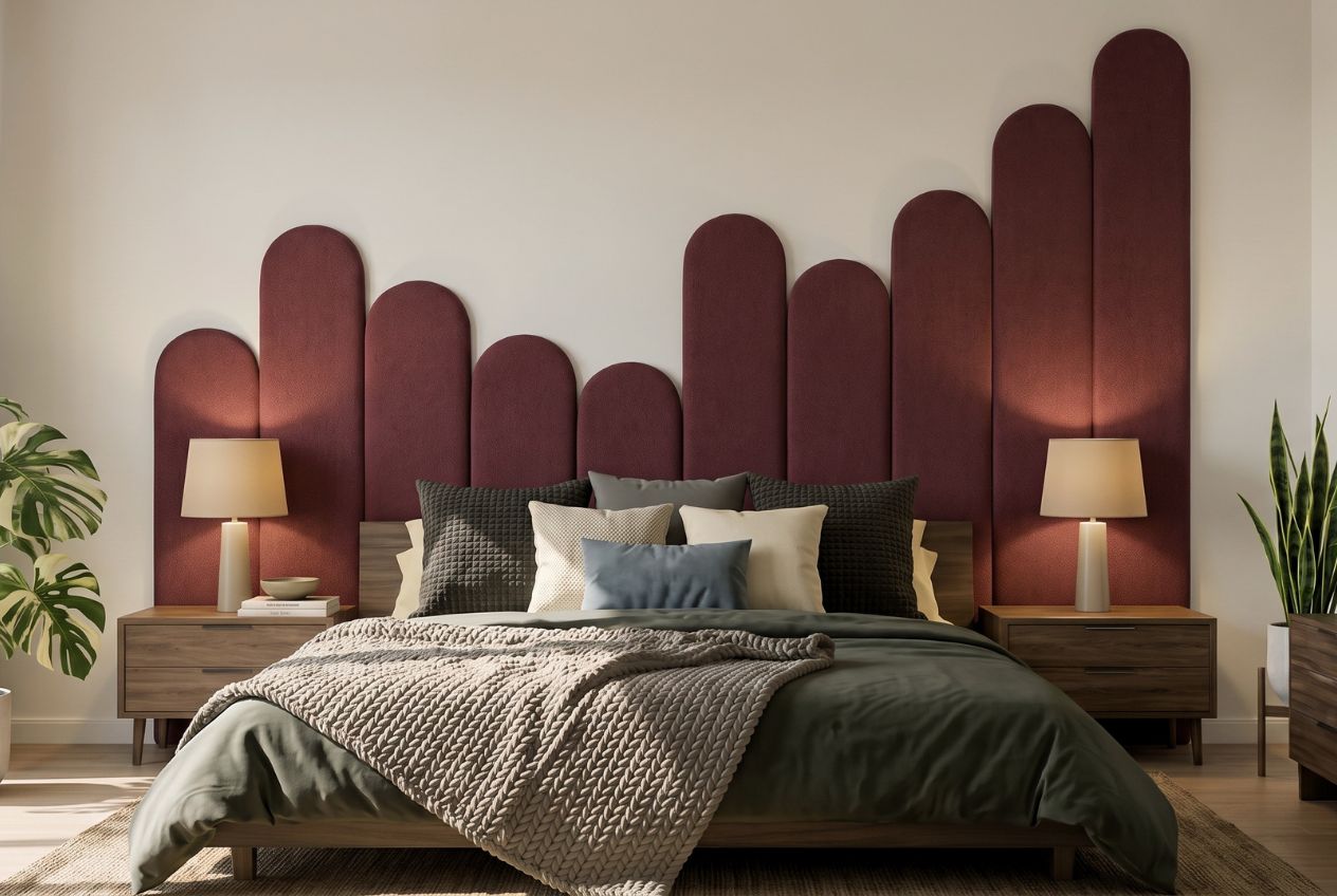
Explore our modern home decor NZ collection for pieces that bring genuine presence to contemporary New Zealand interiors. If you would rather begin with a broader picture of your space, our Mood Library offers curated mood boards to help you find your palette and style direction before you commit to a single purchase. And if you would like more personalised guidance, our team at Liftedplus is ready to help you personalise your space with colour and decor that reflects exactly how you want to feel at home.
FAQ
What is the 60-30-10 rule in interior design?
The 60-30-10 rule divides a room’s colour between a dominant shade at 60%, a secondary at 30%, and an accent at 10%. It creates visual balance and makes bold colour choices feel cohesive rather than chaotic.
Where should I start when adding colour to my home?
Begin in a small, low-stakes room such as a bathroom or laundry where repainting is simple and inexpensive. This lets you build confidence with colour before committing to larger, more visible spaces.
How does lighting affect paint and fabric colours?
Warm bulbs (2700K to 3000K) deepen rich tones and make colourful rooms feel inviting. Cool bulbs above 4000K can make the same colours appear flat or clinical, so matching bulb temperature to your palette matters significantly.
Can I use multiple bold colours in one room?
Yes, provided you align the intensity and saturation of each colour rather than just the hue. Matching the depth of colours across patterns and textiles creates harmony even when the specific shades are quite different from one another.
Should I choose a colour scheme before buying furniture?
Finalise your furniture layout first, then build your colour scheme around it. Buying accent pieces or rugs before the main furniture is in place is the most common source of decorating regret in living rooms.
Recommended
- Bright Room Ideas: Simple Ways To Lift Any Space
- How To Style A Colour Drenched Lounge – Lifted+ | More Colour. More Mood. More Life.
- How To Style Bold Interiors That Still Feel Calm – Lifted+ | More Colour. More Mood. More Life.
- Minimalist Home, But Make It Colour – Lifted+ | More Colour. More Mood. More Life.