
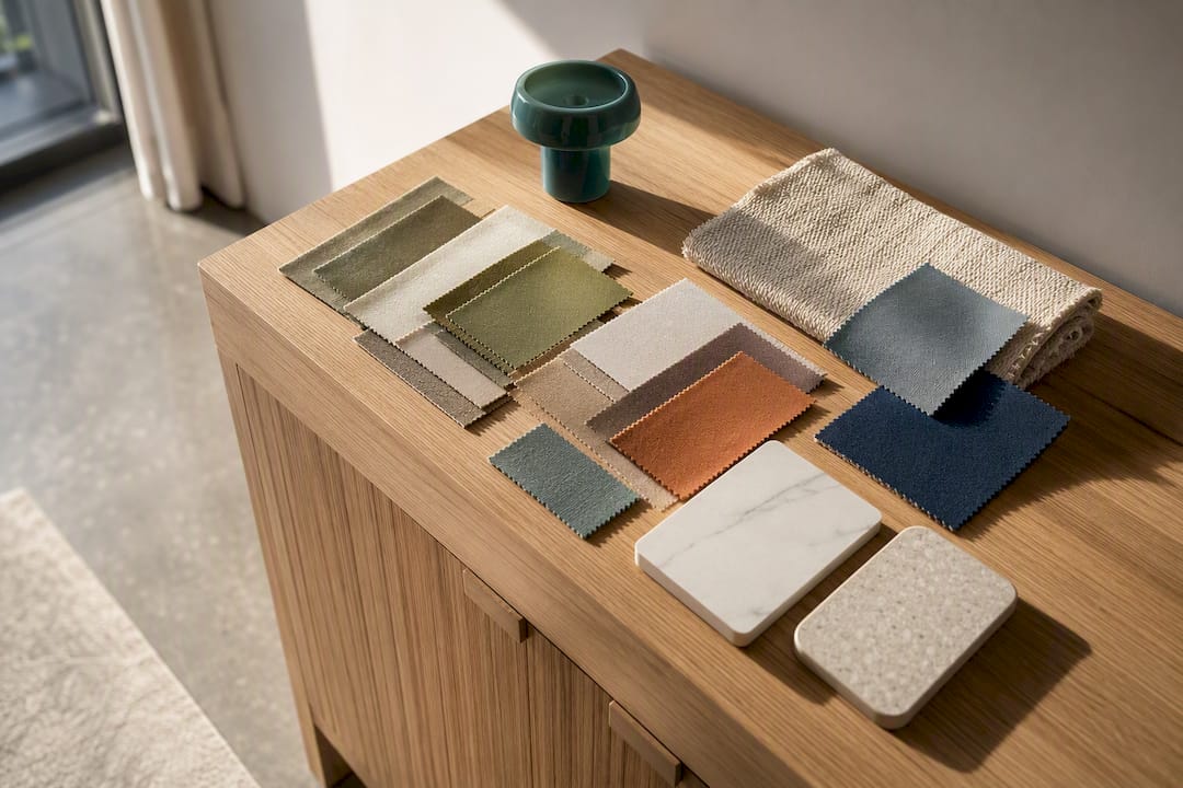
The fastest way into colour on a rental wall is to keep the wall itself neutral and let everything else carry the palette. Apply a simple 70/20/10 split through textiles, art and modular panels, and you get a considered, colourful room without touching a paintbrush. Three routes do most of the work: soft furnishings and art for instant mood, peel-and-stick surfaces for pattern, and modular wall panels like DwellForms™ for sculptural, anchor-level colour you can easily take with you.
TL;DR:
- Non-permanent decor methods like textiles, removable wallpaper, and adhesive panels allow renters to introduce colour without damaging walls or needing approval.
- The 70/20/10 rule guides effective colour distribution, with the dominant 70% in large, movable items and the accent 10% in small, swapping accessories.
- Testing colour samples in different lighting conditions over at least three days helps ensure long-term compatibility before purchase or installation.
- Most landlords focus on damage concerns rather than colour, making removable and adhesive options the safest choice for temporary decor updates.
- Coordinating new colours with existing furniture and undertones ensures a cohesive appearance, preventing clashes and awkward contrasts.
Table of Contents
- Renter-friendly colour palettes: eight combinations that don’t need a wall roller
- Renter-friendly methods to add colour without damaging walls
- How to choose colours that actually work in your rental
- A practical example: planning a DwellForms™ feature wall
- What your lease actually allows before you add colour
- Making a new palette sit naturally with what you already own
- Keeping colour consistent when nothing is fixed in place
- Building palettes for different rooms in the same rental
- Why following colour without commitment changes how a rental actually feels
- Getting started with your first renter-friendly feature wall
- Sources
- FAQ
Renter-friendly colour palettes: eight combinations that don’t need a wall roller
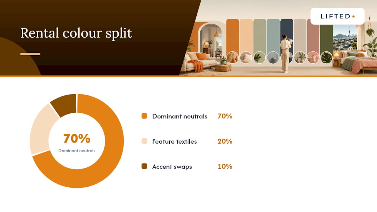
A palette only works if you can picture where each colour actually lands. The 70/20/10 split, a longstanding design shorthand, gives you a simple map: 70% dominant tone, 20% supporting colour, 10% accent punch. For renters, that dominant share should live in things you already own or can move easily, not in paint.
Here are eight combinations built specifically around non-permanent deployment.
- Terracotta, cream and forest green (warm and grounded). Cream stays as your existing wall colour. Terracotta comes in through a DwellForms™ panel arrangement as the anchor feature, forest green arrives via cushions and a throw, and a single botanical print pulls the accent together.
- Dusty blue, warm white and mustard (calm with a lift). Warm white is your base. Dusty blue rugs or curtains handle the secondary layer, and mustard appears in a lamp base or a stack of cushions for the accent hit.
- Charcoal, blush and brass (moody but soft). Blush textiles (bedding, an armchair throw) form the dominant layer against a light wall, charcoal panels anchor one feature area, and brass-toned lighting fixtures supply the accent glow.
- Sage, oatmeal and rust (earthy and current). Oatmeal linen curtains dominate, sage arrives through a modular panel cluster or a large-format print, and rust cushions or ceramics finish the accent.
- Navy, sand and coral (energetic coastal). Sand-toned furniture and rugs anchor the room, navy comes through art or a panel feature wall, and coral accessories (a vase, a cushion) spark the 10%.
- Olive, cream and burnt orange (autumnal and rich). Cream stays neutral on the walls, olive textiles and panels carry the mid-tone, and burnt orange throws or artwork close the loop.
- Lilac, warm grey and gold (soft glamour). Warm grey bedding or upholstery dominates, lilac appears in a panel feature or curtains, and gold accents (mirror frames, candle holders) provide sparkle.
- Teal, ivory and copper (bold but balanced). Ivory remains your base, teal panels or a bold rug carry the secondary weight, and copper lighting or homewares deliver the accent.
Light direction changes how these read in real rooms. North-facing rooms in the Southern Hemisphere tend to run cooler and can wash out muted tones, so warmer neutrals in the dominant 70% help. South-facing rooms get gentler, more even light and can handle cooler, more muted combinations without feeling clinical.
Pro Tip: Photograph your chosen swatch or fabric sample at midday and again in the evening. If the colour still reads true under both lighting conditions, it will hold up once it’s on your wall or furniture.
Renter-friendly methods to add colour without damaging walls
Every method below avoids drilling, painting or anything that jeopardises a bond.
- Removable wallpaper and decals work well for pattern and colour in one hit. Test a small patch on your actual wall surface first, since some rental paints react differently to adhesive, and peel back slowly during removal to avoid pulling paint with it.
- Textiles do more heavy lifting than most renters realise. Curtains, rugs, slipcovers and bedding can set an entire palette and shift it seasonally with zero commitment. Resene’s own guidance for renters points to exactly this: use furnishings as the colour story when painting isn’t an option.
- Wall art and picture-rail hanging should follow simple sizing rules, generally two thirds the width of the furniture below it, and rely on quality command strips rated for the frame’s weight rather than nails.
- Modular wall panels, the DwellForms™ approach, use adhesive pads rated for interior walls instead of screws or construction adhesive, so panels go up, come down and rearrange without wall damage. Their colour blocking without paint covers layout options if you want a feature area rather than a full wall.
- Lighting, plants and window treatments round out a palette cheaply. Warm-toned bulbs lift cool colour schemes, while sheer curtains soften harsh light in north-facing rooms.
If you’re determined to try colour directly on glass, temporary window paints and simple DIY washable mixes exist for short-term decorative use, though they need testing on a small corner first and careful cleanup to avoid residue.
How to choose colours that actually work in your rental
Start with 70/20/10, then adapt it to what you can realistically change. The 70% dominant share should sit in large, neutral items you already own or that came with the property, curtains, a rug, a sofa. The 20% goes into a mid-sized non-permanent feature, a panel cluster or a bold textile. The 10% accent lives in small, swappable pieces like cushions or ceramics.
Light Reflectance Value, or LRV, measures how much light a colour bounces back. Rental guidance generally favours mid-to-high LRV neutrals, typically in the 75 to 90 range, for keeping smaller or darker rooms feeling open. You can approximate this at home by holding a swatch or fabric sample against your wall and checking how much it lightens or darkens the room across the day.
Undertones matter more than the pure hue. A “white” curtain with a yellow undertone will clash with cool grey floorboards, while a warm-toned rug will sit awkwardly against blue-grey tiles. Rental-focused paint guides consistently point to warm undertones for broad appeal, and that principle carries over to textiles and panels too.
- Pull a swatch, fabric sample or colour card in your shortlisted tone.
- Test it against cardboard or a temporary panel section, propped where the feature will actually sit.
- Live with it for three days minimum, checking morning and evening light before you commit to a full order.
Pro Tip: Don’t judge a colour under a single lightbulb at 8pm. Rooms change character completely between breakfast light and lamp light, and three days catches both.
A practical example: planning a DwellForms™ feature wall
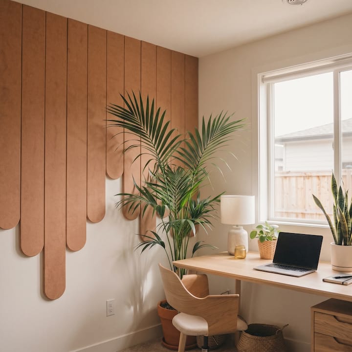
They suit renters who want a genuine feature wall, not a poster, without any drilling or wall damage risk.
A simple recipe: pick one of the eight palettes above, choose a DwellForms™ kit in the dominant or secondary tone, then plan placement around a single focal point, behind a bed, above a console, or along a hallway run. Before committing to a full kit, order a colour sample to check it against your actual wall and lighting.
- Confirm the wall surface is clean, dry and free of loose paint or wallpaper.
- Test the sample kit’s adhesive pad on an inconspicuous patch for 24 hours.
- Photograph the layout in daylight and evening light before finalising the full order.
- When you move, panels lift off cleanly and travel with you to the next rental.
Full installation and care details sit in Lifted+’s guide to damage-free wall panels, and if you want to trial colour placement first, there’s a dedicated method for testing wall panel colours over three days before you buy.
What your lease actually allows before you add colour
Most residential tenancy agreements in New Zealand restrict structural changes and anything that alters the property permanently, but they rarely say much about textiles, art or adhesive-based decor. The safest approach is to check your specific agreement’s wording on wall treatments and, where it’s ambiguous, ask your property manager directly rather than assume.
Landlords are typically far less concerned with colour itself than with damage. A vivid palette delivered through curtains, cushions and adhesive panels raises none of the usual flags that paint or wallpaper does, because nothing is bonded to plaster or paint film. That’s worth mentioning if you’re seeking written approval: frame the request around removability, not aesthetics.
Adhesive pads rated for interior walls generally lift cleanly from painted plasterboard, but wall condition varies between properties, older paint jobs, textured finishes and damp-prone rooms all behave differently. Testing a small patch before committing an entire kit protects both your bond and your weekend. If your lease requires written landlord sign off for any wall additions, keep that approval on file alongside photos of the wall’s condition before and after installation.
None of this guarantees a damage-free outcome on every wall type, which is exactly why the testing step matters more than the palette choice itself.
Making a new palette sit naturally with what you already own
The quickest way to make a colour scheme look intentional rather than accidental is to pull it from what’s already in the room. Walk through and note the undertones in your flooring, your largest piece of furniture and any fixed fittings like a kitchen splashback. Your new palette’s dominant tone should sit comfortably alongside those, not fight them.
If your sofa runs warm grey, a cool-toned teal accent wall will read as jarring no matter how well it’s styled. Choose the secondary and accent colours from the same temperature family as your biggest existing piece, and the whole room reads as considered.
Repetition across at least three surfaces helps a lot. If mustard is your accent, let it show up in a cushion, a small vase and a piece of art, rather than a single lonely cushion doing all the work. This is the same three-colour discipline that keeps interior schemes from feeling scattered: pick your dominant, secondary and accent, then repeat each across multiple items rather than introducing a fourth or fifth tone halfway through.
Existing furniture you can’t change, a landlord’s beige carpet, inherited curtains, becomes the fixed point you build around rather than the thing you’re trying to disguise. Once you treat it as a starting colour rather than an obstacle, palette decisions get considerably easier.
Keeping colour consistent when nothing is fixed in place
Non-permanent decor has one real weakness: colour can drift over time as you add pieces individually. A cushion bought in September and a throw bought in December might both be called “terracotta” and still clash under the same lamp.
Buying textiles and accessories with a physical swatch or sample from your original palette source in hand solves most of this. If you started with a DwellForms™ panel colour, keep a paint chip or fabric offcut from that palette and take it shopping, rather than relying on memory or a phone screen, which renders colour inconsistently between devices.
It also helps to lock in your undertone family early and stay there. A warm palette drifting toward a cooler grey-blue over a few purchases is one of the most common ways renter rooms end up feeling disjointed rather than deliberate. Reassess the whole room every few months rather than adding one piece at a time without checking it against everything else.
Building palettes for different rooms in the same rental
A living room can carry more contrast than a bedroom because it’s a space for energy and conversation. The eight palettes above with navy, teal or charcoal in the secondary position tend to suit living areas well, especially where a DwellForms™ panel feature can anchor one wall while furniture stays neutral.
Bedrooms benefit from calmer combinations, dusty blue, sage or warm grey work harder here than anything high contrast, since the goal is a room that reads as restful at 11pm and gentle at 7am. Keep accent colours muted rather than bold in a bedroom, and consider palette ideas suited to children’s rooms if you’re decorating a shared family rental, since calming tones matter even more for younger sleepers.
Kitchens and hallways can take bolder accents because they’re transitional spaces rather than places you linger for hours. A mustard or burnt orange accent that would feel busy in a bedroom often works well on a kitchen shelf or hallway console. Match the room’s function to the palette’s energy level, rather than applying one scheme uniformly through the whole rental.
Why following colour without commitment changes how a rental actually feels
Permanent decor decisions carry a weight that renters rarely get to set down. Every paint choice in an owned home is also a bet on resale value or a future buyer’s taste, but a rental removes that bet entirely, and I think that’s freeing rather than limiting. Colour you can undo is colour you’re more likely to actually try.
The trade off is real: permanence gives you certainty, flexibility gives you options. Most renters I’d point toward a bold palette have talked themselves out of colour for years because painting felt like too much risk for too little payoff at inspection time. Swap that for a removable panel or a considered textile layer, and the decision gets a lot smaller. A palette you can pack into a box on moving day is still a palette worth having.
— Michelle
Getting started with your first renter-friendly feature wall
If you’ve settled on a palette, the smallest realistic first project is a single focal band, a headboard-height panel arrangement behind your bed, a colour block in the living room, or a run of shapes down a hallway. Each uses one DwellForms™ kit and takes an afternoon, not a weekend.
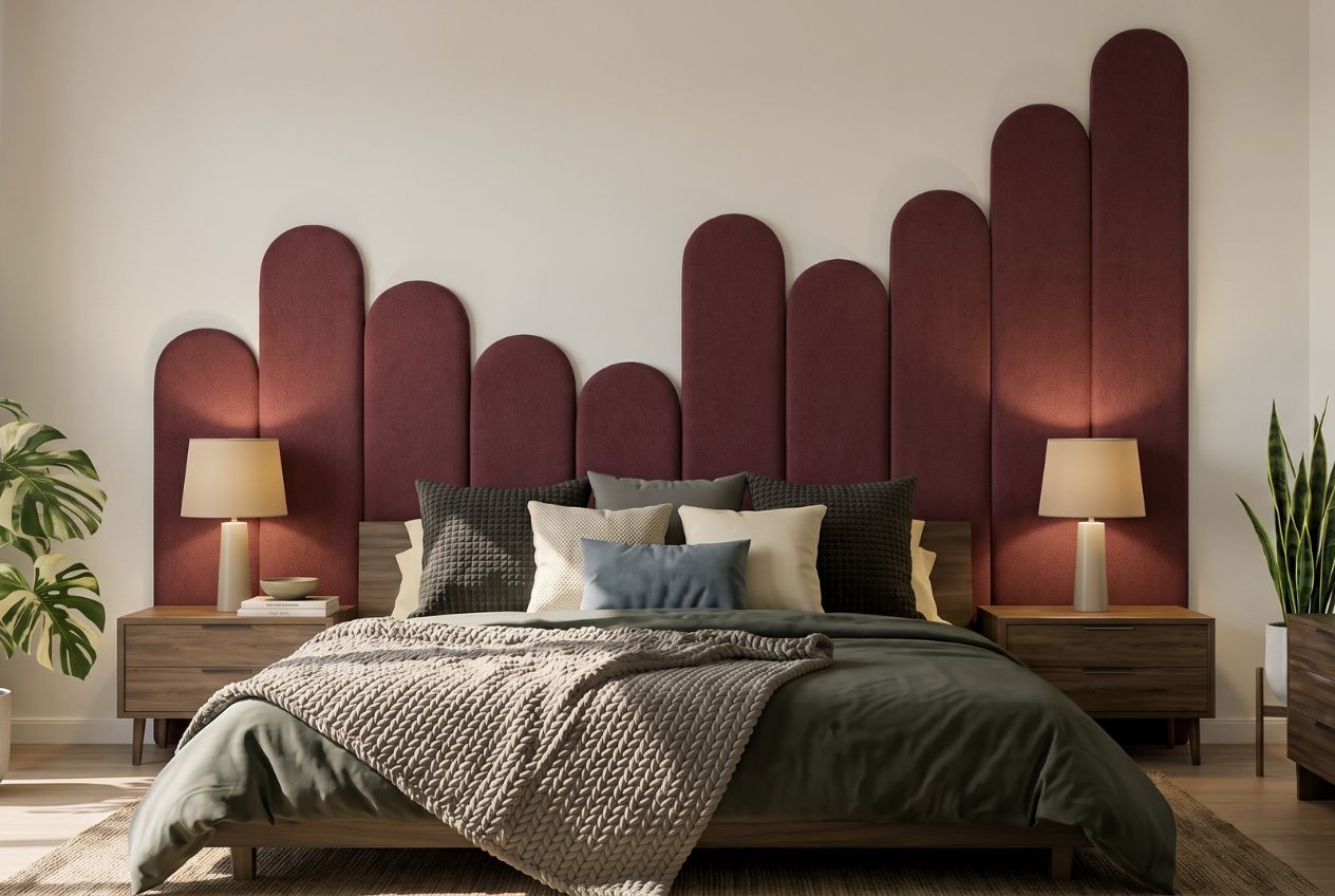
Liftedplus is the practical alternative to painting or wallpapering a rental: DwellForms™ panels install with tested adhesive pads, no drilling, no paint, no landlord negotiation over a colour you might have to strip back later. Order a sample kit first and test it against your wall and lighting for a few days before committing to a full layout. If you want to compare kit shapes before deciding, the Skyline modular panels suit a bold anchor feature, while the Linear Feature Kit works better for a narrower, architectural band. Either way, the panels travel with you when the lease ends.
Sources
For readers who want to go deeper on the specifics touched on above:
FAQ
What colour is replacing grey in trend forecasts?
Warmer neutrals, think warm greige, terracotta-adjacent tones and soft olive, are showing up more often as alternatives to flat cool grey in current interior trend coverage, though grey hasn’t disappeared entirely.
What are some renter-friendly paint colours?
Since renters generally can’t repaint, the better question is which neutral base suits most rentals as-is: mid-to-high LRV warm whites and soft greiges tend to work with the widest range of non-permanent colour layers.
What is the three-colour rule in interior design?
It’s the practice of limiting a room to three main colours, a dominant, a secondary and an accent, and repeating each across multiple items so the scheme reads as intentional rather than scattered.
Do I need landlord approval to add colour with removable panels?
Most tenancy agreements focus on structural or permanent changes rather than removable, adhesive-based decor, but checking your specific lease and confirming with your property manager before installing anything is the safer approach.