
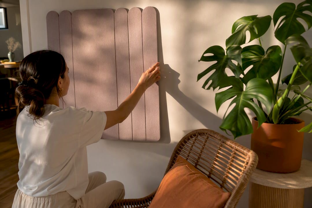
Choose neutrals when you want a wall to recede, mid-tone wood when you want it to anchor the room, deep jewel tones when you want drama, and muted pastels when you want calm without going bland. Lighting, flooring and furniture all shift how a colour actually reads once it’s on a panel, which is why testing samples matters more than trusting a paint chip. If you rent or simply don’t want to commit, DwellForms™ by Liftedplus gives you a no-drill way to trial any of these directions before you buy in.
TL;DR:
- Testing samples in actual room lighting and against your flooring helps ensure color choices meet expectations before full installation.
- Neutral tones are suitable for small or low-light rooms, while jewel tones are best as dramatic accents on a single wall.
- Narrow, fine fluting with matte finishes enhances subtle shadows, making muted colors appear more intentional and textured.
- Removable adhesive panels like DwellForms™ allow renters to experiment with bold colors without permanent wall modifications or damage.
- Color selection varies by room, with moisture-resistant finishes and proper lighting tests essential for areas like kitchens and bathrooms.
Table of Contents
- Best wall panel colours and when to use each
- Wall panel colour ideas by room
- Choosing the right colour for your space
- How material and finish change the way colour reads
- Wall panel trends shaping 2026 colour choices
- Colour recipes worth copying
- DwellForms™: try bold colour before you commit to it
- Why I think colour confidence starts with removable panels
- Getting started with DwellForms™
- Sources
- FAQ
Best wall panel colours and when to use each
Every colour direction does a different job on a panelled wall, and the wrong pick usually comes down to mismatching the colour’s job with the room’s problem.
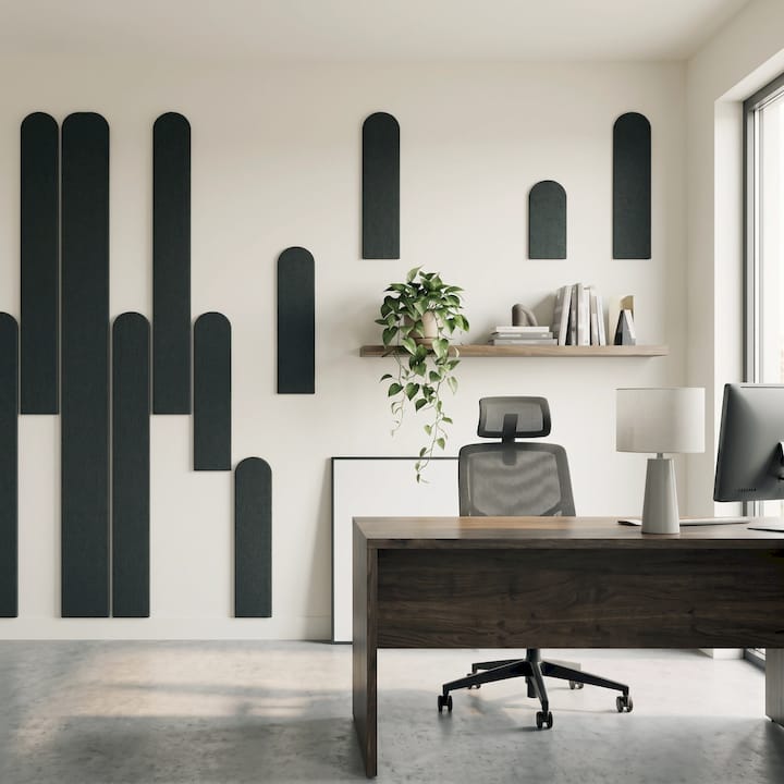
Neutral and warm neutral tones work best when a panel needs to disappear into the architecture rather than compete with it. Think oatmeal, warm greige, or soft putty. These suit smaller rooms, rentals with limited natural light, or any wall where you want texture and shadow play from the fluting itself to do the visual work, not the colour.
Warm wood tones have made a genuine comeback, with designers favouring mid-tone oak and walnut finishes as room anchors rather than wall-to-wall timber. The current advice is to use wood as a single feature wall or a small “special place” zone rather than covering every surface, which keeps the warmth from tipping into a cabin-like heaviness.
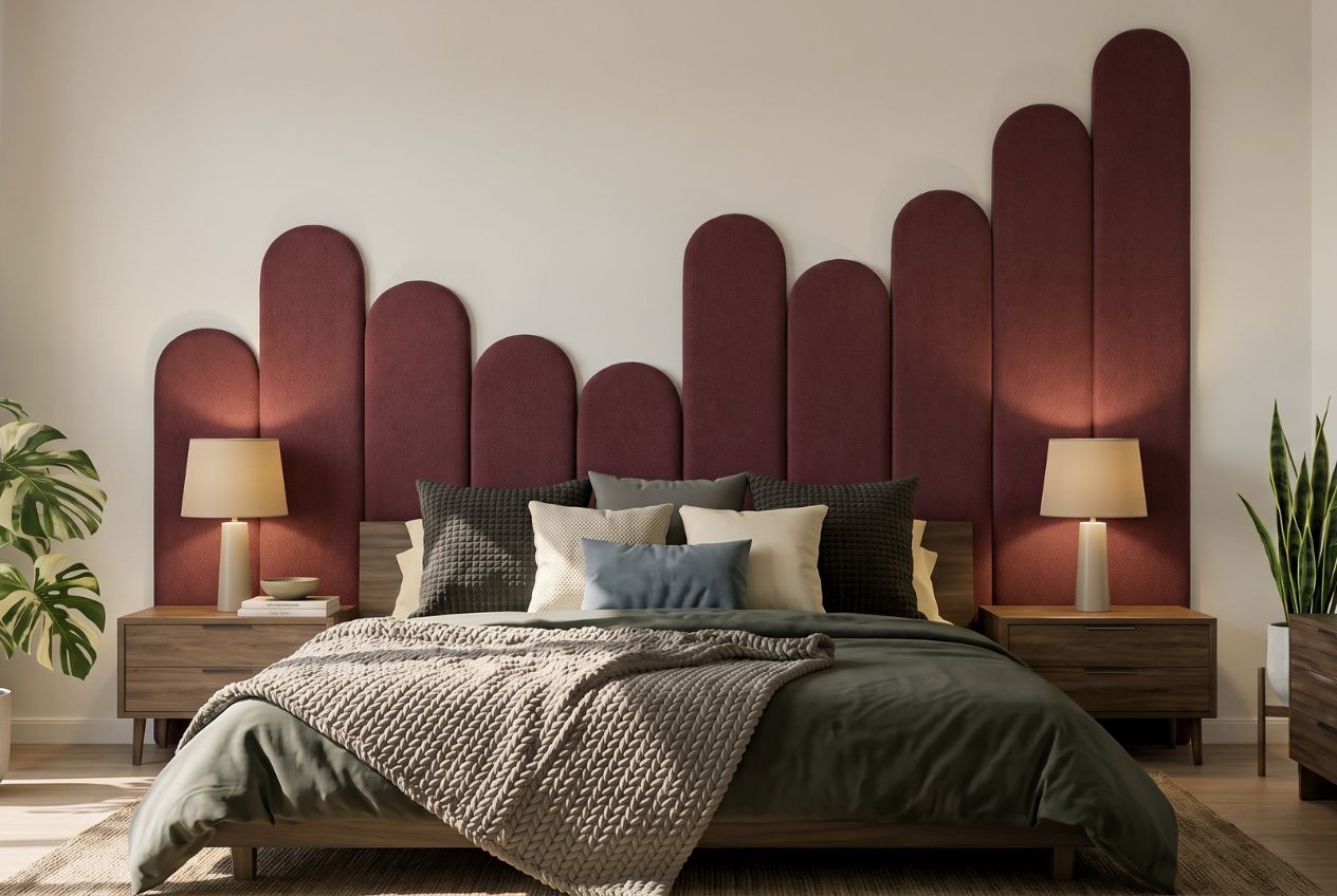
Deep jewel tones including emerald, ink navy and burgundy suit a single accent wall behind a bed, sofa, or dining table. They read as dramatic in the right dose but can swallow a small room whole if used on all four walls, so the rule of thumb is one wall, strong lighting, and enough negative space elsewhere to let the eye rest.
Muted pastels with grey undertones are quietly becoming the modern neutral. Dusty rose, faded sage and soft lilac behave more like sophisticated backdrops than nursery colours when the grey undertone is strong enough, letting you add colour without it feeling childish or fleeting.
Black and high-contrast panels work when there’s enough natural light and texture to stop the wall from feeling like a void. Fine fluting helps here because narrow grooves catch shadow at every angle, giving black depth instead of flatness.
- Neutral tones are well suited for small rooms, rentals, and spaces with low natural light
- Warm wood tones are best applied as a feature wall or in small, cozy zones such as reading nooks
- Jewel tones are best reserved for single dramatic accent walls
- Muted pastels work well for creating calm, adult-friendly colour schemes
- Black or high-contrast panels are best suited to spaces where light and texture are prominent
Specification data across residential projects still shows neutral palettes dominating most installs as reported in non-primary industry sources, with bold and biophilic colours reserved for feature moments rather than whole-room treatments.
Wall panel colour ideas by room
Colour choice changes once you think room by room, because light, moisture and how a space gets used all pull in different directions.
- Living room: A warm wood or muted terracotta panel wall behind the sofa pairs naturally with a bouclé sofa in oatmeal or clay, plus a rug with rust or olive threads. If you’re building a media wall, a deep charcoal or ink navy panel makes the television disappear into the wall rather than sitting on top of it.
- Bedroom: Cocooning schemes work best here. Dusty rose, soft sage or a warm greige on the wall behind the bedhead lowers visual stimulation before sleep, and pairs well with linen bedding in a lighter tone from the same colour family.
- Kitchen: Brightness and practicality matter more than mood here. Soft white, pale sage or warm putty tones suit splashback zones, and a wipeable, moisture-tolerant finish matters more in this room than almost any other.
- Hallway and entry: These get knocked, bumped and scuffed constantly, so mid-tone colours hide marks better than white or black. Colour blocking a lower third in a bold hue with a neutral above adds impact without needing to commit the whole wall.
- Home office: Muted blues and soft greens have the strongest evidence behind them for supporting focus and calm, while a single warm wood panel behind a desk can add enough texture to stop a home office feeling clinical.
A New Zealand-focused idea gallery shows several of these room applications already in use locally, which is a useful gut check if you’re wondering whether a colour direction will suit the light and building style of a typical Kiwi home.
Choosing the right colour for your space
The single biggest mistake people make with wall panel colour is choosing it under shop lighting or from a phone screen, then wondering why it looks completely different at home.
Light direction changes everything. A north-facing room (in the southern hemisphere, that’s your sunniest wall) will warm up a cool grey panel, while a south-facing room can make the same grey feel flat and cold. Bulb temperature matters just as much: warm 2700K bulbs push mid-tone woods and pastels toward amber, while cooler 4000K bulbs keep blues and greens looking true. Testing swatches across different times of day before committing avoids most of the regret.
Flooring should usually contrast, not match. A panel colour too close to the floor tone can make a room feel heavy and low-ceilinged, particularly with darker timber floors. A lighter or more muted panel colour against a dark floor keeps the eye moving and the room feeling taller.
Groove direction plays with scale. Vertical fluting draws the eye upward and can make a low ceiling feel higher, while horizontal grooves widen a narrow wall. Either effect gets stronger or weaker depending on how much contrast the chosen colour creates with the groove shadow.
- Test a sample under morning light, afternoon light and lamp light before deciding
- Hold swatches against your actual flooring, not a photo of it
- Check groove direction against the wall’s proportions, not just the colour
- If renting, always confirm adhesive-based options are appropriate for the wall surface first
Pro Tip: Order a colour sample kit before buying a full panel run, and stick it to the wall for at least three days. Colours that look perfect on day one sometimes read differently once your eyes adjust to the room’s actual light.
For renters specifically, this is where sample testing gets easier rather than harder. Adhesive-mounted panels let you trial a colour on the actual wall, in the actual light, without a drill or a landlord conversation.
How material and finish change the way colour reads
The same colour name can look completely different depending on what it’s applied to, and this is where a lot of people get caught out mid-renovation.
Painted timber or MDF panels give you the most colour flexibility, but sheen matters as much as hue. Testing finish sheen alongside the colour itself is worth doing because matte finishes soften fine fluting while satin sheens catch more shadow and make grooves look deeper.
Solid wood and veneers bring warm undertones that shift with age, light exposure and even humidity, so what looks honey-toned on installation day can deepen toward amber within a year or two.
Stone-effect and 3D relief panels rely on texture and shadow more than pigment, meaning the same grey can look moody in one light and washed out in another depending on how deep the relief is cut.
Textile and PET felt panels hold saturated colour with a soft, tactile depth that painted surfaces can’t quite replicate, and because these are typically installed with adhesive rather than screws, they suit renters who want strong colour without any wall damage.
- Painted MDF: flexible colour, watch sheen and profile depth
- Solid wood: warm and ages over time, needs periodic care
- Stone-effect 3D panels: colour reads through texture and shadow
- PET felt (removable): saturated colour, soft tactile finish, adhesive install
Standard MDF and painted panels also don’t love humidity, so bathrooms and steamy kitchens need moisture-appropriate finishes rather than a straight paint job.
Wall panel trends shaping 2026 colour choices
Trend reporting into 2026 points toward warm earthy neutrals, muted pastels and deep jewel tones taking over from the cooler greige palettes that dominated the last several years.
Biophilic greens are showing up more in wellness-focused bedrooms and home offices, echoing the same neutral-dominant but bold-curious pattern seen across hospitality and creative fitouts, where a single colourful feature wall does the heavy lifting.
Fine, narrow fluting is currently more popular than the wider, bolder grooves that were popular a few years back, based on recent non-primary sources. Narrower flutes change how colour reads because matte finishes on tight grooves catch subtler shadow lines than a bold, glossy wide flute ever could, which is part of why muted colours are having a moment: the texture is doing more of the visual work than the pigment.
- Warm woods and earthy neutrals are replacing cool grey schemes
- Biophilic greens and muted pastels are gaining ground in bedrooms and offices
- Deep jewel tones are showing up as hospitality-style anchor walls in homes
- Tonal layering (close shades of the same colour family) is replacing high-contrast schemes
- Fine fluting is changing how saturated a colour needs to be to still look intentional
None of this means neutrals are going anywhere. It means the neutral palette itself is warming up, and the “safe” choice in 2026 looks noticeably different to the safe choice five years ago.
Colour recipes worth copying
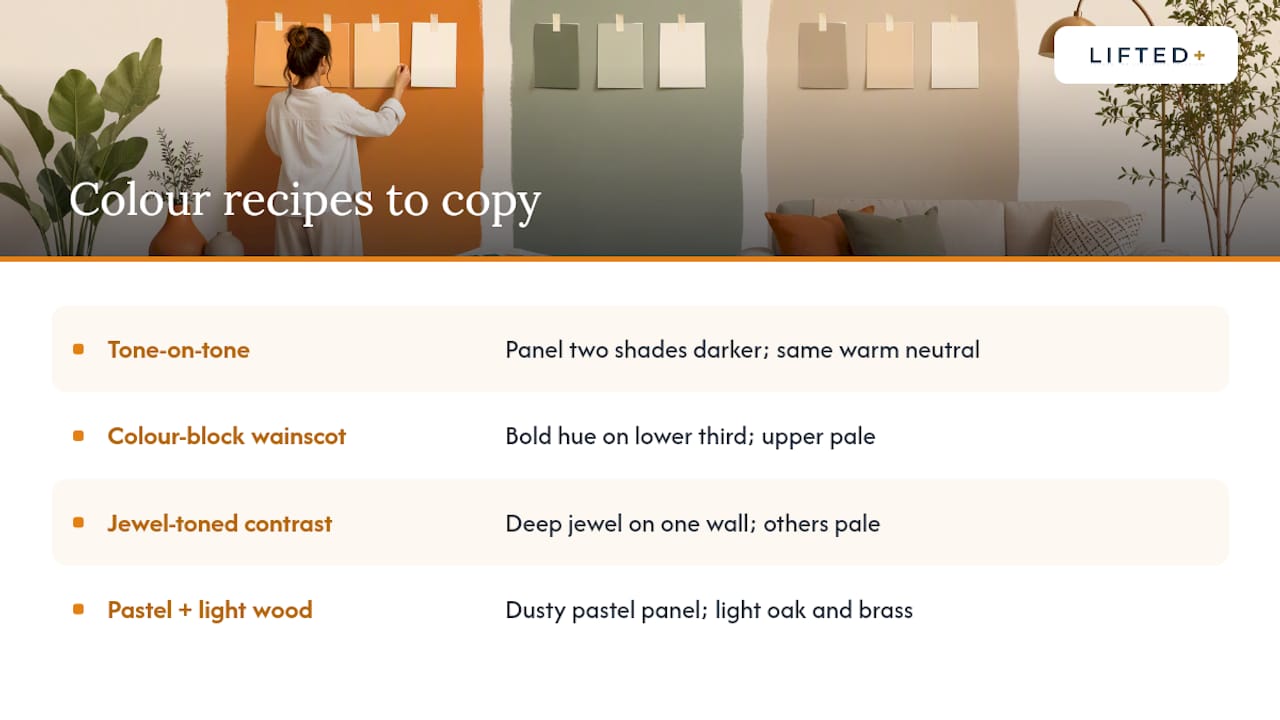
If you want a shortcut past the theory, these four combinations cover most rooms and most confidence levels.
Tone-on-tone living room: Choose a panel two shades darker than your wall paint, in the same warm neutral family, then add texture through cushions and a jute rug rather than colour contrast. This is the safest recipe for open-plan spaces where the wall needs to work with several furniture pieces at once.
Colour-block lower wainscot: Run a bold hue, terracotta or deep teal work well, across the lower third of the wall and keep the upper section white or pale. This gives drama without the commitment of a full-height bold wall, and suits renter-friendly colour blocking particularly well since it’s achievable without paint.
Jewel-toned contrast wall: Pick one wall, go deep (emerald, ink, burgundy), and keep every other surface pale and unfussy. The contrast is the whole point, so resist the urge to repeat the jewel tone anywhere else in the room.
Small-space pastel and light wood: Pair a dusty pastel panel with light oak furniture and brass or matte black fixtures. This combination reads as considered rather than sparse in apartments and studios where every wall has to earn its place.
DwellForms™: try bold colour before you commit to it
DwellForms™ by Liftedplus is built for exactly the hesitation most people feel before painting or panelling a wall: what if the colour is wrong?
- Sample kits let you test an actual colour and texture on your actual wall before ordering a full run
- Layout guides walk you through spacing and pattern options for different wall sizes
- Panels lift off cleanly when you move, so a rental doesn’t limit your options
- Colour without commitment means landlords with no-drill policies are rarely a dealbreaker
For renters juggling landlord restrictions, or homeowners who simply don’t want a six-month colour regret, this is a genuinely renter-friendly feature wall option rather than a scaled-down version of a permanent one.
Why I think colour confidence starts with removable panels
Most people don’t actually lack colour taste. They lack a low-risk way to test it, so they default to another beige wall and call it “timeless.” I’d argue that’s less about taste and more about the cost of being wrong with paint, which is time, mess and a weekend you don’t get back.
Removable, adhesive-based panels change that equation. A jewel-toned or pastel wall stops being a decision and becomes an experiment, which is exactly how colour confidence gets built. Order a sample, stick it up, live with it for a week, and adjust. That’s a far better teacher than any colour wheel.
— Michelle
Getting started with DwellForms™
Once you know the colour direction you’re leaning toward, the practical next step is trying it in real materials rather than guessing from a screen. The DwellForms™ Skyline modular kit suits readers after a full feature wall, while the Linear feature kit is built for a slat-style, directional look if you’re chasing that fine-fluting trend.
Sample kits are the sensible starting point if you’re still deciding between a warm wood, a jewel tone or a muted pastel, and any sample cost gets credited toward your full kit order if you go ahead. Layout templates included with each kit take the guesswork out of spacing and pattern, so you’re not measuring gaps by eye. If you’re renting and worried about landlord approval, this is about as low-risk as colour experimentation gets: no paint, no drilling, no permanent change to the wall underneath.
Order a sample set, hold it against your wall for a few days under your actual lighting, and decide from there.
Sources
Trend and colour claims throughout this guide draw on Good Housekeeping’s wood panelling analysis, Dulux’s panel colour guidance, and INTCO Decor’s 2026 trend report. For further styling ideas, see Liftedplus’s guide to decorative wall panels for homeowners and feature wall ideas without paint.
- Wood wall paneling design trend
- 13 stunning wall panelling ideas for New Zealand homes
- Wall panel design ideas | Dulux
- Spring 2026 interior design trends: wall panels reshaping modern spaces | INTCO Decor
- Acoustic wall panel colors: options, trends and selection guide
FAQ
What is the best colour for wall panelling?
There’s no single best colour. Warm neutrals suit small or low-light rooms, mid-tone wood anchors a feature wall, jewel tones add drama to one accent wall, and muted pastels give calm, adult-friendly colour without going bland.
What are the latest wall panel trends?
2026 trends favour warm earthy neutrals, muted pastels and deep jewel tones over cooler greys, alongside fine, narrow fluting that reads differently to the bolder wide grooves popular a few years ago.
Should panelling be lighter or darker than the wall?
Either works, but the effect changes: lighter panelling against darker surrounding walls opens up a small room, while a panel one or two shades darker than the wall paint creates a subtle tone-on-tone anchor without heaviness.
What are the best colours to paint panelling?
Warm neutrals, soft sage, dusty pastels and deep jewel tones all work well on painted panels, provided you test the sheen alongside the colour, since matte and satin finishes change how the grooves catch shadow.
Do I need to paint or drill to get a colourful panelled wall?
No. Removable options like DwellForms™ use adhesive-mounted PET felt panels, giving renters and homeowners a no-drill way to add saturated colour and texture without paint or permanent wall damage.