

TL;DR:
- Modern interiors can feel warm and purposeful when styled with layered lighting, curated decor, and appropriate color ratios.
- Following the 60/30/10 rule, measuring furniture correctly, and leaving negative space ensure balance and cohesion in a space.
- Patience, thoughtful layering, and intentional curation transform rooms from staged to truly livable, comfortable environments.
Modern interiors have a reputation they don’t entirely deserve. Done well, they feel calm, purposeful, and genuinely warm. Done carelessly, they read as cold showrooms that nobody actually lives in. If you’ve been trying to figure out how to style modern interiors without losing that sense of comfort and personality, you’re not alone. This guide walks you through the practical decisions that separate a polished modern space from a staged one: colour ratios, furniture scale, layered lighting, curated decor, and the common mistakes that quietly undermine even the best intentions.
Table of Contents
- Key takeaways
- How to style modern interiors: start with colour and space
- Layering lighting and textiles for depth
- Curating decor and artwork intentionally
- Common styling mistakes and how to fix them
- Knowing when your modern interior is working
- My honest take after years of styling modern spaces
- Bring your modern interior to life with Liftedplus
- FAQ
Key takeaways
| Point | Details |
|---|---|
| Colour ratios define cohesion | Follow the 60/30/10 rule for neutrals, secondary tones, and bold accents to hold a room together. |
| Furniture placement comes first | Map your largest anchor piece before choosing colours, rugs, or accessories. |
| Layered lighting creates warmth | A single ceiling fixture is never enough; add sconces and floor lamps to build perimeter depth. |
| Negative space is a design tool | Breathing room around furniture and art reads as intentional and considered, not empty. |
| Styling is iterative, not one-off | Rotate art and textiles seasonally to keep your modern interior feeling alive rather than frozen. |
How to style modern interiors: start with colour and space
Before you move a single piece of furniture, you need a clear plan for colour and proportion. This is where most styling attempts stall. People choose a paint colour they love, buy a sofa in a complementary tone, and then wonder why the room feels off. The issue is almost always structural, not aesthetic.
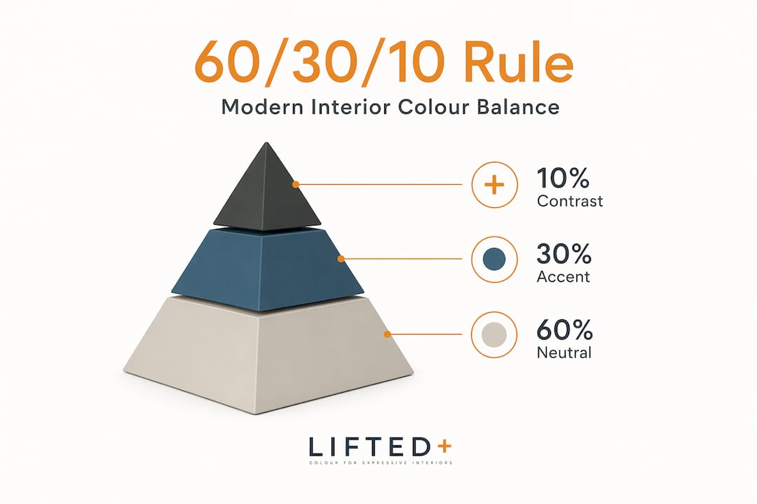
The most reliable framework for styling contemporary spaces is the 60/30/10 colour rule: 60% neutral base (walls, large upholstery, flooring), 30% secondary tone (curtains, secondary seating, cabinetry), and 10% bold accent (cushions, art, a single ceramic or vase). In 2026, those warm neutrals skew towards clay, warm white, and sand rather than cool grey, with accents landing in ochre, rust, deep sage, or terracotta.
| Colour layer | Proportion | 2026 examples |
|---|---|---|
| Dominant neutral | 60% | Warm white, clay, sand, linen |
| Secondary tone | 30% | Warm sage, taupe, dusty rose |
| Bold accent | 10% | Ochre, rust, deep terracotta |
Furniture scale is equally critical. A sofa that is too large or too small for its wall pulls the whole room out of balance. Your primary sofa should sit within two-thirds of the width of the wall it faces. In a typical living room with a 3.6 metre wall, that means a sofa no wider than around 2.4 metres. Anything larger crowds the room; anything smaller floats disconnectedly.
Open layouts benefit enormously from deliberate negative space in design. Leaving room for the eye to rest around a sculptural chair or a single artwork isn’t minimalism for its own sake. It’s what makes the room feel considered rather than stuffed.
Pro Tip: Map and measure your largest furniture anchor first. Once the sofa or bed is placed with correct clearances on all sides, the colour palette and every subsequent decision will feel far more natural.
Layering lighting and textiles for depth
This is where a modern interior either comes alive or stays flat. Layered lighting creates perimeter warmth and depth that no single overhead fixture can replicate, no matter how beautiful. Think of your central pendant or ceiling fixture as the room’s spine. Without supporting layers, it holds the space upright but doesn’t make it feel inhabited.
Here’s how to build a layered lighting scheme from scratch:
- Start with your ambient source. A pendant, semi-flush fitting, or recessed lighting handles the general illumination. Choose a bulb temperature between 2700K and 3000K for warmth without muddiness.
- Add sconces at wall level, flanking a mirror, fireplace, or reading nook. These push light toward the perimeter and give the room visual breadth.
- Place a floor lamp in a corner where natural light doesn’t reach. A linen or paper shade diffuses the glow softly rather than casting a direct beam.
- Add at least one table lamp on a sideboard, console, or bedside table. This creates intimacy at eye level when seated.
- Consider a small, architectural accent light, a picture light over art, or an LED strip under a floating shelf, to introduce subtle drama.
For guidance on which fittings work best in specific rooms, Liftedplus has a detailed lighting types guide covering modern New Zealand interiors specifically.
Textiles are the other half of this equation. Warm modernism pairs clean lines with tactile softness, and the textures you choose carry as much visual weight as your furniture. Floor-length linen drapery that pools slightly at the base adds height and softness simultaneously. A wool or jute rug grounds the seating zone and introduces organic texture underfoot. Bouclé cushions or a textured throw on a streamlined sofa soften the geometry without disrupting it.
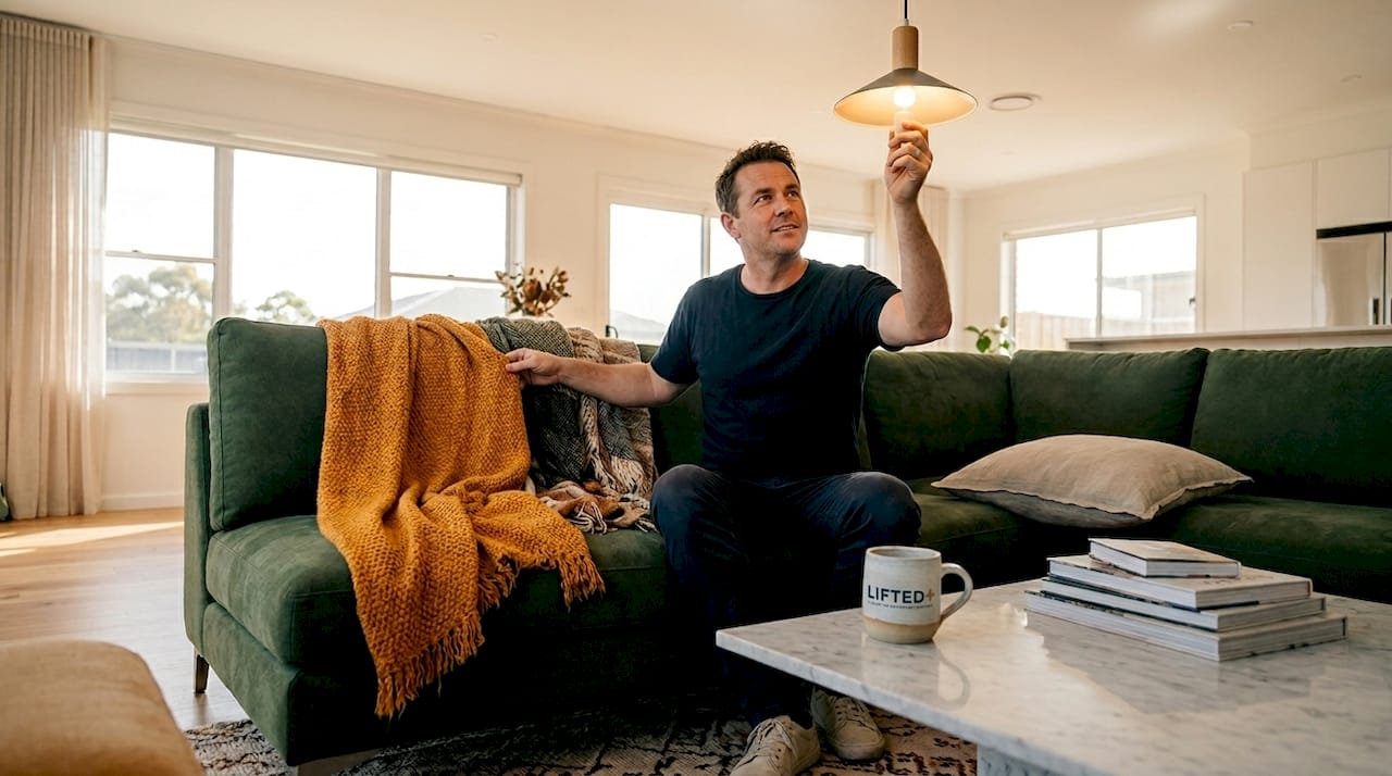
Pro Tip: Treat lighting and textiles as a pair, not separate decisions. When your lighting is warm and your textiles are tactile, even a very spare room feels lived in.
Curating decor and artwork intentionally
Accessories are where most modern interiors go wrong. Too many, and the clean lines you’ve worked to establish disappear under visual noise. Too few, and the room feels provisional. The skill is in deliberate curation. This is the art of choosing decor that allows the eye to rest between objects, grouping with intention rather than filling available surfaces.
The “rule of three” is the standard guidance for object grouping: cluster objects in odd numbers, vary their height, and mix textures. It works well, but it isn’t a law. A single sculptural vase, placed alone on a sideboard with space around it, reads as confident and intentional. A pair of objects on either side of a console can feel architectural. What breaking the rule creates is a sense of curation rather than decoration.
Artwork hanging height is one of those details that most people get wrong, even in otherwise well-styled rooms. The standard, museum-height placement positions the centre of the artwork 57 to 60 inches from the floor. When artwork hangs too high, it disconnects from the furniture below and the room loses its visual cohesion. When it hangs at the right height, it anchors the wall and ties the composition together.
One underrated move in modern decor ideas for living rooms: include a single vintage or clearly handmade piece among your contemporary objects. It’s the element that pulls a space out of the safe, polite middle and gives it soul. A found ceramic, an inherited print in a simple frame, or a hand-thrown bowl on a shelf, these are the details that make a room feel inhabited rather than assembled.
Common mistakes that quietly undermine your styling efforts include:
- Over-accessorising flat surfaces until no surface is visible
- Choosing a rug that is too small for the seating zone (all furniture legs should sit on, or at least front legs on, the rug)
- Buying a complete matching furniture suite, which reads as catalogue rather than curated
- Using artificial plants as a substitute for real texture and organic form
- Hanging artwork too high, disconnecting it from the room’s sightlines
For a practical guide on keeping surfaces styled without clutter, the Liftedplus resource on shelf styling techniques is worth bookmarking.
Common styling mistakes and how to fix them
Even when you understand the principles, certain patterns surface repeatedly in modern interiors that don’t quite land. The good news is that most of them have straightforward fixes.
The most frequent issue is overcrowding. Furniture pushed against every wall, objects covering every surface, and multiple competing focal points create visual noise rather than visual interest. The fix is applying a clear 70/30 visual balance: 70% of the room speaks one consistent visual language in texture, colour, and form, while 30% introduces contrast and personality. This ratio applies to patterns, furniture styles, and even the ratio of filled to empty surface space.
| Common mistake | The fix |
|---|---|
| All furniture against the walls | Float seating inward to create a defined conversation zone |
| Single overhead light source | Add sconces, a floor lamp, and at least one table lamp |
| Rug too small for the space | Size up: all front furniture legs should sit on the rug |
| Mixing too many competing styles | Anchor to one style family, then introduce one contrast element |
| Too many accessories, too quickly | Edit to what you genuinely love, then add slowly over time |
Lighting errors are also common. A single recessed light or a bare pendant leaves the room’s perimeter dark and the space feeling smaller than it is. Correcting this doesn’t require rewiring. A plug-in sconce or a well-placed floor lamp can shift the entire room’s atmosphere.
Pro Tip: Resist the urge to style a room in a single weekend. The most characterful modern interiors are built gradually, acquiring one considered piece at a time. This avoids the “showroom” effect that makes a space feel purchased rather than lived in.
Knowing when your modern interior is working
There are a few clear signs that a modern interior has been styled well. The room feels calm when you enter it, not because it’s empty, but because nothing is competing for your attention unnecessarily. You can move through the space without awkward clearances. The lighting shifts the mood appropriately at different times of day. The textiles invite touch. These are the hallmarks of a well-considered space.
A useful test: remove all your accessories temporarily and assess the “bones” of the room. Does the furniture arrangement still make sense? Does the colour palette hold? If the answer is yes, you have a strong foundation. If the room looks incomplete or oddly proportioned without accessories, the underlying layout or colour plan needs attention before you add objects back.
Signs your modern interior styling is on track:
- Visual calm on entry, no single element is shouting for attention
- Clear traffic flow with comfortable clearances between furniture pieces
- Lighting that responds to different activities and times of day
- A mix of textures that reward a closer look
- At least one element that feels genuinely personal, not just aesthetically correct
Maintaining a modern interior over time means treating it as a living space rather than a finished project. Rotate artwork seasonally. Layer in new textiles as the weather changes. Adjust your lighting setup as furniture moves or natural light shifts. A well-styled modern interior also supports cognitive ease, the kind of low-level calm that comes from a space that isn’t demanding anything from you visually. Keep it iterative and responsive to how you actually live.
My honest take after years of styling modern spaces
I’ve spent years working through these principles in real rooms, and the lesson that took longest to absorb was this: warmth and restraint are not opposites. For a long time, I thought modern interiors required stripping back until nothing remained. The rooms I styled that way felt correct but cold. Photogenic, but not liveable.
What actually changed things was layered lighting and tactile textiles. A bouclé throw, a linen curtain that grazed the floor, a warm floor lamp in the corner of a very spare room. These additions cost relatively little but transformed how a space felt after dark, which is when you actually live in it most.
I’m also sceptical of following the “rule of three” too rigidly. Some of the most striking rooms I’ve encountered used a single statement object on a surface and nothing else beside it. That kind of confidence, one thing, placed with care, held by space around it, is harder to achieve than a trio of objects. But when it works, it holds the room in a way that no formulaic grouping can.
The most accessible truth about modern interior styling is this: patience matters more than budget. One genuinely considered piece, added when you find it rather than bought to fill a gap, will always outlast a room full of things assembled in a hurry.
— Michelle
Bring your modern interior to life with Liftedplus
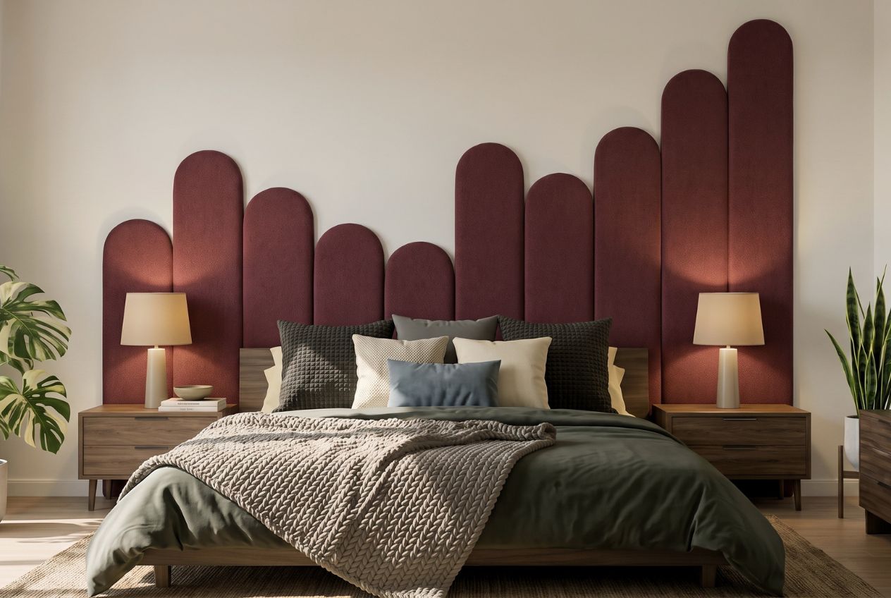
If you’re ready to move from planning to styling, Liftedplus has the pieces and the perspective to help. The Liftedplus Mood Library is a practical starting point for mapping your palette and testing how colours and textures sit together before you commit. From there, the modern home decor collection brings together statement art, sculptural lighting, and curated textiles that reflect 2026’s grounded, warmth-forward aesthetic. Every piece is selected for form and presence, not trend-chasing. If you want to understand how individual decor pieces shift the mood of a space, the guide on how decor personalises your space is worth reading alongside this one.
FAQ
What is the 60/30/10 rule in modern interior design?
The 60/30/10 rule divides your room’s colour into three proportions: 60% dominant neutral, 30% secondary tone, and 10% bold accent. It creates a cohesive colour structure without making the space feel flat or overly matchy.
How do you add warmth to a modern interior without clutter?
Layer tactile textiles like wool rugs, linen curtains, and bouclé cushions alongside warm-toned lighting between 2700K and 3000K. These elements add sensory warmth and visual softness without introducing excess objects or visual noise.
What height should artwork be hung in a modern interior?
The centre of a piece of artwork should sit 57 to 60 inches from the floor. This museum-standard height keeps artwork connected to the furniture below and maintains visual cohesion across the room.
How do you choose modern furniture that fits the space properly?
Measure the wall your primary piece will face first, then select a sofa or bed that occupies no more than two-thirds of that width. This single guideline prevents the most common furniture scale errors in modern home decorating.
What are the most common mistakes when styling a modern interior?
The most frequent mistakes include choosing a rug that is too small, over-accessorising flat surfaces, using a single light source, and buying a matching furniture suite. Applying the 70/30 visual balance principle across texture, colour, and form resolves most of these issues.