
TL;DR:
- Colourful wall art adds personality and energy to rooms through strategic color, scale, and material choices.
- Choosing the right size and placement ensures the art makes a lasting visual impact in modern interiors.
Colourful wall art is vibrant artwork that adds personality, energy, and depth to your living spaces through carefully chosen colours, scale, and style. Whether you are drawn to bold abstract canvases, botanical prints, or limited-edition gallery pieces, the right work on the right wall pulls a room out of the safe, polite middle and gives it genuine presence. Think colourful canvas prints, oversized decorative wall paintings, or a curated cluster of bright art for walls that tells a story about who lives there. Choosing well means understanding materials, scale, and colour strategy before you ever pick up a hammer.
1. What types of colourful wall art suit modern interiors?
Canvas prints are the most practical choice for Australian homes. Their matte finish handles bright natural light without glare, and the colour vibrancy holds over time without the reflective distraction of glass-framed prints. For rooms that receive strong afternoon sun, canvas is the clear front-runner.
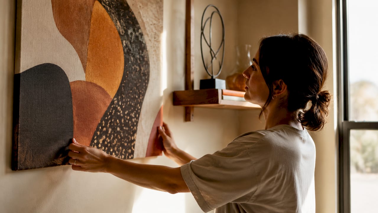
Peel-and-stick murals offer a different kind of freedom. Vinyl suits smooth surfaces with high colour vibrancy, while non-woven paper works better on lightly textured walls and is a friendlier option in children’s rooms. Polyester fabric murals are durable but deliver a matte, softer finish that suits relaxed, earthy interiors.
Framed prints and gallery-wrapped canvases each carry a different visual weight. Framed works feel considered and deliberate, while gallery wraps feel contemporary and uncluttered. Mixing frame styles adds character to a space; consistent frame finishes bring calm and cohesion. The choice depends on whether you want the room to feel curated or collected.
Pro Tip: If you are unsure between a glossy and matte finish, choose matte. Glossy prints create distracting reflections in rooms with multiple light sources, and the effect worsens at night.
The finish you choose shapes how the art reads from across the room. Textured surfaces catch light and create depth. Flat, smooth prints recede slightly and let the image carry the full weight. Neither is wrong, but each serves a different spatial intention.
2. How do you choose the right size and placement?
Size is the single most common mistake in decorating with vibrant wall decorations. Art that is too small for its wall looks lost, and no amount of colour or quality rescues it. The correct sizing rule is for art to span 50–75% of the furniture width below it, and to occupy 60–75% of the available wall space.
Height matters as much as width. Art should hang centred at 145–150 cm from the floor, which places the visual centre of the piece at eye level for most adults. When hanging above a sofa or console, leave a 15–25 cm gap between the top of the furniture and the bottom of the frame.
| Scenario | Recommended size |
|---|---|
| Above a 2-metre sofa | 100–150 cm wide artwork |
| Narrow hallway wall | Vertical format, 40–60 cm wide |
| Large open-plan feature wall | Oversized single piece or gallery cluster |
| Above a bedhead | 60–80% of bedhead width |
| Small bathroom wall | 30–50 cm, one focused piece |
If you are torn between two sizes, size up. Undersized art consistently disappoints in real rooms, even when it looks proportionate in a product photo. The room absorbs scale faster than you expect.
Pro Tip: Cut a piece of kraft paper to your intended art size and tape it to the wall before buying. Live with it for two days. You will immediately know if it is the right scale.
Horizontal works visually widen a room. Vertical works add perceived height. This is a simple tool that pulls subtle tones and shapes from the room’s architecture and makes the art feel intentional rather than incidental.
3. Which colour strategies work best in modern spaces?
Colour in art does one of two things in a room. It either integrates with what is already there, or it contrasts to create a focal point. Both are valid. The key is choosing one approach and committing to it.
The integration approach works by pulling accent colours from existing room elements: cushions, rugs, upholstery, or cabinetry. If your sofa has terracotta cushions, a canvas with warm ochre and rust tones will feel like it belongs. The art does not match the room; it resonates with it.
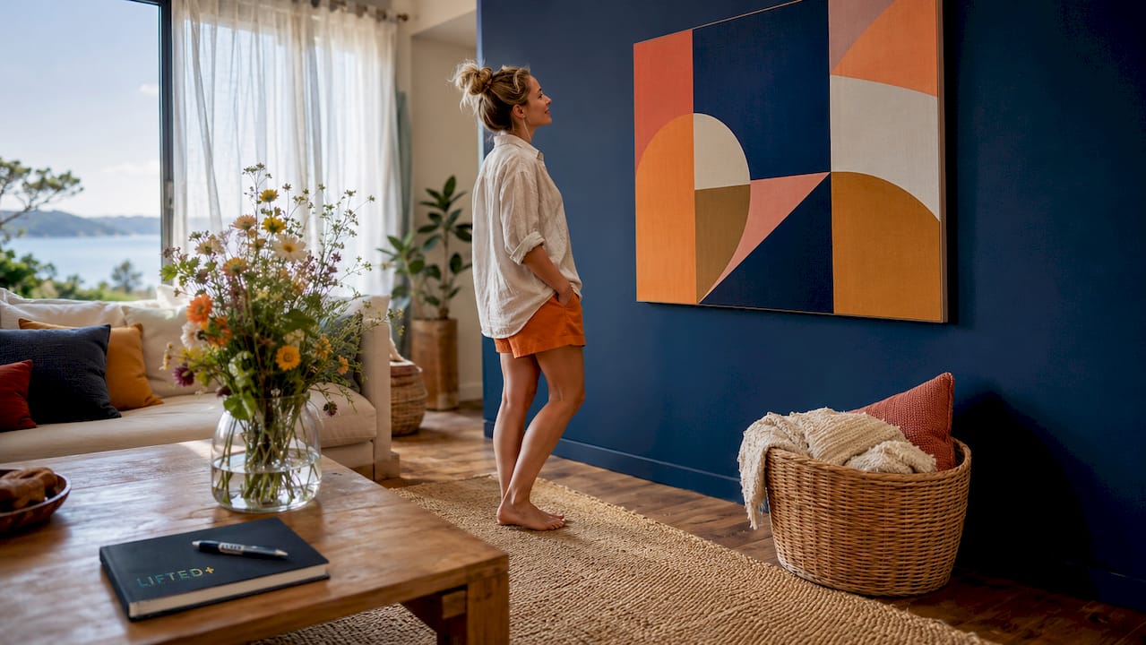
The contrast approach places bold, bright art for walls against a neutral backdrop. A white or warm grey wall becomes a stage. An oversized abstract in cobalt, emerald, or deep burgundy holds the room without competing with furniture. This is the approach that creates focal clarity in minimalist spaces.
Style choices that work consistently in modern New Zealand interiors include:
Abstract bold works in warm earth tones or saturated jewel colours that anchor open-plan living rooms. Botanical and nature-inspired prints that bring organic softness to kitchens and bedrooms. Coastal themes with layered blues and sandy neutrals that suit light-filled spaces near water. Scandinavian-influenced minimalist prints with restrained palettes that complement timber and concrete finishes.
The style you choose should reflect the mood you want the room to carry. Art that evolves in meaning as you live with it creates a lasting emotional connection that purely decorative pieces rarely achieve. That is the difference between art you buy and art you choose.
4. What are the best installation and care methods?
Installation method depends on wall surface and the weight of the piece. For standard plasterboard walls, picture hooks rated to the artwork’s weight are the most reliable option. Heavy framed works over 5 kg need wall anchors or studs. Peel-and-stick murals require a clean, smooth, dust-free surface for proper adhesion.
- Clean the wall surface with a dry cloth before any installation.
- Use a spirit level to mark hanging points accurately.
- For heavy pieces, locate wall studs with a stud finder before drilling.
- For peel-and-stick murals, start from the top and smooth downward to avoid air bubbles.
- Allow framed works to settle for 24 hours before making final adjustments.
Light exposure is the most overlooked factor in art longevity. Direct sunlight damages paper-based prints over time, causing fading and brittleness. Canvas and textured works handle sunlight better, but UV-filtering glass or acrylic glazing is the best protection for any framed work in a sun-exposed room.
Cleaning is straightforward. Dust canvas works gently with a soft, dry brush. Wipe framed glass with a lint-free cloth. Avoid moisture near unframed paper prints. For peel-and-stick vinyl, a lightly damp cloth removes surface marks without lifting the adhesive.
For guidance on choosing art for large walls, including double-height spaces, scale and material choice become even more critical. The principles remain the same; the stakes are simply higher.
Key takeaways
Colourful wall art creates lasting impact when scale, colour strategy, and material choice are aligned with the room’s light, proportions, and existing palette.
| Point | Details |
|---|---|
| Size up when uncertain | Art spanning 50–75% of furniture width holds a room; undersized pieces disappear. |
| Match material to light | Canvas handles Australian sunlight without glare; glossy prints reflect and distract. |
| Choose one colour strategy | Integrate art with existing accents or contrast against neutrals. Do not attempt both. |
| Hang at eye level | Centre artwork at 145–150 cm from the floor with a 15–25 cm gap above furniture. |
| Live with it first | Tape a paper template to the wall for two days before committing to a purchase. |
What I have learned from living with bold art
I used to think the safest approach was to choose art last, once everything else in a room was settled. I was wrong. Art chosen as an afterthought tends to feel like an afterthought. The rooms that hold you, the ones you actually want to spend time in, are built around a piece that has presence and intention.
The most consistent mistake I see is undersizing. People stand in a shop, look at a 60 cm canvas, and think it will be enough. It almost never is. The room swallows it. When you are unsure, size up without hesitation. A piece that is slightly too large for a wall is far more interesting than one that is too small.
The other thing I have come to believe is that art should evolve in meaning as you live with it. The question worth asking before any purchase is not “does this match my sofa?” It is “will this still speak to me in ten years?” Colour fades from trend. Meaning does not.
Do not overlook unconventional spots. Above cabinetry, in a bathroom, at the end of a hallway. These are the places where a single well-chosen piece creates genuine surprise. Art does not need to live only on the obvious walls to hold a room.
— Michelle
Vibrant wall art, curated for modern New Zealand homes
Liftedplus brings together a considered collection of vibrant wall art that goes well beyond the generic. Each piece is selected for its colour presence, scale, and ability to anchor a room rather than simply fill a wall. The range includes limited-edition framed works and oversized prints that suit the proportions of modern New Zealand interiors.
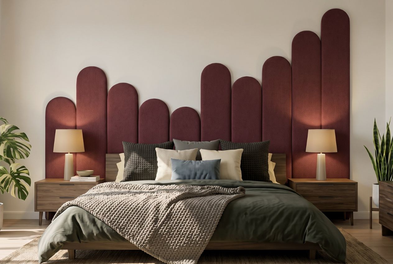
If you are ready to move beyond safe and predictable, the Liftedplus shop is a good place to start. You will find pieces that carry genuine artistic weight alongside guidance on how decor shapes mood and personal style in the spaces you live in every day. Limited-edition releases are available in select sizes, so pieces worth having do not stay available for long.
FAQ
What size wall art works above a sofa?
Art above a sofa should span 50–75% of the sofa’s width and hang with a 15–25 cm gap between the bottom of the frame and the top of the sofa. For a standard 2-metre sofa, that means a work roughly 100–150 cm wide.
Is canvas or framed print better for bright rooms?
Canvas is the better choice for bright, sun-filled rooms. Canvas handles glare better than glossy framed prints, and its matte surface reads clearly under strong natural light without reflective distraction.
How do I choose colours that work with my existing decor?
Pull one or two accent colours from existing room elements such as cushions, rugs, or upholstery, and look for art that carries those tones. This creates cohesion without forced matching and lets the art feel like a natural extension of the room.
Can I hang wall art in a bathroom?
Yes, with the right material. Canvas and framed works with sealed backing handle bathroom humidity better than unframed paper prints. Keep art away from direct water spray and ensure the room has adequate ventilation to protect the piece over time.
How do I know if a piece is the right scale before buying?
Cut kraft paper to the dimensions of the artwork and tape it to the wall. Live with it for at least two days. This simple test reveals whether the scale works with your furniture and wall proportions before you commit to a purchase.