
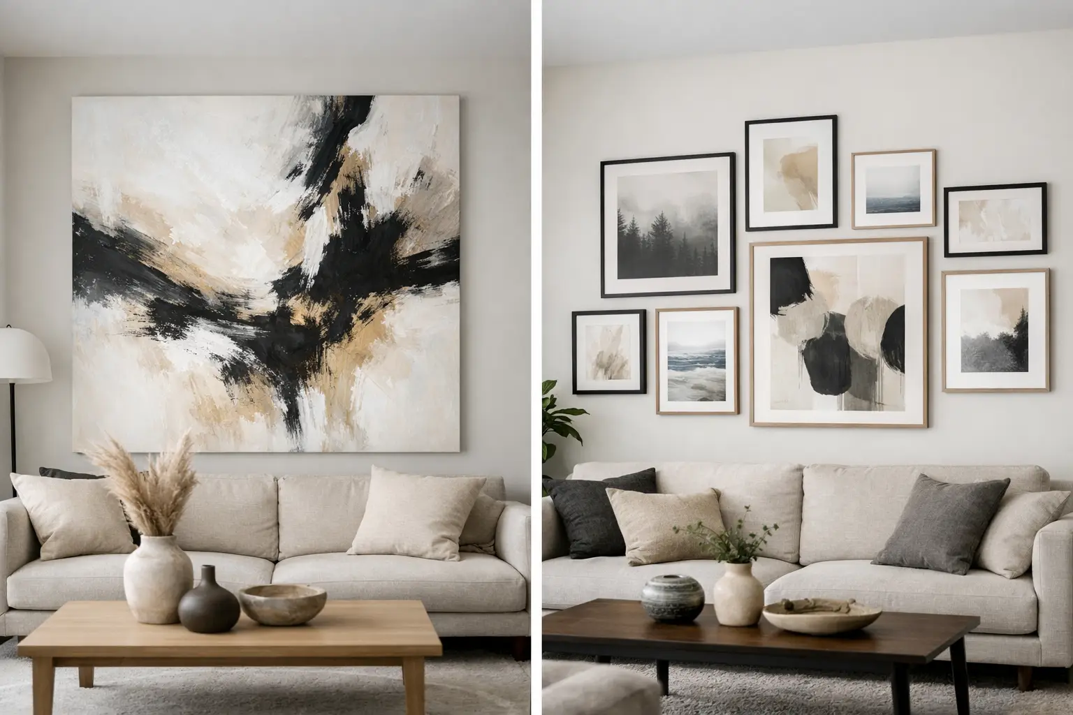
A blank wall tells on a room. It makes even good furniture look like it has been placed on pause.
That is why the oversized art vs gallery wall impact question matters more than people think. This is not just about how much wall space you fill. It is about how a room lands when you walk in, where the eye goes first, and whether the space feels decisive or slightly unresolved.
Both approaches can work beautifully. Both can also miss. The difference is usually not taste. It is scale, architecture, and how much visual authority the room actually needs.
Table of Contents
Oversized art vs gallery wall impact: what changes the room more?
If the goal is immediate presence, oversized art wins.
A single large-scale piece has force. It simplifies the room, creates a focal point fast, and gives the whole scheme a stronger sense of identity. In open-plan homes, townhouses, and newer architectural spaces where ceilings are higher and walls run longer, that kind of scale often feels less like a flourish and more like the missing structural element.
A gallery wall creates a different kind of impact. It is more layered, more narrative, and often more personal. Instead of one strong statement, it builds rhythm through repetition, contrast, and composition. Done well, it adds texture and intelligence. Done badly, it can read as visual admin.
So which changes a room more? Usually the oversized piece. Which says more about the people living there? Often the gallery wall. That trade-off matters.
When oversized art is the stronger move
Oversized art is at its best when the room needs conviction.
Think of a large sofa sitting against a wide wall, a dining area that feels visually underpowered, or an entry that should make an impression but currently does very little. One architectural-scale artwork can pull these spaces together in a way smaller pieces rarely can. It does not just decorate the wall. It sets the emotional pitch of the room.
This is especially true if your interior already leans clean and edited. In a space with sculptural lighting, strong joinery, or a restrained material palette, one oversized work keeps the language sharp. It lets colour, shape, and scale do the heavy lifting without introducing too many competing signals.
There is also a practical advantage. One piece is easier to place than eight. The decision-making is cleaner, the installation is simpler, and the result often feels more resolved. If you want a room to feel elevated without spending weeks arranging and rearranging frames on the floor, this matters.
That said, oversized art asks for confidence. If the piece is weak, the whole room feels weaker for it. There is nowhere to hide. Scale amplifies quality, but it also amplifies hesitation.
Why large-scale art works so well in contemporary homes
Many contemporary homes need more than decoration. They need anchor points.
Large windows, open sightlines, and broad walls can make standard-sized artwork look apologetic. You end up with a lot of white space around something that should be commanding attention. Oversized art solves that problem by matching the architecture instead of shrinking from it.
It also changes how colour behaves. A bold hue in a small frame can feel like an accent. The same colour at scale can shape the whole atmosphere of a room. It can energise a neutral scheme, sharpen softer materials, or bring warmth to spaces that feel a little too cool and composed.
When a gallery wall makes more sense
A gallery wall comes into its own when you want complexity rather than singular impact.
It works well in transitional spaces such as hallways, stairwells, home offices, and corners that benefit from movement. It can also suit rooms that already have a dominant feature, like a dramatic sofa, a strongly patterned rug, or a striking light fitting. In those cases, one more oversized focal point may push the room too far. A gallery wall can create interest without turning everything into a contest.
There is an intimacy to this approach too. A gallery wall invites a closer look. It is less about the instant hit and more about the accumulated effect. That can feel rich and collected, especially if the mix includes varied mediums, framing styles, or personal works alongside design-led pieces.
But scale still matters. Many gallery walls fail because each individual piece is too small for the wall it sits on. The arrangement becomes busy without ever becoming substantial. If you go this route, the composition needs enough mass to hold its own in the room.
The risk of the gallery wall
The gallery wall has become a default solution for people who are not ready to commit.
That is usually where it goes wrong. Instead of a considered composition, it becomes a collection of maybe. Too many frames. Too little contrast. Not enough spacing consistency. The result can feel fussy, especially in rooms that would benefit from one clear gesture.
A gallery wall should look curated, not crowded. It needs discipline. Repetition helps. So does a defined palette, consistent framing logic, or a strong idea that links the pieces together.
How to choose for your space
The better question is not oversized art or gallery wall. It is what the room is asking for.
If your wall is long, your furniture is substantial, and the space feels underpowered, go larger. If the room needs a focal point, choose the thing that can actually hold one. This is where oversized art tends to outperform almost every time.
If your space is smaller, more layered, or already full of strong forms, a gallery wall may give you the visual density you want without creating a single dominant note. It can also be more forgiving in tighter homes where one very large piece would feel too imposing.
Look at viewing distance as well. In a living room where you experience the wall from across the space, bigger usually reads better. In a corridor or stairwell where people pass close by, multiple pieces can create a more engaging moment.
Then there is mood. Oversized art often feels bolder, calmer, and more intentional. A gallery wall tends to feel expressive, eclectic, and conversational. Neither is better on principle. One is simply more aligned with the effect you want.
Oversized art vs gallery wall impact in real rooms
Above a sofa, oversized art usually has more authority.
That is because the sofa already forms a strong horizontal block. One large work above it creates a clean relationship between furniture and wall. A gallery wall can work here too, but it needs enough width and weight to avoid looking scattered.
In a dining area, oversized art can be transformative. Dining rooms often benefit from one decisive move, especially if the furniture is simple and the lighting is sculptural. A single large piece gives the room energy without overcomplicating it.
In hallways and staircases, gallery walls often feel more natural. These spaces are about progression and movement, so a sequence of works can enhance that rhythm. The arrangement becomes part of the journey through the home.
In bedrooms, it depends on the mood. If you want the room to feel grounded and calm, oversized art can bring a strong sense of order. If you want it to feel softer and more personal, a tighter gallery arrangement may be the better call.
The style question people often skip
This choice is also about your tolerance for visual noise.
If you are drawn to interiors that feel clean, colour-led, and architecturally resolved, oversized art is often the sharper answer. It delivers impact without clutter. It says more with less, but it does not disappear into the background.
If you like interiors that feel layered, referential, and slightly more relaxed, a gallery wall can add that collected energy. The key is making sure it still feels intentional, not inherited from a decade of safe styling habits.
For many homes, the most effective answer is not one rule applied everywhere. It is using oversized art where the room needs to land hard, then using smaller grouped works where intimacy and rhythm matter more. That is often how a home starts to feel designed rather than merely decorated.
At Lifted+, this is exactly why architectural-scale art matters. Some walls need more than filler. They need a piece with enough presence to shift the room.
The right wall treatment should make the rest of the space look better, not just busier. Choose the option that gives the room a point of view, then let it hold the room properly.