
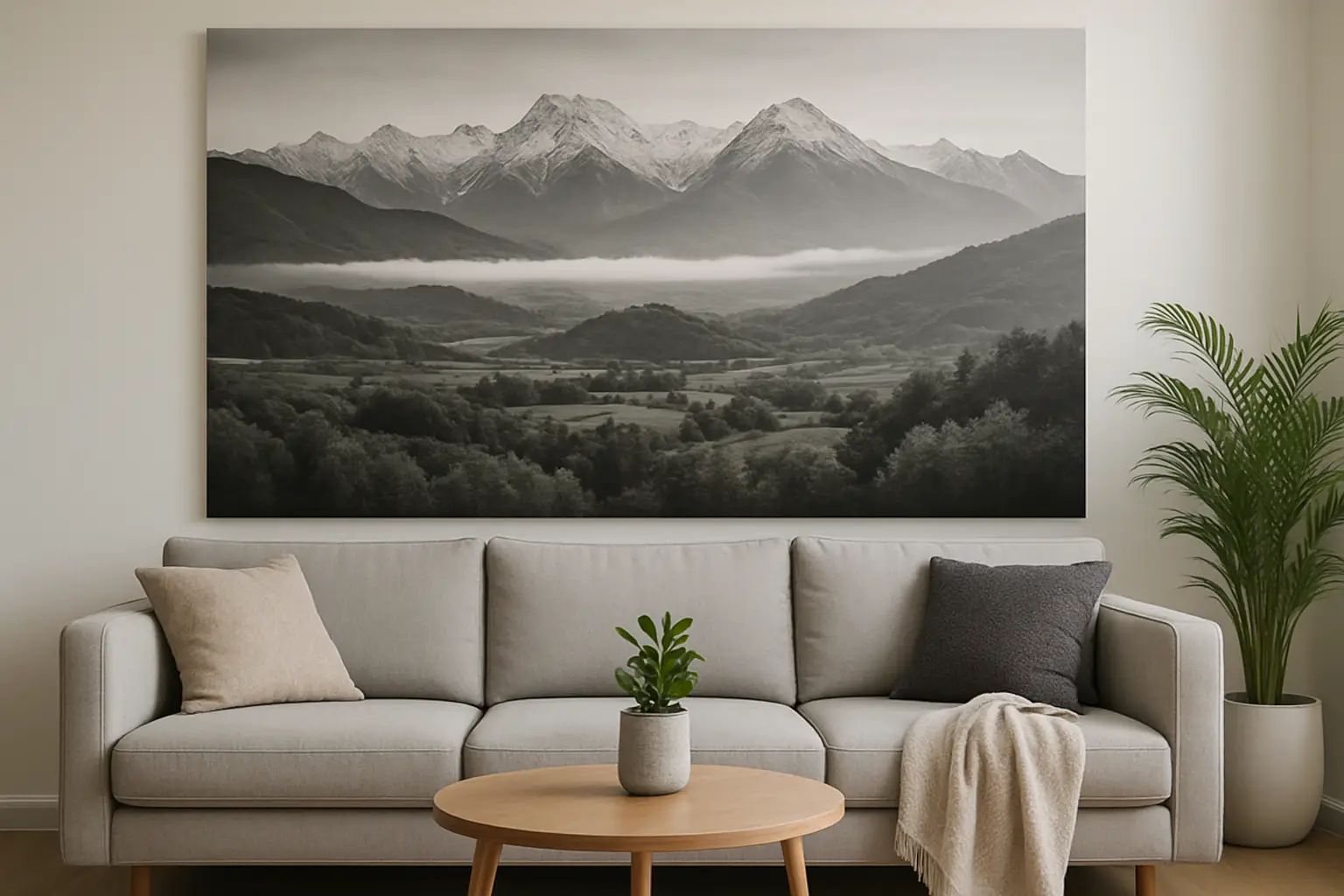
If your living room feels “nearly there”, it’s usually not the sofa. It’s the wall behind it. The space is doing that awkward thing where it’s technically decorated, but emotionally flat. You’ve got cushions, a rug, maybe a plant that’s trying its best – yet the room still reads as temporary.
Large scale wall art fixes that in one move. Not as filler. As the anchor that tells the rest of the room what it’s meant to be.
Table of Contents
Why large scale wall art for living room works
A living room is a high-traffic, high-feeling space. It’s where you decompress after work, host friends, scroll, snack, talk, flop, repeat. Small art can be beautiful, but it often gets swallowed by the visual noise of a lounge: wide sofas, big screens, tall windows, open-plan kitchens.
Large scale wall art for living room spaces works because it carries visual weight. It gives your eye a place to land, then it quietly organises everything else around it. Suddenly your coffee table looks intentional, your lighting looks like a decision (not a default), and your neutral walls stop acting like a blank apology.
There’s a trade-off: big art asks you to commit. But that’s also the point. If you want a room with actual personality, you can’t keep everything reversible.
Size isn’t a vibe – it’s maths (with a little swagger)
If you’ve ever bought a print that looked generous online and then arrived looking like a polite postcard, you already know this.
A strong rule for above a sofa is to aim for artwork that spans about two-thirds to three-quarters of the sofa’s width. If your sofa is 240 cm wide, you’re typically looking at 160-180 cm of art presence. That can be one oversized piece, two substantial pieces, or a tight pair that reads as one.
Height matters too. In most living rooms, the centre of the artwork should sit around eye level when you’re standing – roughly 145-155 cm from the floor. But if your sofa back is high, or your ceilings are tall, you may need to cheat slightly upward so the piece doesn’t feel like it’s crouching.
It depends on the room’s architecture. A villa with high studs can handle more vertical drama. A modern flat with standard ceilings often looks best with wide, landscape-scale work that stretches the wall and calms the proportions.
Placement that makes the room feel designed
Hanging big art is less about perfect measurements and more about avoiding the two classic mistakes: floating too high, or looking like it’s not connected to anything.
Above a sofa, keep the bottom edge roughly 15-25 cm above the backrest. Close enough to feel related, not so close that it feels cramped.
If you’re working with a large blank wall that isn’t anchored by furniture, you’ve got two options. You either commit to truly oversized art that can stand alone, or you create an anchor with a console, sideboard, or even a low bench first. Art likes company. It reads more intentional when it’s part of a vignette with grounding elements below.
And yes, you can hang large scale wall art above the TV. The rule is not “never” – it’s “don’t compete”. If the art is visually louder than the screen, your living room starts to feel like two centres fighting for attention. If your TV is the unavoidable focal point, put the art adjacent, not directly above, and use it to balance the wall rather than challenge it.
Colour: the fastest way to change the mood of the lounge
Neutrals are fine. But if your living room already has beige carpet, warm timber, and a grey sofa, more quiet art won’t lift anything. It will just blend.
Large-scale art is your permission slip to bring colour in at an architectural level. Colour isn’t just aesthetic – it changes the temperature of the room. It can make an open-plan space feel more defined, make a dark corner feel alive, and make the whole lounge feel less like a showroom and more like you.
A practical way to choose colour is to pick one of these starting points, then commit:
- Pull one colour from something you already love (a rug, a cushion, a piece of pottery) and amplify it in the artwork.
- Choose the opposite of what your room currently is. If everything is warm and sandy, go electric and cool. If everything is cool and grey, go saturated and warm.
- Let the artwork be the only “big” colour move, then support it with small echoes in objects and lighting.
There’s a trade-off here too. High-saturation colour can feel intense in a tiny room if you also stack it in every accessory. The fix is not to retreat to beige. The fix is to let the art do the heavy lifting, and keep the rest edited.
One huge piece vs a set: what looks best?
A single oversized artwork reads modern, confident, and calm. It’s also the easiest way to make a living room feel more expensive, because it mimics what galleries do: fewer pieces, more presence.
A multi-panel set can work brilliantly if it’s curated to read as one composition. The key is spacing. Too wide and it looks like you ran out of nerve. Too tight and it looks like you couldn’t afford the large piece. Aim for consistent gaps (often 4-8 cm), and keep the overall width in that two-thirds-to-three-quarters sofa range.
If you’re the type who changes your mind often, sets can feel safer because you can split them across walls later. If you’re tired of “safe”, go singular.
Frame, finish, and the reality of glare
Living rooms have windows. They have lamps. They have screens. So the surface finish of your large scale wall art matters.
Glass-fronted frames can look sharp, but glare can turn your artwork into a mirror during the day. Matte finishes reduce reflection and make colour look richer, especially under warm lighting at night.
Framing also changes the read of the piece. A thin, clean frame feels architectural. A chunky frame can feel heavy unless your room already has bold lines and weighty furniture. If you’ve got lots of curves (rounded sofa, soft rug, pillowy cushions), a crisp frame adds contrast and structure.
Make it a “room-defining anchor”, not a random add-on
The secret to making large wall art look like it belongs is to let it lead the styling decisions that follow.
Once the artwork is up, choose one supporting element that echoes it. Maybe it’s a lamp with a punchy shade. Maybe it’s a vase in a similar tone. Maybe it’s a throw that picks up a background colour quietly. The goal is resonance, not matching.
You don’t need ten accessories. You need two or three that feel like they’re on the same team.
This is where curated collections help, especially if you want impact without spending your weekends in decision fatigue. Brands that build “Edits” – art plus lighting plus objects designed to play together – effectively do the coordination work for you. Lifted+ does this with colour-forward drops and mood-driven curation at https://Liftedplus.com, which is ideal if you want the statement piece first, then the supporting cast without the clutter.
Common living room scenarios (and what to do)
If your lounge is small, big art can actually make it feel larger – as long as you keep the rest tight. One oversized piece on a main wall reduces visual fragmentation. Lots of small frames can make a small room feel busy.
If your living room is open-plan, large scale wall art is your zoning tool. Put it where you want the “lounge” to begin. The eye will treat that wall as the start of the living area, even if the kitchen is two steps away.
If you rent, you can still go large. Use proper picture hooks if allowed, or lean a big framed piece on a console or shelf for a relaxed, editorial look. The trade-off is security – leaning art needs a stable base and a low-traffic spot if you’ve got kids or pets.
If you’ve got high ceilings and the room feels echoey, go taller, not just wider. A vertical piece can pull the eye up and make the room feel intentionally grand rather than accidentally empty.
The one check before you buy
Stand where you usually sit. Look at the wall you’re targeting. Then ask a blunt question: do you want that wall to whisper, or do you want it to do something?
Large scale wall art isn’t about filling space. It’s about choosing the emotional temperature of your living room, then making every other decision easier. Pick the piece that changes how the room feels when you walk in – and let the rest of the styling fall in line behind it.
Your lounge doesn’t need more stuff. It needs one confident move.