
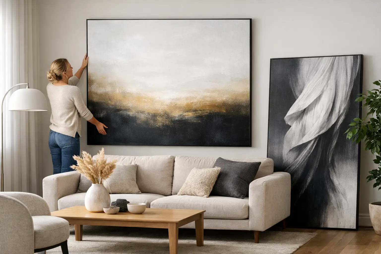
A too-small artwork makes a room feel hesitant. A properly oversized one changes the whole conversation.
That is the real answer to how to decorate with oversized art. It is not about filling a blank wall for the sake of it. It is about giving a room a point of view. Done well, oversized art anchors furniture, sharpens proportions and brings the kind of mood that safe, scattered styling never quite manages.
Large-scale art is not a finishing touch. It is often the thing that makes the room make sense.
Why oversized art works so well
Oversized art holds a room in a way smaller pieces rarely can. It creates structure. It tells the eye where to land. In open-plan homes, hard-edged new builds and city flats with simple architectural lines, that matters more than people think.
A large artwork can soften a stark wall, add tension to a polished interior or bring warmth to spaces that feel clean but slightly too controlled. It also reduces the need for visual clutter elsewhere. When one piece has enough presence, you do not need to over-style every surface with extra objects just to make the room feel finished.
This is where people often get it wrong. They treat oversized art as if it is risky because of its scale, when in reality it can be easier to work with than lots of smaller pieces. One strong focal point is often calmer than ten modest ones competing for attention.
How to decorate with oversized art without overpowering the room
The first rule is simple. Oversized should feel intentional, not accidental.
That does not mean a piece needs to dominate every other element. It means the scale should relate clearly to the furniture and architecture around it. Above a sofa, console or bed, the artwork should generally span a generous portion of the width beneath it. If it looks like it is floating in too much empty space, it is probably too small. If it extends so far beyond the furniture that it feels disconnected, you have pushed too far.
There is always some judgement involved. A low, long sofa can handle a broad horizontal piece. A narrow wall near a stair landing may suit a tall vertical work that emphasises height. Rooms with high stud ceilings can absorb more scale than people expect, especially if the rest of the palette is restrained.
The second rule is to let the artwork lead. Once you choose a large piece, other decisions should respond to it. Pull a colour from the composition into a cushion, a rug or a sculptural object. Repeat the mood rather than copying every tone exactly. If the art is graphic and high-contrast, keep surrounding forms clean. If it is textural or painterly, introduce materials that echo that softness.
Oversized art looks strongest when the room feels edited around it.
Start with placement, not palette
Most people start by asking which colours will work. A better question is where the piece should sit and what job it needs to do.
Above the sofa is the obvious choice because it gives the living room an anchor. In a dining room, one large work can make the space feel more architectural and less like an afterthought. In a bedroom, oversized art above the bed creates an instant headboard effect, especially when the wall itself is simple.
Hallways are underrated here. A single large-scale work in a transitional space creates impact immediately and sets the tone before you even enter the main room. It can also make a narrow passage feel purposeful rather than purely functional.
If the piece is going on a wall with strong natural light, think about glare and shifting colour throughout the day. In some New Zealand homes, especially those with generous glazing and bright coastal light, this can affect how an artwork reads. A richly saturated piece may come alive in daylight, while a glass-covered work in the wrong position can become all reflection and no presence.
Size matters, but proportion matters more
People love rules, but scale is not solved by a formula alone. The better test is visual balance.
If you are hanging art above furniture, leave enough breathing room so the piece feels connected, but not cramped. Too high and it disconnects from the room. Too low and it can feel heavy. In most cases, oversized art works best when it sits lower than people first assume, visually tied to the furniture beneath it rather than drifting towards the ceiling.
If the wall is huge, resist the temptation to fill every centimetre. Not every large wall needs the largest possible artwork. Negative space can make a single piece feel more expensive, more composed and more deliberate. The goal is not maximum coverage. It is maximum effect.
That is especially true in homes with clean architectural detailing. A bold artwork against a quiet wall has room to breathe. Pack too much around it and you lose the confidence of the gesture.
Choose art that shifts the mood
When people ask how to decorate with oversized art, they are often really asking what kind of art to choose. The answer depends on the room you want to create.
If you want energy, choose work with contrast, movement or unapologetic colour. This is where oversized art can be transformative. A vivid piece changes the emotional temperature of a room immediately. It injects optimism. It cuts through beige fatigue. It gives contemporary interiors a pulse.
If you want calm, go large with restraint rather than small with caution. Soft tonal variation, atmospheric forms and limited palettes can still have huge impact at scale. Large does not have to mean loud. It just needs conviction.
Abstract work is often the easiest fit for modern interiors because it interacts well with architecture and materials. But photography, graphic works and textural pieces can be equally strong. What matters is that the piece has enough visual weight to hold its own.
Support the art instead of competing with it
A statement artwork does not need a silent room around it, but it does need a disciplined one.
That means being selective with supporting pieces. Sculptural lighting, a considered rug, one or two objects with real presence – these can all build the room around the artwork. What usually weakens the effect is filler. Too many small accessories. Too many decorative gestures with no relationship to each other. Too much trying.
This is where curated interiors always feel stronger than over-styled ones. Every piece should either reinforce the atmosphere or get out of the way.
If your artwork is colour-forward, you do not need to match everything exactly. In fact, perfect matching often looks flat. Better to echo a tone in a different material or introduce a related shade that gives the room depth. Think burnt orange with soft pink, deep blue with acid green, or clay red with walnut and chrome. Contrast creates life.
Framed, unframed or leaning?
Presentation changes the feel of oversized art more than many people realise.
A framed piece feels polished and architectural. It suits formal living areas, dining spaces and rooms with crisp lines. An unframed canvas can feel more relaxed and immersive, which works beautifully in bedrooms or spaces where softness matters. Leaning a large work against the wall can look confident and slightly undone, but only if the room itself supports that attitude. In a busy family zone, it may read more impractical than editorial.
There are trade-offs. Framing adds presence but also weight and cost. Leaning is flexible but not always ideal for homes with children or pets. A canvas without glass avoids reflection, but the finish needs to feel substantial enough to carry the scale.
One big piece or a gallery wall?
If your instinct is impact, choose one big piece.
Gallery walls have their place, but they create a different effect. More layered, more collected, more conversational. Oversized art is cleaner. Bolder. It gives the room a clearer hierarchy. For modern interiors, that clarity often wins.
There are exceptions. A grid of large works can look striking in expansive spaces. Pairing one oversized piece with a smaller secondary artwork elsewhere in the room can also create balance. But if the room already feels busy through joinery, texture or view, one commanding artwork is usually the smarter move.
The confidence factor
The final piece is confidence. Not fake bravado. Just enough certainty to stop decorating like you are apologising for taking up space.
Oversized art works because it commits. It says this room is meant to be felt, not just used. It gives shape to colour, rhythm to architecture and intention to empty walls. If your interiors have been drifting towards safe, this is often the move that pulls them back into focus.
A room does not need more things. It needs a stronger centre of gravity. Start there, and let the rest follow.