
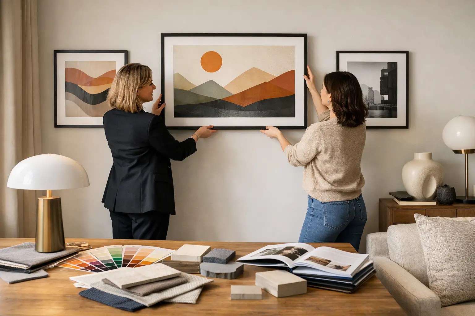
A limited edition artwork should not end up behaving like background filler. If you are wondering how to decorate with limited edition art, start there. These pieces are made to hold visual weight, shift the mood of a room, and give the space a point of view. Treat them like the lead, not the afterthought.
That matters even more in homes that are already architecturally strong. A clean-lined townhouse, a renovated villa, a compact city flat – all of them benefit from a focal point with conviction. Limited edition art brings rarity, yes, but its real value is compositional. It gives the room structure. It tells everything else where to sit.
Why limited edition art changes the room
There is a difference between filling a blank wall and building an interior. Open-edition prints can absolutely work, but limited edition art carries a different kind of presence. It feels intentional. Collected. Chosen. That subtle sense of scarcity changes how people read the room, because the piece feels less like decoration and more like a decision.
It also asks more of the space around it. That is a good thing. Once a work is editioned, signed, or produced in a finite release, it tends to come with stronger visual identity – bolder scale, more distinctive colour, more confidence in composition. Instead of blending politely into beige-on-beige styling, it sets a tone and expects the room to keep up.
This is where many interiors either come alive or fall flat. The art is strong, but everything around it is timid. A statement piece with no supporting structure just looks stranded.
How to decorate with limited edition art as a focal point
The simplest rule is this: choose the art first, then build the room around it. Not the other way round.
When people do it in reverse, they often end up trying to squeeze a bold piece into a scheme that was designed to stay safe. The result is visual hesitation. A vivid print lands in a room full of soft neutrals and underscaled furniture, and instead of feeling expressive, it feels apologetic.
Start with the artwork’s strongest qualities. Is it the scale? The colour story? The geometry? The mood? Once you know what is doing the heavy lifting, you can echo that quality elsewhere without copying it too literally.
If the artwork is architectural and oversized, the room needs enough visual substance to support it. That might mean a longer console, a broader sofa, or a sculptural floor lamp with real presence. If the piece is colour-led, pull one or two tones into the room through objects, upholstery, or lighting. Not every shade needs repeating. In fact, too much matching can make the space feel staged rather than designed.
The goal is resonance, not repetition.
Use scale properly, or do not bother
Undersized art is one of the quickest ways to drain energy from a room. If a limited edition piece is meant to lead, it needs enough size to hold the wall and speak to the furniture beneath it.
Above a sofa, the artwork should usually span a generous portion of the sofa width. Above a sideboard or console, it should feel anchored rather than perched. In a dining room, larger scale often works better than people expect, because the table already creates a strong horizontal line that can handle it.
This does not mean every room needs one enormous piece. It means scale should feel deliberate. A smaller limited edition work can still command attention, but it usually needs more negative space around it and less visual competition nearby.
If you are working with a compact room, resist the instinct to go tiny. Small spaces can handle bold moves. Often they need them.
Let colour shape the atmosphere
The best interiors do not use colour as garnish. They use it to direct feeling.
Limited edition art is often the easiest place to introduce bolder colour with intent, especially if you are not interested in repainting entire rooms. A work with saturated blue, acidic green, rust, cobalt, or blush can completely change the temperature of a space. It can make a room feel sharper, warmer, lighter, or more electric.
The mistake is treating colour in the artwork as a strict shopping list. If the print includes orange, pink, and burgundy, you do not need all three in cushions, ceramics, and throws. Pull one dominant note and one secondary note. Then let material do some of the work. Smoked glass, brushed metal, lacquer, linen, boucle, timber – all of these affect how colour lands.
A room with bold art and flat materials can still feel unfinished. A room with bold art and layered texture feels composed.
Where to place limited edition art for maximum impact
Placement changes everything. The right piece in the wrong spot loses authority.
Entry spaces are strong candidates because they let the artwork set the tone immediately. A corridor, landing, or foyer does not need to be neutral ground. It can announce the mood of the home from the first step inside.
Living rooms are the obvious option, but they work best when the art is given enough breathing room. If the wall is crowded with shelving, television units, and competing decor, the artwork has to fight too hard. Let one element lead.
Bedrooms can also handle statement art, but the mood needs a little more restraint. That does not mean pale or forgettable. It means choosing work with presence that still suits the slower rhythm of the room. Rich colour can be restful when the composition feels balanced.
Dining spaces are often overlooked, which is odd because they are ideal for bold art. People sit still there. They look. They linger. A large limited edition piece can make even a simple dining area feel considered and complete.
Frame and hang it with conviction
A strong piece in a weak frame is a missed opportunity. The frame should support the work’s character and suit the room, not disappear by default.
Black can sharpen. Oak can warm. White can work, but in some interiors it is simply the safest option rather than the best one. If your home leans clean and architectural, a crisp frame can heighten the graphic quality of the piece. If the room has more warmth and material contrast, timber or darker finishes often give the art more depth.
Hanging height matters too. Too high, and the work disconnects from the furniture and architecture around it. Too low, and it can feel cramped. As a general rule, art should relate to the room, not float above it like an afterthought.
Build a room that supports the art
Once the artwork is in place, the rest of the room should strengthen its effect.
This is where supporting pieces earn their keep. Lighting can echo line or shape. A rug can stabilise a colour note. An object on a console can reinforce the sculptural quality of the composition. Good styling is not about adding more. It is about making each surrounding element feel relevant.
Be selective. If the art is energetic, maybe the furniture forms should be simpler. If the art is minimal but large-scale, perhaps the room can handle a more sculptural lamp or side chair. Balance is always contextual. It depends on the artwork, the architecture, and how much visual intensity you actually want to live with every day.
This is also why curated interiors tend to feel stronger than over-shopped ones. Fewer pieces, better chosen, with clearer roles.
What not to do when decorating with limited edition art
Do not buy a bold piece and then neutralise it with fear. If you loved the work because it felt alive, do not strip the room of all personality around it.
Do not over-style the surface beneath it. A console covered in vases, books, candles, bowls, and small objects will only clutter the read.
Do not force perfect colour matching. Rooms with exact colour repetition can feel flat, even when the palette is bold.
And do not assume rarity alone makes something right for your home. Limited edition does not automatically mean impactful. The piece still needs presence, proportion, and a real relationship to the room.
The smartest way to buy
If you are investing in limited edition art, buy with the whole room in mind. Think about what the piece will face, what will sit below it, how daylight hits the wall, and whether the scale suits the architecture. A beautiful work can disappoint if the context is wrong.
This is where a tightly edited approach is useful. Brands with a strong point of view, including Lifted+, make the process easier because the artwork is not presented as isolated product. It is shown as part of a complete visual language – colour, form, mood, and the supporting pieces that help it land properly.
That is the shift worth making. Stop thinking of art as the final decorative layer. Start treating it as the move that gives the room its energy, shape, and confidence. When the piece is right, everything else gets clearer.