
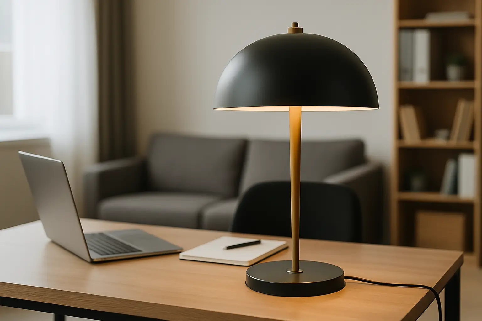
You know that moment when the sun drops and your living room suddenly looks like it’s waiting for someone else to make a decision? That’s not a “needs more cushions” problem. That’s lighting.
A statement lamp is the fastest way to make a space feel designed on purpose. Not styled. Not “fine”. Designed. The right one becomes a visual anchor in daylight and a mood engine at night – and it does both jobs without asking you to redecorate your whole life.
This is how to choose a statement lamp with confidence, especially if you love colour, hate filler, and want your home to feel like it has a point of view.
Table of Contents
What makes a lamp a statement (and not just a light)
A statement lamp doesn’t whisper “I’ll match whatever you’ve already got.” It shows up with presence. That presence can come from scale, silhouette, colour, material, or a shade that behaves like sculpture.
Here’s the trade-off: the more your lamp behaves like a hero piece, the more you need to decide what it’s hero-ing. Is it the room’s main moment, or is it supporting the real star (like a large artwork, a dramatic sofa, or a bold rug)? Both are valid. You just don’t want three leads fighting for the same scene.
Start with the job, not the look
Before you fall for a curved ceramic base or a juicy glass shade, decide what you need the lamp to do. Statement lamps can do more than one job, but they usually do one best.
If you want atmosphere, you’re looking for a lamp that throws light sideways and down, softens edges, and makes faces look good. If you want function (reading, working, detailed tasks), you need directed light and less shade opacity. If you want a room-defining object, the lamp can be primarily sculptural – but you still need to live with the light it produces.
A practical way to check yourself: ask whether you’ll use it for two hours every night or whether it’s there to change the vibe when it’s on. Daily use tends to reward comfort and glare control. Mood use rewards drama.
Scale rules: go bigger than your instincts
Most people under-buy lamp size. They choose something polite, then wonder why the room still feels flat.
The fastest “how to choose a statement lamp” win is scale. A statement lamp should read clearly from the doorway. If it disappears unless you’re standing next to it, it’s not doing the work.
For table lamps, think in proportion to the surface it sits on. A lamp on a large sideboard needs height and width so it doesn’t look like it’s been left there temporarily. On a bedside, you want presence without blocking your book or blasting your eyes.
For floor lamps, the height should relate to eye level when seated. Too short and it looks like it’s crouching. Too tall and it can feel like a streetlight indoors. Arc lamps are a special case – they can be tall if the shade lands exactly where you need the pool of light.
If you’re unsure between two sizes, pick the larger one. The smaller option usually reads as “extra”. The larger option reads as “choice”.
Shape and silhouette: pick your vibe in one line
Silhouette is how a lamp communicates before it’s even switched on. You can choose a shape that calms the room, sharpens it, or makes it playful.
Curves (globes, domes, rounded bases) soften modern spaces and look especially good against angular architecture. They’re friendly. They blur harsh lines.
Hard lines (cylinders, rectangles, strong stems) add structure and make a space feel more editorial. They also pair well with busy art because they don’t compete with organic chaos.
Then there are the weird ones – intentionally wonky silhouettes, stacked forms, oversized shades. These are the lamps that turn into conversation pieces. The trade-off is that they demand you keep the rest of the vignette simple. If the lamp is doing the talking, your side table styling should stop interrupting.
Colour: choose one “loud” relationship
Colour is where statement lamps earn their keep. A lamp can either echo a colour already in your room, or introduce a new one that upgrades everything around it.
If you’re colour-confident, pick a lamp that pulls a hue from your artwork and makes it physical in the space. This is how a room looks cohesive without being matchy.
If you’re colour-curious, start with one strong note. A lamp in a saturated shade can sit beautifully in an otherwise pared-back room – but only if you repeat that colour once somewhere else. One repeat is enough: a cushion, a vase, a book spine, a small artwork. No need to theme your whole personality around it.
And yes, you can mix warm and cool colours. The key is temperature consistency within the lamp itself. A cool blue base with a warm-toned shade can look accidental unless it’s clearly intentional.
Material and finish: go tactile, not shiny-for-the-sake-of-it
The material is the difference between “nice photo” and “I’m keeping this forever”. Think about what the lamp looks like in daylight.
Ceramic and textured finishes feel grounded and design-led. Glass can be bold without being heavy, especially if it’s coloured or opal. Metals can be sharp and modern, but the finish matters – brushed tends to feel more lived-in; high gloss can look loud in the wrong way.
A useful litmus test: if the finish reflects everything around it, it will also reflect clutter. If your surfaces tend to collect life (keys, chargers, yesterday’s coffee), choose a material that doesn’t act like a mirror.
Shade logic: this is where the glow gets decided
Shades aren’t an afterthought. They’re the mood.
A pale fabric shade diffuses light and flatters everyone. A coloured shade can tint the light, which is a power move when you want a space to feel warm, intimate, or playful. An opaque shade with a reflective interior can throw strong light downwards while keeping the exterior crisp.
Pay attention to translucency. If you hate seeing the bulb, avoid thin shades that show hot spots. If you love a graphic look, a visible bulb can be part of the design – but choose a bulb that looks intentional (shape and warmth), not whatever was in the drawer.
Also: shade proportion matters more than people think. An oversized shade instantly reads statement, even on a simple base. A small shade on a chunky base can look top-heavy in the wrong way.
Light quality: warm wins, but not always
Most homes look better with warm light. It makes skin tones kinder and spaces calmer. For living rooms and bedrooms, warm white is usually the move.
But if the lamp is in a workspace or kitchen-adjacent zone, you may want something slightly brighter and cleaner so colours read true and you don’t feel sleepy at 3pm. The trade-off is that cooler light can make a room feel more clinical, especially against white walls.
Dimmable is the cheat code. It lets one lamp do multiple jobs across the day. If you’re choosing a statement lamp, you’re choosing a mood tool – give yourself control.
Placement: design the room in pools of light
Overhead lighting is not your main character. It’s the background.
A statement lamp works best when it creates a pool of light where you actually live. Next to a sofa arm for reading. Behind a lounge chair to frame a corner. On a sideboard to lift the whole wall and make art look intentional.
Corners are underrated. A good floor lamp in a neglected corner can make the whole room feel bigger because it lights the edges instead of just the centre.
If you’re using a statement lamp near a TV, keep the shade low-glare and avoid harsh, exposed bulbs that bounce off the screen.
Pairing with art and furniture: choose who leads
If you’ve invested in a large-scale artwork, your lamp can either echo it or set it off.
Echoing means repeating a key colour or shape language. A rounded lamp base works with curvy abstract art. A clean-lined lamp looks sharp under architectural photography.
Setting it off means contrast. A bright lamp under muted art can make the wall feel alive. A neutral lamp under bold art can give the eye a rest.
The rule is simple: if both pieces are highly detailed, the space gets noisy. Let one be complex and the other be clean.
If you want that curated, high-impact look without wading through endless options, the Electric Joy Edit at Lifted+ is built around this exact principle – statement pieces first, supportive pieces second, zero filler.
The quick “regret check” before you buy
A statement lamp should feel like a decision you’ll be proud of, not a trend you’re borrowing.
If you’re hesitating, ask yourself four things: will it still look good when it’s off; is it big enough to hold its place; do you like the light it gives, not just the base; and can you name where it will live without rearranging the entire room.
If you can answer those, you’re not just buying a lamp. You’re choosing the version of your home you want to come back to at night.
Closing thought: when you’re unsure, choose the lamp that makes the room feel more like you – because the point of a statement piece is that it doesn’t ask for permission.