
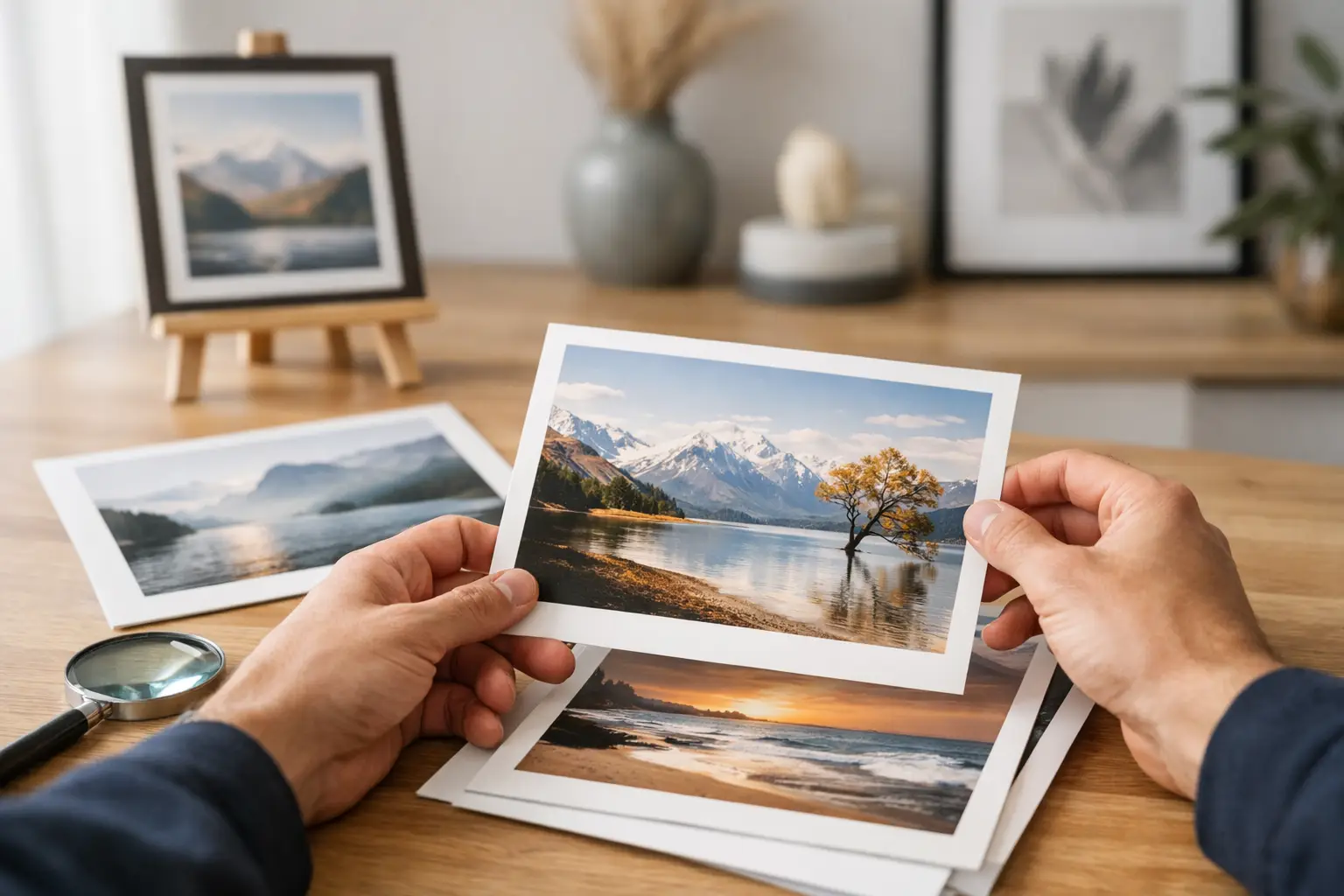
A small print on a big wall is one of the fastest ways to make a good room feel unfinished. The opposite is also true. Get the scale, edition and mood right, and the artwork stops being an accessory. It becomes the thing that gives the room its pulse.
That is the real appeal of limited edition art prints NZ buyers are looking for. Not just rarity for its own sake, but a piece with presence. Something considered, finite and strong enough to shape a space.
Table of Contents
Why limited edition art prints in NZ feel different
Buying art for a home in New Zealand comes with its own rhythm. Rooms often work hard – open-plan living, strong natural light, pared-back architecture, materials that lean tactile rather than ornamental. In that context, artwork has a bigger job to do.
A limited edition print can bring clarity to a space that feels a little too restrained. It can add tension to clean architectural lines, warmth to polished surfaces, or a hit of colour that changes the entire mood of a room. That matters more than whether something merely “matches” the sofa.
The edition itself also changes the experience. An open edition can still be visually appealing, but a limited release carries intent. There is a sense that the work has been produced carefully, in a defined quantity, rather than endlessly replicated until the image loses impact. For design-aware buyers, that distinction matters.
What makes a print worth buying
Not every limited print deserves a spot on your wall. The label alone is not enough. If you are weighing up limited edition art prints NZ collections, the better question is whether the piece has enough visual authority to hold the room.
Start with scale, not sentiment
Most people shop for art too small. They find an image they like, then choose a safe size. The result is polite and forgettable.
If the wall is significant, the artwork should be too. In a living room, dining area or entrance, a larger print often works harder than a cluster of smaller pieces. It reads faster, anchors the furniture and creates a clearer design statement. Small formats have their place, especially in studies, bedrooms or layered gallery walls, but they should feel intentional rather than hesitant.
Edition size matters, but not in the way people think
A tiny edition of ten is not automatically better than an edition of fifty. What matters is whether the release feels genuinely limited, thoughtfully produced and aligned with the artist or brand’s approach.
Ask what you are actually paying for. Is it stronger paper stock, better print quality, a signed or numbered run, sharper curation, or a more distinctive image? Scarcity has value, but only when the work itself has substance.
Colour should do a job
The best prints do not just “add colour”. They direct the emotional temperature of a room.
A saturated piece can make a restrained interior feel energised. A softer palette can calm a room with a lot of hard lines and reflective finishes. Deep reds, electric blues, acid greens, burnt orange – these are not random choices. They change how a space lands when you walk into it.
If your room already has strong materials such as walnut, concrete, brushed steel or stone, the print should respond to that. Sometimes that means contrast. Sometimes it means echo. It depends on whether you want the art to sharpen the room or soften it.
How to choose limited edition art prints NZ homes will actually suit
There is no single right style, but there is a right fit between artwork and architecture.
For modern flats and townhouses
Compact urban homes benefit from artwork that creates impact without clutter. One bold print over a sofa, console or bed often works better than filling every wall. Look for strong composition, confident colour blocking or abstract forms with enough breathing room around them.
This is where limited edition prints can outperform mass-market wall decor. They feel more deliberate. Less filler, more focal point.
For architectural homes
Large walls, high studs and generous glazing can make average art disappear. Architectural spaces need pieces with enough scale and graphic force to stand up to the room.
That does not always mean louder. It means clearer. A work with strong form, depth or contrast will usually land better than something over-detailed or visually timid. In these spaces, art should not apologise for itself.
For warmer, layered interiors
If your home already leans textural – timber, boucle, linen, vintage accents, earthy stone – a print can stop the room becoming too soft around the edges. Colour-forward work brings tension and freshness.
This is often the sweet spot: tactile materials below, crisp visual energy above. A room feels more resolved when those elements push against each other a little.
What to check before you buy
A good art purchase is partly emotional and partly practical. Ignore either side and regret tends to follow.
First, look closely at dimensions. Not the image online, the actual measurements. Tape the size out on the wall if you need to. It is a simple trick, but it saves people from buying timidly.
Then consider framing. Some prints need the clean architecture of a thin frame. Others can hold their own with more presence around the edge. If you are buying unframed, factor in the total finished look rather than just the print price.
Paper and print quality also matter more than many buyers expect. Rich blacks, clean detail and colour depth are what give a print its sense of substance. If the finish looks flat or flimsy, the whole piece loses authority.
Finally, think about longevity. Not whether you will love the exact shade forever, but whether the artwork still feels compelling once the novelty wears off. The strongest pieces keep giving a room shape over time.
The trade-off between trend and permanence
There is nothing wrong with buying something because it feels fresh. Interiors should have energy. But there is a difference between a piece that feels current and one that is merely trend-led.
A lot of generic wall art borrows the language of contemporary design without any real conviction. It references the right colours, the right shapes, the right moods – but says very little. Limited edition art should offer more than that.
The better buy is usually the piece that feels slightly bolder than your first instinct. Not chaotic, not forced. Just confident enough that it changes the room rather than blending into it. Safe art tends to become invisible surprisingly fast.
Where curation matters
Too much choice is not always helpful. In fact, it often leads to weaker decisions. Endless pages of prints make everything feel interchangeable, and when everything is possible, people default to beige.
That is why strong curation matters. A tightly edited collection tells you something about scale, mood, palette and placement. It helps you see the artwork as part of a whole interior rather than an isolated purchase.
For buyers who want a room to feel considered, that perspective is useful. It is one reason brands with a clear point of view stand out. At Lifted+, the emphasis is on pieces created to hold a room, not just fill a wall, which is a far more useful standard when you are investing in statement art for a home.
Styling a limited print without flattening its impact
Once the artwork arrives, resist the urge to over-style around it. If the print is the focal point, let it lead.
A large work above a sofa or sideboard does not need a clutter of competing objects underneath. Give it some space. Repeat one or two colours from the print elsewhere in the room through lighting, textiles or an object, and leave it there. The aim is cohesion, not echoing every tone until the room feels overworked.
Lighting matters too. Natural light can make a print sing during the day, but consider evening ambience as well. A well-placed lamp or wall light can pull the artwork back into focus after dark, which is especially useful in living spaces used at night.
A smarter way to buy art for your home
If you are searching for limited edition art prints NZ buyers genuinely want to live with, look past the idea of art as a finishing touch. Start with the question of what your room is missing. More energy? More structure? More contrast? More mood?
Buy the piece that answers that question clearly. Not the one that feels safest on screen.
The right print does more than fill blank space. It gives the room direction, confidence and a point of view people can actually feel the moment they walk in. And that is usually the difference between a home that looks decorated and one that feels designed.