

TL;DR:
- Furniture significantly influences a room’s atmosphere and emotional impact. Warm tones and intricate forms energize social spaces, while cool tones promote calm and focus. Strategic arrangement and seasonal updates enhance overall ambiance and well-being.
Furniture is rarely the first thing people credit when a room feels extraordinary. Most reach for paint swatches or new lighting before considering that the sofa’s silhouette, the dining table’s warm timber tone, or the curve of a reading chair might be doing the heaviest emotional lifting. Yet furniture colour and form significantly affect both aesthetic preferences and physiological responses, meaning the pieces you choose don’t just fill space — they shape how your body and mind feel inside it. This guide walks through the science, the strategies, and the seasonal thinking that will help you transform your home into a space that genuinely moves you.
Table of Contents
- Why furniture matters for home ambiance
- How colour, form and function influence mood
- Bringing nature inside: The biophilic effect and chaos versus calm
- Practical design strategies for vibrant New Zealand homes
- What most people miss when designing for ambiance
- Bring your home’s ambiance to life with Lifted+
- Frequently asked questions
Key Takeaways
| Point | Details |
|---|---|
| Colour and form matter | The shapes and colours of your furniture visibly and subtly change the mood and energy of your space. |
| Balance is key | Mixing bold hues, calming tones and textures prevents overstimulation or dullness in any room. |
| Function guides style | Anchor a room with its largest or most-used piece, then layer in supporting elements for both flow and flair. |
| Nature needs moderation | Bringing in plants or nature-inspired furniture adds interest, but too many elements can tip a space toward visual chaos. |
Why furniture matters for home ambiance
When we talk about ambiance, we tend to think about candles, soft music, or the quality of afternoon light through a window. Furniture rarely enters the conversation. That’s a significant oversight. Furniture is the primary anchor of any room’s atmosphere. It defines scale, sets the emotional register, and determines whether a space feels alive or inert.
Recent research confirms what skilled designers have long understood: furniture colour and form significantly affect aesthetic preferences and physiological responses. In studies measuring galvanic skin response and brainwave activity, warm-coloured and intricately shaped furniture consistently raised arousal levels. Participants showed heightened engagement, faster cognitive responses, and stronger emotional reactions when surrounded by warm, complex forms compared to cool, minimal ones.
“The furniture in a room doesn’t sit passively in the background. It speaks continuously, shaping every moment spent within those walls.”
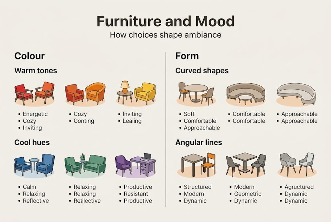
What does this mean practically? Warm colours — deep reds, burnt oranges, amber yellows — energise a room and invite social connection. Cool colours — sage greens, slate blues, soft greys — soothe the nervous system and encourage focus or rest. The contrast between furniture and surrounding decor amplifies these effects further, creating emotional tension or harmony depending on your intent.
Arrangement matters just as much as colour. Furniture placed to encourage face-to-face conversation creates a different social energy than pieces oriented toward a screen. Pathways between pieces affect how freely people move and breathe within a space. A room that flows well feels generous. One that doesn’t feels draining, regardless of how beautiful the individual pieces are.
For those building timeless vibrant interiors, the starting insight is this: your furniture is not decoration sitting on top of your home’s atmosphere. It is the atmosphere.
- Warm-toned furniture raises energy and encourages conversation
- Cool-toned pieces support calm, focus, and restorative rest
- Complex, sculptural forms increase visual engagement and emotional response
- Furniture arrangement shapes perceived spaciousness and social flow
- Contrast between pieces and their surroundings heightens emotional impact
How colour, form and function influence mood
Colour is personal. But it’s not arbitrary. Research into colour and mood reveals some clear patterns: around 62% of people report that relaxing colour choices improve their sense of ambiance at home, while 27% actively seek more stimulating environments in social spaces. These aren’t small numbers. They reflect real, consistent human responses to colour in the built environment.
Warm hues — terracotta, ochre, rust — work beautifully in communal areas like living rooms and dining spaces. They pull people into conversation and create a sense of warmth and welcome. Used in moderation, they energise without overwhelming. Push them too far and the space can feel restless or overstimulating, particularly in smaller rooms.
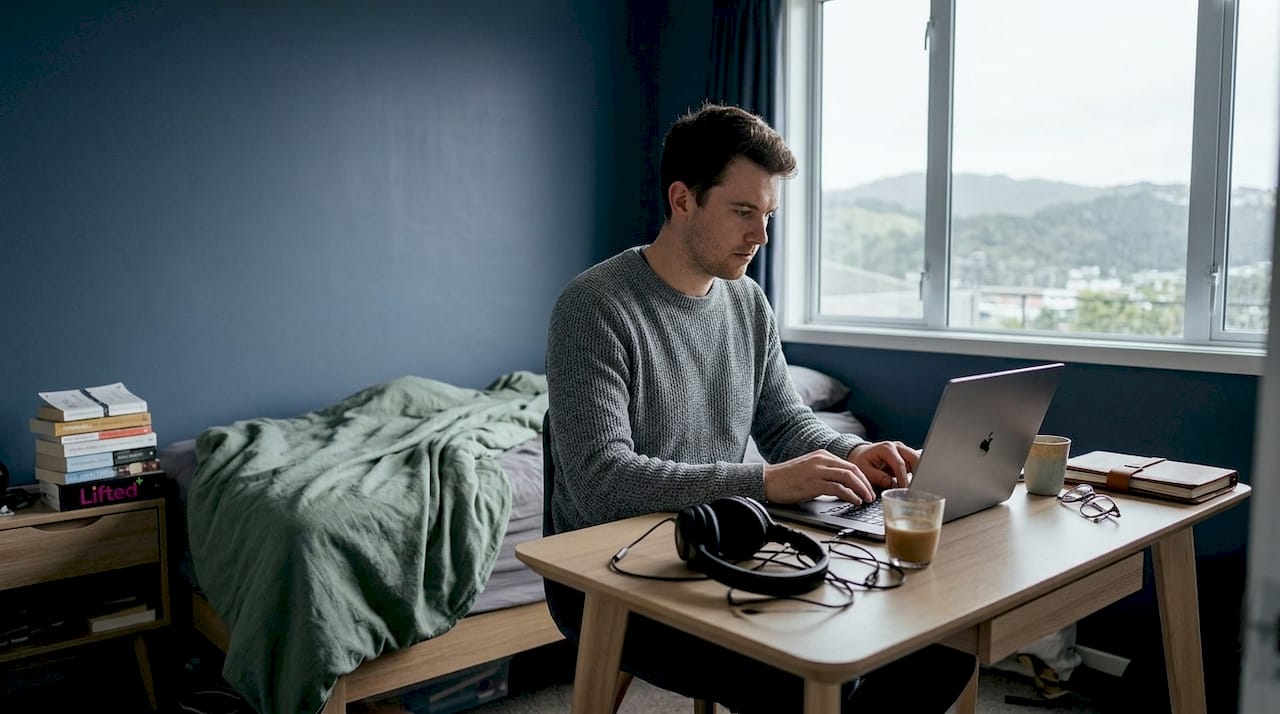
Cool hues — deep teal, dusty sage, soft navy — are excellent for bedrooms and home offices. They calm the mind and reduce visual noise. The risk is flatness. Without texture, layering, or a contrasting accent, a cool-toned room can feel cold rather than serene. The fix is tactile: linen, boucle, raw timber, or woven rattan introduce warmth without disturbing the calm.
Neutrals offer timelessness and flexibility, but they demand effort. A room built entirely on beige and white needs bold art, strong sculptural forms, or rich textural contrast to hold its presence. Without those anchors, it drifts toward the forgettable.
Pro Tip: When choosing between curved and angular furniture, consider the energy you want. Curved forms soften a room, reduce tension, and feel more inviting. Angular pieces introduce structure, clarity, and a sense of purpose. Most well-balanced spaces use both.
For colourful apartment inspiration that avoids the trap of visual noise, the key is layering intentionally. Start with your hero piece — the sofa, the dining table, the statement armchair — and build outward. Supporting pieces should complement, not compete. Seasonal accents, cushions, throws, and objects from a well-chosen layer home decor approach bring the composition together without crowding it.
| Element | Effect on mood | Best used in |
|---|---|---|
| Warm tones (ochre, rust) | Energising, social | Living rooms, dining areas |
| Cool tones (sage, navy) | Calming, focused | Bedrooms, home offices |
| Neutrals (linen, stone) | Timeless, flexible | Any room with bold accents |
| Curved forms | Softening, inviting | Social and relaxation spaces |
| Angular forms | Structured, purposeful | Work spaces, formal areas |
Bringing nature inside: The biophilic effect and chaos versus calm
Biophilic design — the practice of connecting interior spaces to the natural world — has moved well beyond a trend. It’s now understood as a genuine contributor to wellbeing. Furniture that incorporates natural materials, organic forms, or even integrated planting brings a different quality of attention into a room. It draws the eye without demanding it.
But there’s a nuance worth understanding. Overly integrated biophilic elements in furniture can increase fascination while simultaneously risking a sense of chaos. A planter shelf that holds twelve trailing plants, a living wall behind the sofa, and a timber coffee table with embedded moss might each be beautiful in isolation. Together, they can overwhelm the senses and make a room feel more like a greenhouse than a home.
The solution isn’t to avoid nature-inspired pieces. It’s to be selective. One strong natural element — a sculptural timber console, a single statement planter in a ceramic vessel, a raw-edge dining table — carries significant presence without tipping into visual clutter.
Pro Tip: In New Zealand’s seasonal climate, rotating your natural elements is one of the most effective and low-cost ways to refresh a room’s atmosphere. In autumn and winter, bring in deeper, earthier vessels and dried botanicals. In spring and summer, shift to lighter greenery and brighter ceramic tones. Your home breathes with the seasons.
For ideas on brightening spaces naturally, the principle holds: less, chosen well, always outperforms more, chosen carelessly.
| Approach | Fascination level | Chaos risk | Best for |
|—|—|—|
| Traditional potted plants | Moderate | Low | Any room |
| Integrated plant furniture | High | Medium to high | Statement corners |
| Minimalist natural pieces | Moderate | Very low | Calm, focused spaces |
Practical design strategies for vibrant New Zealand homes
Theory is only useful when it translates into decisions you can actually make on a Tuesday afternoon with a tape measure in hand. Here is a clear process for designing a room that holds its ambiance across seasons.
- Define the space’s primary purpose. A room that tries to be everything becomes nothing. Decide whether the space is primarily for rest, social connection, focused work, or family life before choosing a single piece.
- Select your hero piece first. The largest anchor piece sets the visual and emotional register for everything else. Choose it with intention — colour, scale, and form all matter here.
- Layer supporting pieces around it. Secondary furniture should complement the hero without competing. Vary heights, materials, and tones to create depth.
- Choose seasonal accents last. Cushions, throws, art, and objects are the easiest elements to swap and the most powerful for seasonal relevance.
- Review your flow. Maintain 30 to 36 inch walkways between pieces to ensure the room breathes. If movement feels awkward, the ambiance will too.
Visual weight is a concept worth understanding. A large, dark sofa carries significant visual mass. Balance it with lighter pieces elsewhere — a pale rug, open shelving, a slender side table. Colour intensity contributes to weight as much as physical bulk does. A small terracotta vase in a sea of white holds more visual gravity than its size suggests.
Pro Tip: New Zealand’s seasonal shifts are dramatic enough to warrant two distinct styling moments each year. Swap your soft furnishings and small decor in autumn and again in spring. It costs very little and transforms how your home feels entirely.
For a full NZ styling guide or advice on small space styling, the same principle applies: work with the room’s natural qualities rather than against them.
What most people miss when designing for ambiance
Here is something we’ve noticed consistently: most people focus almost entirely on colour when they want to improve a room’s feel. They repaint, reupholster, or add a bright cushion. Sometimes it works. Often, the room still feels slightly off and they can’t explain why.
The missing variable is almost always proportion, sightlines, or intent. A room where every piece is fighting for attention has no hierarchy. Without hierarchy, there’s no rest for the eye and no emotional landing point. True ambiance comes from knowing what to emphasise and what to let recede.
Playing safe with neutrals rarely delivers emotional richness. A timeless style guide will always tell you to anchor with a bold element — a sculptural lamp, a piece of wall art that holds the room, a chair in a colour that earns its place. That one brave choice does more for atmosphere than ten cautious ones.
The most counterintuitive advice we give? Remove something. When a room feels heavy or uninspired, the instinct is to add. But taking away one piece — a side table, a redundant shelf, an artwork that no longer fits — often creates the lift the space needed. Negative space is not emptiness. It’s breathing room, and it’s one of the most underused tools in residential design.
Bring your home’s ambiance to life with Lifted+
If this guide has sparked the urge to make a real change, Lifted+ is built precisely for that moment. Our curated range of colourful furniture is designed with New Zealand homes in mind — vibrant, sculptural, and grounded in colour palettes that hold their presence across seasons.
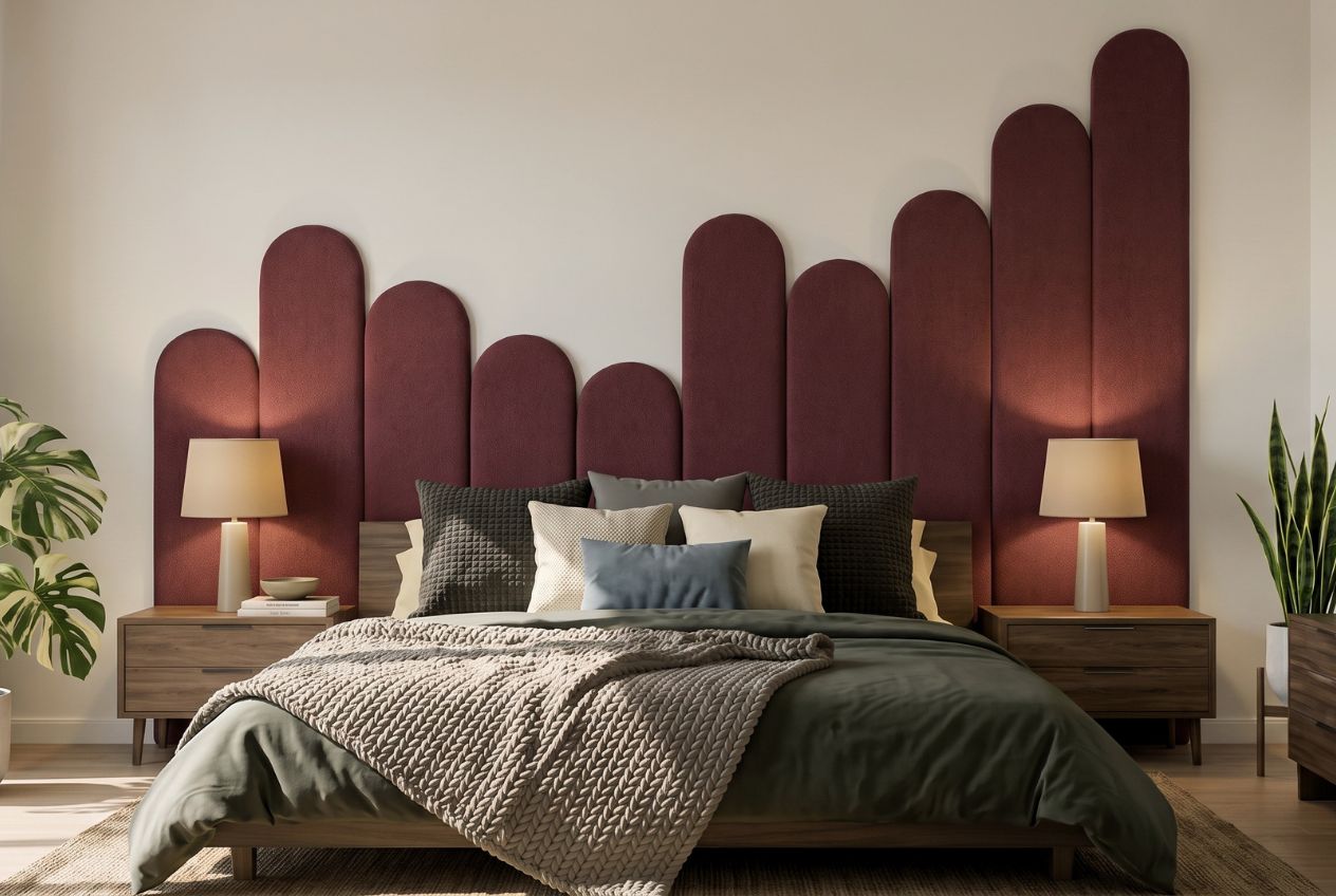
Browse our wall art collection for statement pieces that anchor a room and bring hierarchy to your walls. Or explore our editorial guides on how to personalise your space with decor that reflects your aesthetic and your life. Every piece we offer is chosen to transform, not just fill. Your next great room starts with one intentional choice.
Frequently asked questions
Which colours make a living room feel relaxed but not dull?
Greens and light blues create a relaxing atmosphere, but pairing them with textured cushions or bold art prevents the space from feeling flat. Cool colours calm but need contrast to avoid visual monotony.
How much furniture is too much for good ambiance?
If walkways are narrower than 30 inches wide, the room will feel cramped regardless of how beautiful the pieces are. Remove one item and the flow and spaciousness will improve immediately.
Can plant-filled furniture make my home feel cluttered?
Integrated plant furniture adds genuine intrigue but can tip into visual chaos quickly. Balance it with simple forms and open surfaces to keep the space feeling considered rather than crowded.
What’s a quick way to update ambiance for a new season?
Swapping soft furnishings and art for pieces in seasonal textures and colours is the fastest and most cost-effective way to reset a room’s atmosphere entirely.