
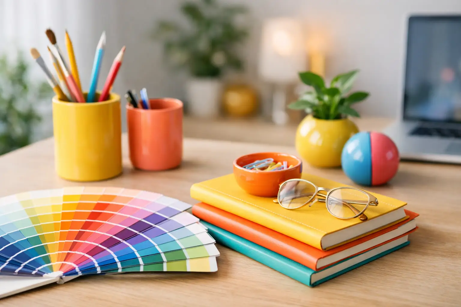
The quickest way to flatten a good room is to play it safe. White walls, beige upholstery, pale timber, one black accent – it all behaves. But it rarely lifts. A real guide to styling with optimistic colours starts somewhere else: with the idea that colour is not decoration added at the end. It is mood, energy and direction from the beginning.
Optimistic colour does not mean turning your home into a paint chart. It means choosing shades that feel alive – saffron, cobalt, acid green, tomato red, lilac, apricot, electric blue – and using them with enough intention that the room feels composed rather than chaotic. The goal is not noise. It is atmosphere with pulse.
What optimistic colours actually do in a room
Some colours recede. Others hold eye contact. Optimistic colours tend to do the second. They energise a neutral shell, sharpen the architecture and make a room feel inhabited by someone with a point of view.
That matters in modern homes, especially those with clean lines, large glazing and open-plan layouts. Strong architecture can handle stronger colour than people think. In fact, crisp spaces often need it. Without contrast, they can feel a little too controlled. Add a confident hit of saturated colour and the room loosens up.
There is also an emotional reason to use it. Bright, clear tones shift how a space feels at different times of day. Morning light makes warm tones glow. Evening light gives deeper shades weight and drama. In grey winters or on overcast coastal days, optimistic colour stops a room from going flat.
A guide to styling with optimistic colours starts with one anchor
If you try to make every item the hero, nothing lands. The most effective approach is to choose one anchor piece that sets the emotional temperature of the room. Usually that is oversized wall art, a sculptural light, or a statement sofa.
This anchor does two jobs. First, it gives you a palette to work from. Second, it creates hierarchy, which is what makes bold interiors feel designed rather than random.
Architectural-scale art is especially useful here because it can hold a room without adding clutter. One large work in high-impact colour can organise everything around it – upholstery, objects, even the finish of a side table or rug. It is far more effective than scattering ten small colourful accessories across shelves and hoping for the best.
If your anchor is a piece of lighting, let it lead in a different way. A coloured lamp or pendant brings both hue and glow, which means it changes the room twice: in daylight as an object, and at night as atmosphere.
Build the palette, then edit it hard
Optimistic interiors are not created by adding more and more colour. They are created by selecting the right colours, then resisting the urge to keep going.
A useful rule is to work with one dominant colour, one supporting colour and one tension note. So you might start with cobalt, support it with soft apricot, then add a small hit of oxblood or chrome yellow. Or you might build around green, then warm it with rust and sharpen it with lilac. The tension note is what stops the scheme feeling obvious.
What you do not need is five equally loud colours all fighting for airtime. It can work, but only if the room has very strong structure and a disciplined hand. Most homes benefit from a tighter edit.
Material matters just as much as hue. Glossy finishes bounce colour differently from matte ones. Velvet deepens it. Glass lightens it. Powder-coated metal makes it feel clean and graphic. A colour that looks playful on lacquer can feel almost earthy on linen. That is why optimistic colour works best when you think in surfaces, not swatches.
Let the room tell you how far to push it
Not every space wants the same level of intensity. A north-facing room with soft, cool light may benefit from warmer shades that stop it feeling washed out. A sun-drenched living area can handle cleaner, sharper tones because the light gives them energy rather than harshness.
Size changes things too. In a smaller flat or townhouse, one concentrated area of colour often works better than an all-over approach. A large artwork above a console. A bold pendant over the dining table. A single upholstered chair that breaks up a quiet room. These moves create impact without visual traffic.
In larger open-plan spaces, colour can help zone the room. A vibrant rug or artwork can define the living area, while a contrasting light or dining chairs set apart the eating zone. This is one of the smartest ways to use optimistic colour – not just to brighten a room, but to organise it.
The mistake people make with bright colour
They treat it like a garnish.
A few cheerful cushions on an otherwise cautious room will not transform the mood. They usually just expose how hesitant the scheme is. If you want colour to work, give it enough scale to matter.
That does not mean repainting every wall. It means choosing placement with conviction. A large-format artwork has authority. A coloured floor lamp in the right position can change the whole corner. A pair of dining chairs in a saturated finish reads as a decision, not an afterthought.
The other common mistake is matching too closely. Room schemes feel richer when colours relate rather than repeat. If your artwork contains coral, you do not need coral everywhere else. Pick up one undertone in the work, then answer it with something adjacent – terracotta, blush, paprika, aubergine. Close cousins create depth. Identical matches can feel flat.
How to balance optimistic colours with restraint
Bold does not mean relentless. Every bright room needs somewhere for the eye to rest.
That is where shape, negative space and quieter materials come in. Pale plaster walls, natural timber, stone, smoked glass, brushed steel, off-white upholstery – these elements give the stronger colours room to breathe. They are not filler. They are framing devices.
This is especially useful if you love expressive interiors but do not want your home to feel frantic. The balance often comes from contrast in texture rather than dropping back to generic neutrals. A vivid artwork against a chalky wall. A glossy red lamp beside a travertine side table. A citrus object on a dark walnut shelf. The room still has energy, but it also has rhythm.
Styling optimistic colours room by room
Living rooms can take the most colour because they are active, social spaces. Start with the biggest visual plane that is not the floor or walls – usually art, a sofa, or lighting – then layer supporting tones through smaller objects. Keep at least one element sculptural so the room feels designed from every angle.
Bedrooms need a different touch. You may want colour, but perhaps not constant stimulation. Here, optimistic shades work best when they are softened by material. Think dusty rose velvet, warm marigold in a woven textile, or a rich blue artwork with generous white space around it. The mood should still feel lifted, just not over-caffeinated.
Dining spaces are ideal for bolder experimentation because people experience them in bursts. A vivid pendant, coloured dining chairs or oversized art can create drama without demanding attention all day. If the room is compact, one strong gesture is enough.
Hallways are underrated. They are transitional spaces, which makes them perfect for a sharper hit of personality. A colourful console vignette or a single large artwork can set the tone before you even enter the main living area.
Why statement pieces matter more than small accessories
There is a reason tightly curated interiors feel stronger than rooms filled with bits and pieces. Statement pieces establish order. They stop you from compensating with clutter.
A room built around one or two decisive elements will always feel more modern than a room trying to create personality through scattered décor. This is where a design-led edit becomes useful. Rather than choosing from endless options, you choose fewer, better pieces that already know how to work together.
That approach suits optimistic colour perfectly. Bold colour needs confidence, and confidence comes from clarity. One commanding artwork, one sculptural lamp, one object with real form – that can do more than an armful of safe accessories ever will.
The best optimistic interiors feel intentional, not trendy
There is a difference between living with colour and chasing novelty. The first has staying power. The second dates quickly.
If you want your room to hold up, choose colours you respond to emotionally, not just visually. Which shades make the space feel more open, more alive, more like you want to spend time there? Start there. Then give those colours a proper role in the room.
At Lifted+, the strongest spaces are rarely the busiest. They are the clearest. More colour. More mood. More life. But also better placement, stronger scale and no filler.
If your room feels flat, do not add another beige layer and hope for the best. Choose one optimistic colour with intent, let it take up space, and build from there.