
Most homes do not need more stuff. They need a stronger point of view.
That is the real starting point for a guide to curating a cohesive home edit. Not shopping for the sake of it. Not layering in safe pieces until everything blurs into one polite beige sentence. A cohesive edit comes from deciding what your space should feel like, then choosing pieces that support that mood with intent.
The difference is obvious the moment you walk into a room. One feels assembled. The other feels authored.
Table of Contents
What a cohesive home edit actually means
A cohesive home edit is not about matching everything. That is the quickest route to a flat, over-controlled room. Cohesion is about connection. Your artwork, lighting, furniture and objects should feel like they belong to the same conversation, even if they are contrasting in colour, shape or material.
Think of it as rhythm rather than repetition. A curved lamp can echo the rounded line in a print. A deep lacquered red might pick up the warmth in timber. A sculptural object can reinforce the architectural confidence of a larger hero piece. Nothing needs to be identical. It just needs to make sense together.
This is where many rooms lose their edge. People buy in fragments – one chair here, one vase there, a piece of art chosen because there was a blank wall to fill. The result is rarely terrible. It is just forgettable.
Start with the piece that holds the room
Every strong edit needs an anchor. Usually, that is the largest visual statement in the room – often artwork, sometimes lighting, occasionally a standout furniture piece. Start there.
This matters because focal points set the rules. A large-scale artwork with bold geometry creates a different brief from a soft tonal landscape. A sculptural pendant pushes a room in a different direction than a restrained table lamp. If you begin with smaller accessories, you end up making dozens of tiny decisions without a clear framework.
The anchor piece should do more than fit the wall or fill the corner. It should shift the mood of the room. It should hold attention. It should tell you what comes next.
If your space is compact, that does not mean you need a timid focal point. Smaller rooms often benefit from one confident move rather than several half-decisions. Scale is relative, but impact matters.
Build the palette, then tighten it
Colour is where cohesion either sharpens or falls apart. The usual mistake is thinking a palette needs to be broad to feel layered. It does not. In fact, the most effective rooms often revolve around a disciplined set of tones used with intention.
Choose a lead colour, a supporting colour and one tension point. The lead colour is the dominant mood-setter. The supporting colour adds depth or softness. The tension point is what stops the room feeling too resolved – black against clay, acid yellow against deep blue, burgundy against chrome.
That tension is important. Without it, cohesive can slip into bland.
A guide to curating a cohesive home edit should always leave room for contrast, because contrast is what makes a room feel alive. The trick is to repeat that contrast in small ways so it feels deliberate. If you introduce cobalt in the art, you might repeat it in a side table book, a glazed object or the trim on a cushion. Not everywhere. Just enough.
If you already own pieces you want to keep, use them as data. What colours are already doing the work? What is fighting for attention? Edit first, then add.
Use shape and material as hard-working tools
Colour gets most of the attention, but form and material do just as much heavy lifting.
A room full of straight lines can feel crisp, but also rigid. Too many rounded pieces and the whole space softens to the point of losing structure. The strongest edits usually balance both. Maybe the sofa is low and linear, while the lamp has a generous curve. Maybe the artwork is graphic and architectural, while the ceramic objects add irregularity.
Materials need the same level of control. Timber, glass, linen, stone, lacquer and metal each carry a different mood. When they are layered well, the room feels dimensional. When they are scattered without intention, the room feels busy.
There is no perfect formula. It depends on the architecture of the home and the atmosphere you want. A light-filled Auckland villa can carry richer contrast than many people think, especially if the bones are classic. A compact city flat may need fewer materials overall, simply to keep visual noise in check. The point is not restraint for its own sake. The point is clarity.
Think in zones, not isolated products
A cohesive room is rarely built product by product. It is built in zones.
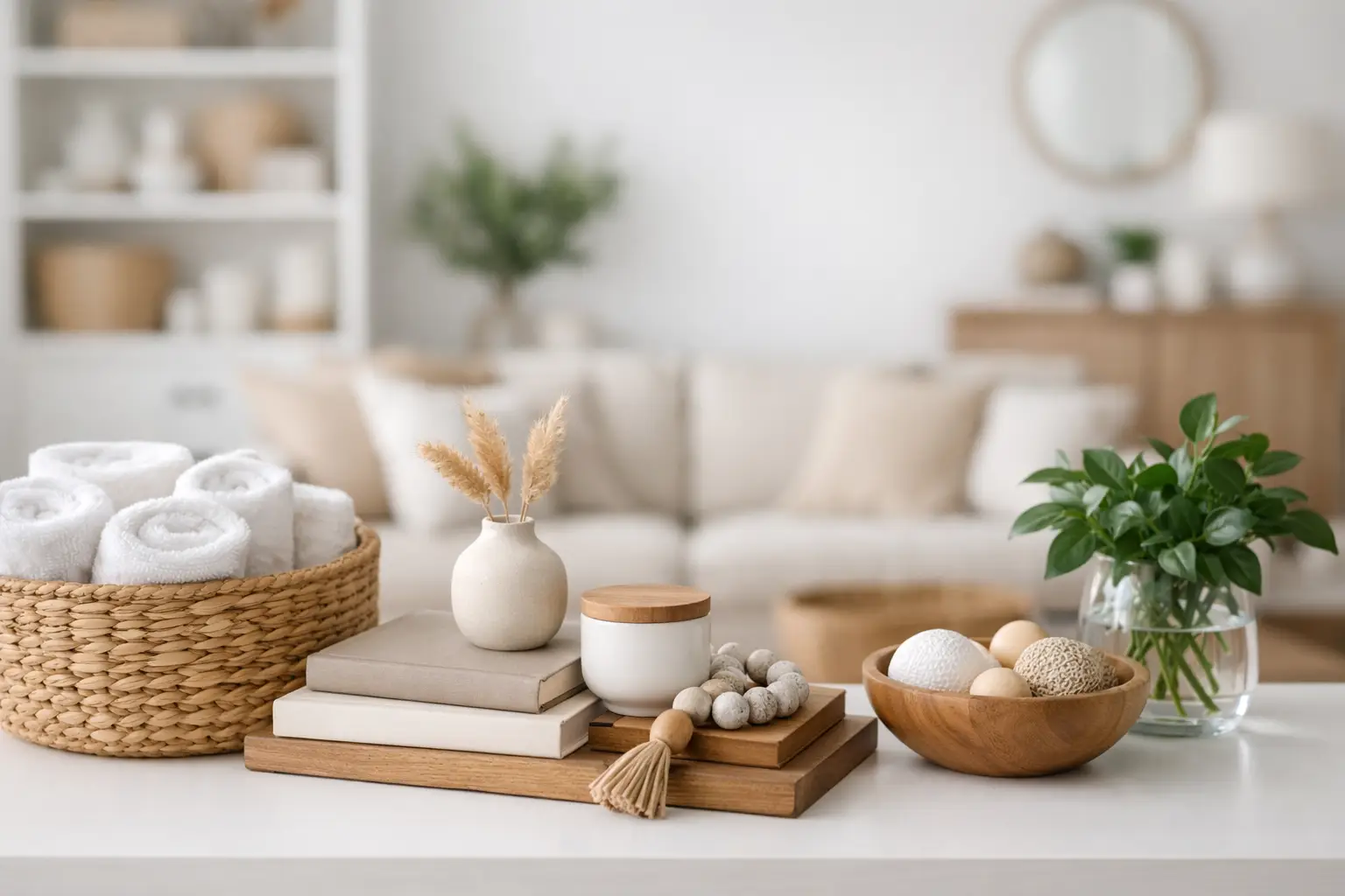
Look at each area as a composition. The wall art does not stand alone. It relates to the console beneath it, the lamp beside it, the negative space around it. A coffee table is not a holding pen for random objects. It is a visual pause in the middle of the room and should be styled with that in mind.
This is why curated room edits work so well. They show relationships. They help you see how one strong piece can be supported by quieter forms, how colour can travel through a room without becoming repetitive, and how scale keeps everything balanced.
When you shop only by category, it is easy to miss that. You end up buying a good lamp and a good print and a good vase, yet they never quite click together. A zone-based approach solves that problem before it starts.
Edit harder than you think you need to
The word edit matters. Cohesion is as much about what you remove as what you add.
If a room feels muddled, the answer is not always another layer. Sometimes it is taking away the side table that is too slight, the cushions that add colour but no conviction, or the decorative pieces that are technically fine but contribute nothing to the overall mood.
This can be the uncomfortable part, because editing asks you to be honest about what is diluting the room. Not every object deserves a place just because you own it. Not every surface needs styling. Empty space is not unfinished. Often, it is what gives the rest of the room its strength.
A useful test is simple: if you removed this item, would the room lose something important? If the answer is no, it may be filler.
How to keep it personal without losing cohesion
The fear with a more considered edit is that the room will start to feel staged. Too polished. Too controlled. Fair concern.
A home still needs personality, but personality lands better when the framework is strong. That might mean mixing new design-led pieces with older objects that have texture and story. It might mean displaying books you actually return to, ceramics collected over time, or a vintage chair that adds friction in the best possible way.
The key is selectivity. Personal does not have to mean plentiful.
This is where a lot of design-conscious homes get it right. They are not trying to recreate a showroom. They are building spaces with emotional charge – rooms that feel optimistic, expressive and lived in, without tipping into clutter. If you want help visualising that balance, curated collections like the Edits at Lifted+ can be useful because they show how statement pieces, lighting and objects can work together as a complete mood rather than a random set of purchases.
A simple framework for curating your home edit
If your room needs a reset, do this in order. Choose the focal point first. Set a colour direction around it. Limit the material palette. Check the balance of shapes. Then remove anything that weakens the mood.
That order matters. Get the hero piece wrong and every supporting choice becomes harder. Get the palette too broad and the room loses definition. Ignore scale and even beautiful pieces can feel strangely adrift.
The process should feel decisive, not exhausting. You are not trying to please every trend cycle or cover every design base. You are building a room that knows what it is.
And that is really the point of a cohesive home edit. More intention. More mood. More life.
If a piece does not help the room say something clear, it probably does not belong there.