
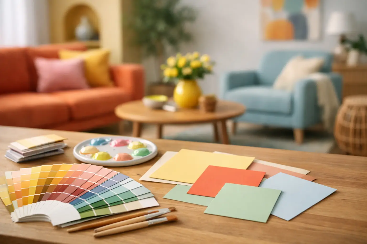
Beige had a long run. But if your home feels flat, polite or visually underfed, the answer is not another off-white wall. The best colour palette ideas for optimistic interiors do something more deliberate – they lift the energy of a room, sharpen its identity and make everyday spaces feel more alive.
Optimism in interiors is not about throwing bright paint at every surface and hoping for the best. It is about building a palette that feels open, warm and confident. Done well, colour changes the emotional temperature of a room. It can make a compact flat feel expansive, give a renovated villa more presence, or turn a new-build living area into something with actual character.
Table of Contents
What makes a palette feel optimistic?
An optimistic palette has movement in it. There is usually contrast, a little warmth, and at least one colour with enough clarity to wake the room up. That does not always mean saturated brights. Sometimes optimism comes from the tension between a soft base and a sharper accent. Sometimes it comes from sunlight bouncing off lacquered red, apricot upholstery or a glossy cobalt lamp.
The key is intent. Rooms feel optimistic when colour is used to create mood, not just decoration. That is why random accent cushions rarely do the job. A palette needs a centre of gravity – a focal artwork, a statement light, a dominant wall tone, or a hero chair – and then supporting colours that make the whole composition feel resolved.
This is also where many people hesitate. They want a more expressive home, but they do not want chaos. Fair enough. Optimistic interiors should feel energising, not noisy. The difference comes down to structure.
Colour palette ideas for optimistic interiors that actually work
1. Butter yellow, tomato red and chalky pink
This palette has warmth without becoming sugary. Butter yellow brings light. Tomato red adds punch. Chalky pink softens the sharper edges and stops the scheme from feeling overly graphic.
It works especially well in living rooms and dining spaces that need a lift, particularly when the architecture is clean and slightly minimal. Use yellow in broader areas if you want the room to feel more open, then bring in red through lighting, art or a single upholstered piece. Pink works best as the buffer – on textiles, ceramics or smaller furniture.
The trade-off is obvious. Red can dominate quickly. If you are using it, let it be intentional and repeated at least twice so it looks placed rather than accidental.
2. Cobalt blue, cream and vivid green
If you want optimism with edge, this one has range. Cobalt has authority. Cream keeps it breathable. Vivid green adds freshness and a slightly unexpected jolt.
This palette suits contemporary homes with strong lines, polished concrete, timber flooring or large glazing. It also plays well with sculptural forms, because the colour contrast already gives the room a clear rhythm. Cream should do the heavy lifting in the background, while cobalt anchors the room through art, a rug or a feature chair. Green is best used as the electric note.
The risk is making it feel too cold. Counter that with tactile finishes – boucle, wool, timber, smoked glass – so the room still feels like somewhere people actually live.
3. Apricot, rust and sky blue
This is a more relaxed version of optimism. It feels sunlit, a little nostalgic and very liveable. Apricot has enough softness to work across larger surfaces, rust adds depth, and sky blue stops the whole thing sliding too far into earthiness.
This combination works beautifully in bedrooms, reading rooms and open-plan spaces that need warmth but not intensity. It is also a strong option if you are colour-curious but not ready for hyper-saturated contrast. The blue matters here. Without it, the room can feel too baked and heavy.
Think of this palette as layered rather than loud. Linen, washed cotton, matte finishes and oversized art all help it land properly.
4. Lilac, oxblood and peach
Not every optimistic interior needs to be sunny. Some feel buoyant because they are unexpected. Lilac and peach bring lightness, while oxblood gives the scheme backbone.
This palette is for people who want a room with personality, not just pleasantness. It is particularly effective in spaces that are otherwise architecturally restrained – white walls, clean joinery, simple flooring. The deeper red keeps the sweeter tones from drifting into something too decorative.
Use lilac in moderation if natural light is limited. In dim rooms it can flatten unless there is enough contrast around it. Peach is often easier to carry through paint, upholstery or objects because it remains warm even in shadow.
5. Tangerine, soft blue and espresso brown
There is a reason this combination keeps showing up in the strongest modern interiors. Tangerine is bright, but not childish. Soft blue cools and balances it. Espresso brown adds sophistication and weight.
This is an excellent palette for homes that already have walnut, dark timber or bronze details. It makes those elements feel intentional rather than leftover. It also works in open-plan areas where you want colour, but still need some visual grounding.
The brown is what makes it grown-up. Without it, tangerine and blue can feel a touch too playful. With it, the room looks edited.
How to build an optimistic palette without overdoing it
The fastest way to lose confidence with colour is to start with six shades and no hierarchy. A better approach is to begin with one dominant emotional note. Ask yourself what the room actually needs. More light? More warmth? More clarity? More energy? That answer should shape the palette.
Then choose your lead colour and one balancing tone. After that, add a third colour only if it improves the room. Not because it looks good as a swatch, but because it adds contrast, depth or cohesion.
Scale matters too. A strong colour used only in tiny fragments can feel fussy. The same colour repeated across artwork, upholstery and a lamp suddenly looks deliberate. This is why statement pieces matter. A large artwork or sculptural light can hold the room and make bolder supporting colour feel far easier to manage.
If you are working with an open-plan area, keep the palette consistent but shift the ratios. Maybe the living zone leans blue with apricot accents, while the dining area flips towards apricot with blue in smaller hits. The continuity keeps the home feeling connected without making every room identical.
The materials matter as much as the colours
A palette never exists in isolation. Gloss, texture and finish all change the way colour behaves. Tomato red in velvet feels different from tomato red in powder-coated metal. Butter yellow on a limewashed wall feels quieter than the same shade on lacquered joinery.
That is often the missing layer in optimistic interiors. People focus on hue and forget surface. If your palette is already lively, choose some materials that absorb light and soften the effect. If the room feels dull, bring in sheen – glazed ceramic, polished stone, reflective metal, high-gloss paint.
This matters even more in New Zealand homes where natural light can shift quickly through the day. Colours that look airy in a bright morning can feel muted by late afternoon, especially in south-facing rooms. Testing tones in real light is not optional if you want a palette that stays convincing.
Where colour should lead the room
Optimistic interiors tend to work best when colour is not scattered evenly across everything. One element should lead. That might be an architectural-scale artwork, a statement sofa, an oversized pendant, or a painted wall with real presence. Everything else should support it.
This is where curation beats clutter. A room with one commanding artwork and three well-judged colour echoes will usually feel stronger than a room packed with smaller decorative gestures. More pieces do not create more impact. Better placement does.
If you want a shortcut, build the room the same way a strong retail edit does: start with the hero, add supporting forms, then finish with one or two sharper notes. Lifted+ leans into this approach for good reason. It helps colour feel composed instead of chaotic.
When to pull back
Not every room needs maximum voltage. Bedrooms, for example, often benefit from optimistic palettes that feel lighter and more atmospheric than punchy. Entry spaces can handle stronger contrast because you move through them quickly. Living areas usually sit somewhere in the middle – enough energy to hold attention, enough restraint to live with daily.
If a palette feels close but not quite right, the fix is often subtraction, not addition. Remove one competing accent. Repeat the strongest colour once more. Swap a bright white for a softer cream. Optimism is not about excess. It is about clarity, warmth and momentum.
The best rooms do not apologise for colour. They use it to create mood on purpose. If your interior needs more life, start there – not with filler, but with a palette that knows exactly what it is trying to do.