
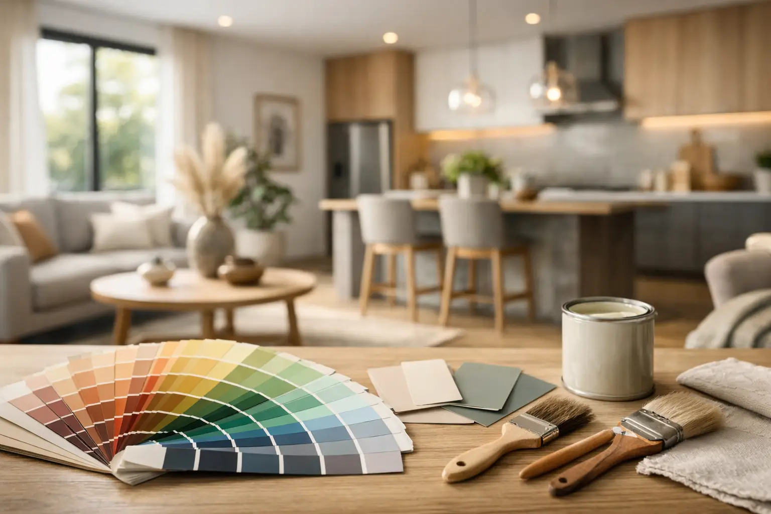
Open-plan rooms can look expensive and still feel unresolved. The sofa works. The dining table works. The kitchen works. Yet somehow the whole thing doesn’t. That’s usually a colour problem. A strong colour palette for open plan living doesn’t just make a space look pulled together – it decides how the room feels, where the eye lands, and whether the space has energy or falls flat.
This matters even more in homes where kitchen, dining and living all share one footprint. Without walls doing the hard work, colour has to create structure. It has to zone the room without chopping it up. It has to connect finishes that are often fixed – timber flooring, stone benchtops, cabinetry, black window frames – while still leaving room for personality. Beige can keep the peace, but it rarely holds the room.
What makes a colour palette for open plan living work
The best palettes do two things at once. They create cohesion across the full space, and they give each zone its own identity. Get too matchy and the room becomes one long blur. Push contrast too far and it starts to feel like three separate rooms forced together.
The answer is rhythm. Repeating colours, materials and tonal weights across the space creates flow. Then you vary how each zone uses them. Your dining area might carry the richest tone through art or upholstered seating, while the living space picks it up in a rug, object or lamp. The kitchen can stay cleaner and more architectural, but it still needs to speak the same language.
Think in terms of a cast, not a single star. One dominant base, one or two key colours, darker anchors, and a lighter note to keep the whole thing breathing.
Start with the fixed elements
Before choosing cushion covers or a paint swatch with an emotional support latte beside it, read the room properly. Open-plan spaces already come with a palette. Flooring, cabinetry, splashbacks, benchtops, window joinery and even the size and direction of light all influence what will work.
If your floor has warm undertones, an icy palette can feel disconnected unless there’s enough contrast to make that tension feel intentional. If your kitchen is already white and oak, adding more pale neutrals often creates a washed-out result rather than a calm one. In many New Zealand homes, especially newer builds and architect-designed renovations, the challenge is not a lack of good finishes. It’s knowing how to stop them from blending into polite nothingness.
Start by identifying the undertone that already dominates – warm, cool or neutral. Then decide whether you want to reinforce it or interrupt it. Reinforcing creates ease. Interrupting creates edge. Both can work. The difference is confidence.
Choose a base that can travel
Your base colour should be able to move through every zone without looking strained. That might be a soft chalky white, a warm stone, a muted clay, a grey-green, or even a pale blush if the architecture can carry it. The point is not to play it safe. The point is to choose a base with enough range to support bolder moves elsewhere.
In open-plan spaces, the base is what stops colour from feeling random. Walls, large rugs, curtains, and bigger upholstery pieces often carry this job. If the room gets strong daylight, you can usually push the base a little moodier. If the light is cooler or limited, a muddied mid-tone can suddenly feel heavy.
Use colour to zone, not divide
A good open-plan scheme guides you through the room. You should feel where cooking ends and dining begins, then where the space softens into living. Colour helps define those shifts without putting up visual barriers.
This can be subtle. A deeper tone around the dining zone makes it feel grounded and intentional. A lighter, more layered living area feels softer and more relaxed. In the kitchen, tighter use of colour often works best – cabinetry, stools, lighting, and one strong artwork or object to stop the hard finishes feeling clinical.
If you want bolder zoning, keep the palette tight and vary saturation instead. For example, use olive as the through-line, then bring in sage in one area and a darker forest note in another. That gives separation without visual chaos.
The 60-30-10 rule is useful – until it isn’t
Yes, the old ratio can help. Sixty per cent base, thirty per cent secondary, ten per cent accent. But open-plan rooms are rarely neat enough for formula alone. A large artwork can outweigh its actual size. A coloured sofa can dominate the entire sightline from the kitchen. A sculptural pendant over the dining table can shift the room’s centre of gravity in seconds.
Use ratios as a check, not a command. If one colour is visually loud, you may need less of it. If your palette is more tonal and muted, you can often use more without overpowering the space.
Pick a mood, then build the palette backwards
The mistake most people make is choosing colours they like in isolation. Open-plan living asks for a stronger editorial decision. What do you want the room to feel like at 7am, at lunch, and when people are over for dinner?
If you want energy, look at high-contrast combinations with warmth in them – terracotta, rust, cobalt, citron, tomato red, lacquered black. If you want calm with backbone, consider olive, tobacco, camel, oxblood, deep blue, plaster tones. If you want lightness without defaulting to bland, try butter, peach, eucalyptus, chalk, soft blue and smoked lilac.
Mood comes from tension as much as harmony. A room made entirely of agreeable tones can feel underwritten. One sharper note changes everything. This is where statement art, lighting, and colour-forward objects earn their place. They don’t just decorate. They set the emotional temperature.
Three palette directions that suit modern open-plan homes
Warm earth with punch
This is the antidote to sterile white boxes. Start with warm white or pale clay walls, then add cinnamon, terracotta, olive and chocolate brown. Black or bronze accents sharpen the scheme. It suits timber floors, travertine, brushed metals and spaces that need more depth.
The risk is heaviness. Offset it with crisp lighting, lighter upholstery, and pieces with sculptural shape rather than visual bulk.
Coastal, but grown up
Not nautical. Not beach-house cliché. Think chalky whites, sand, muted sage, dusty blue, weathered timber and a hit of ink or charcoal. This works beautifully in bright homes where you want softness but still need contrast.
The trap here is going too pale. Without a darker anchor or one saturated colour, the room can drift. Add a strong focal point that holds the eye.
High-contrast modern
For those done with safe interiors, this is where things get interesting. Use a restrained base such as warm white, putty or soft grey, then layer in bold notes like ultramarine, acidic green, vermilion or aubergine with blackened accents. This palette thrives on tension and clean lines.
It needs restraint in other areas. If every surface shouts, nothing lands. Keep some planes quiet so the stronger elements can actually perform.
Let one element lead
In open-plan spaces, a focal piece can solve more than people realise. Large-scale art, a sculptural pendant, or a rug with real presence gives the room a centre. From there, the rest of the palette has something to answer to.
This is especially useful if you’re building the room in stages. Choose the piece that holds the most visual weight, then repeat or contrast its colours across smaller moments. A strong artwork can pull the kitchen and living zone into the same conversation. A bold pendant over the dining table can make that zone feel deliberate rather than leftover.
At Lifted+, this is exactly how colour-led interiors get built – not by stuffing a room with matching accessories, but by starting with one piece that sets the mood and letting the rest of the space support it.
Common mistakes with an open plan palette
The first is playing every zone at the same volume. If the kitchen, dining and living area all have equal colour intensity, the room can feel oddly flat. Some zones should recede. Others should lead.
The second is relying only on small accessories for colour. A few cushions and a vase cannot carry an open-plan room. You need colour at different scales – wall art, upholstery, lighting, rugs, dining chairs, painted joinery, or curtains.
The third is confusing neutral with timeless. Timeless interiors usually have contrast, texture and conviction. They do not always look safe.
How to know when the palette is right
Stand at the point where you can see all three zones at once. The space should feel connected before you notice individual items. Then look again. Each area should still have its own pulse.
If your eye jumps awkwardly from one unrelated colour moment to another, edit. If everything fades into one pleasant fog, push contrast. The right palette for open plan living has both flow and friction. It feels cohesive, but not quiet for the sake of it.
A well-composed room doesn’t need more stuff. It needs better decisions. Start with mood. Trust tension. Let colour do more than fill the gaps.
Because in an open-plan home, colour is not the finishing touch. It’s the architecture you can change.